
10 UI Design Best Practices to Build High-Converting Websites Faster in 2026

In the world of no-code development, speed is a superpower. But speed without quality leads to sites that look amateurish and fail to convert. The real challenge isn't just building a website; it's launching a professional, high-performing digital asset that achieves business goals. This is where mastering core UI design best practices becomes a non-negotiable advantage.
Many creators spend countless hours wrestling with layouts, colors, and fonts, only to end up with a site that doesn't deliver. The secret isn't to become a master designer overnight. It's to build upon proven systems and principles that are already baked into professional-grade tools and templates. While UI focuses on the visual interface, it's crucial to remember that it works hand-in-hand with the overall user journey. To truly drive results with UI design, understanding core UX principles is paramount. You can delve deeper into the top 10 best practices in User Experience (UX) design to build a solid foundation for your projects.
This guide breaks down 10 essential UI design best practices that you can apply immediately, with a specific focus on how to implement them efficiently in Framer. We'll explore how leaning on expertly crafted templates, like those from FramerDevs, can help you bypass the steep learning curve and immense time investment of building from scratch. This approach lets you go straight to launching websites that are not only beautiful but are also optimized for speed, conversions, and business success from day one. Let's dive into the principles that separate amateur sites from professional, results-driven platforms.
1. Visual Hierarchy and Information Architecture
Effective UI design begins with a solid foundation. Visual hierarchy and information architecture (IA) work together to create that foundation, guiding users through your interface with clarity and purpose. Think of IA as the blueprint for your content's structure, while visual hierarchy is the interior design that directs attention to what matters most.
Visual hierarchy uses principles like size, color, contrast, and spacing to signal importance. A prominent headline, a brightly colored call-to-action button, and generous whitespace all work to create a natural flow. This is one of the most critical UI design best practices because it reduces cognitive load, allowing users to understand information and make decisions quickly. Without it, a page feels chaotic and users are more likely to abandon their task.
How to Implement Strong Hierarchy
A well-organized visual system is not just about aesthetics; it’s about communication. The goal is to create a clear path for the user’s eye to follow.
Follow Natural Scan Patterns: Most Western users scan pages in an F-pattern or Z-pattern. Place your most important elements (like your value proposition and primary CTA) along these paths to capture attention immediately.
Limit Key Actions: Avoid overwhelming users with too many choices. Stick to one primary call-to-action (CTA) per screen section. Make it visually distinct through size and color to draw the eye.
Use Semantic Headings: Structure your content with proper heading tags (H1, H2, H3). This not only improves visual organization but also boosts SEO and accessibility for screen readers.
Key Insight: Whitespace is an active element in your design. Generous spacing between elements improves legibility and clarifies relationships, making your entire layout feel more intentional and less crowded.
For no-code builders, achieving a professional hierarchy from a blank canvas is a time-consuming and error-prone process. This is a key reason businesses choose professional templates; they come with this structure pre-built. As experts in conversion-optimized design, FramerDevs ensures every premium template has this structure built-in, with pre-defined styles for headings, buttons, and spacing. This guarantees consistency and lets you focus on your business-critical content, not foundational design theory. Starting with a solid information architecture is also key; you can map out your user flows with a Figma wireframe template before ever touching a design tool, saving significant development time.
2. Mobile-First Responsive Design
A mobile-first approach to responsive design has become a non-negotiable standard. This methodology dictates that you begin the design process with the smallest screen, the mobile device, and then progressively expand the design for larger screens like tablets and desktops. With mobile traffic now eclipsing desktop for many industries, ensuring a flawless experience on a phone is essential for user satisfaction and business success.
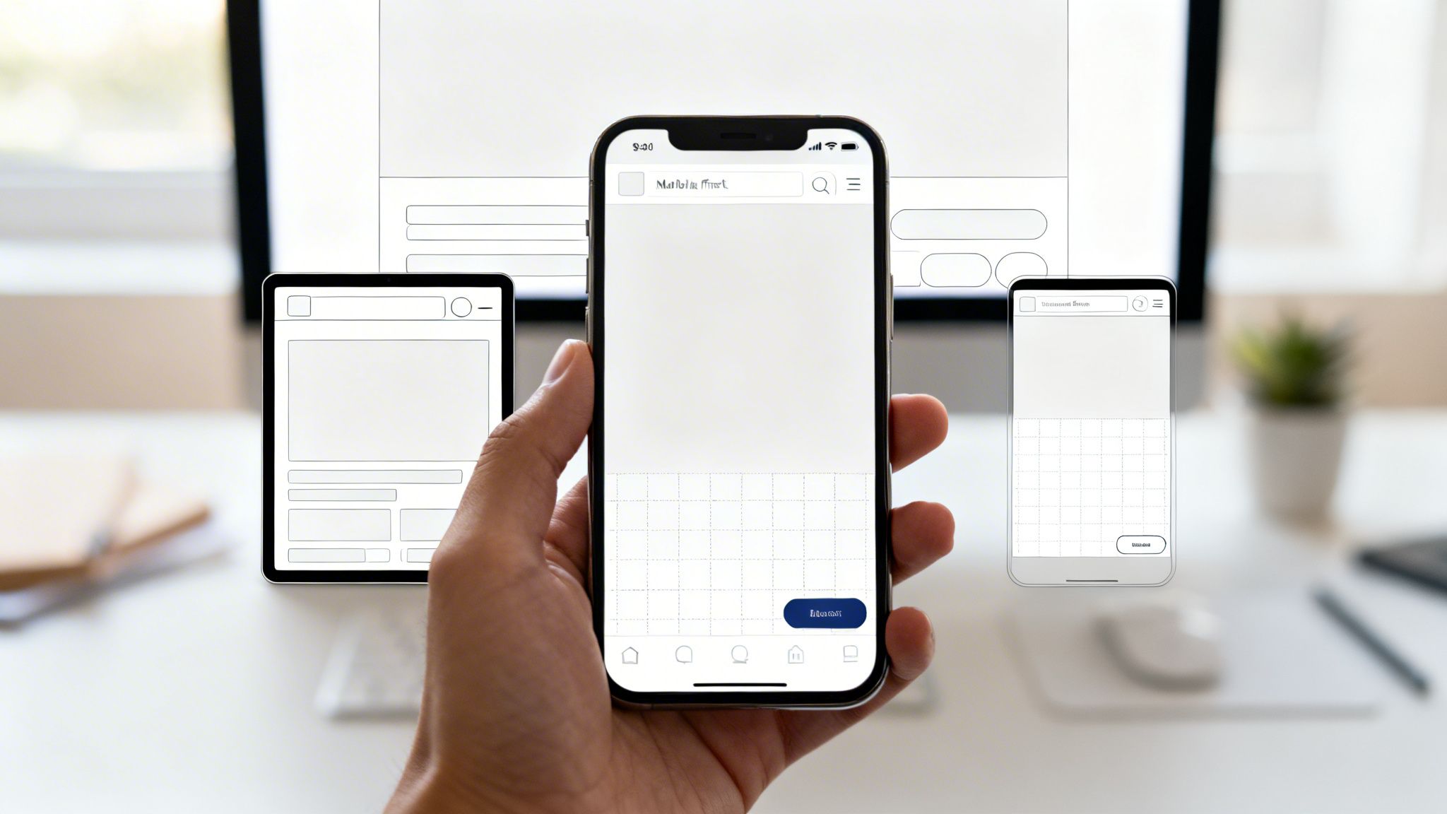
This strategy forces designers to prioritize the most critical content and actions from the start. By starting with limited screen real estate, you are compelled to make disciplined choices about what truly matters, resulting in a cleaner, more focused user experience on every device. This is one of the most important UI design best practices because it also directly impacts SEO, as search engines prioritize mobile-friendly websites.
How to Implement Mobile-First Design
Adopting a mobile-first mindset from the outset prevents the common problem of trying to cram a complex desktop design onto a small screen. It is a more strategic and efficient way to build for the modern web.
Start with Mobile Viewports: Begin your design process at a common mobile width, like 375px. Define the core content, navigation, and user flows for this constrained view first. Then, scale up to tablet (around 768px) and desktop (1440px+), adding complexity and layout adjustments as more space becomes available.
Prioritize Touch-Friendly Elements: Mobile interactions are tactile. Ensure buttons, links, and other interactive elements have ample spacing and are large enough to be tapped easily without accidental clicks. A minimum tap target of 44x44 pixels is a good starting point.
Test on Real Devices: Browser emulation is useful, but it cannot fully replicate the experience of using a real device. Test your design on actual phones and tablets, paying attention to performance on slower networks and how touch interactions feel.
Key Insight: Logical breakpoints are more effective than device-specific ones. Instead of designing for "the iPhone" or "the iPad," create breakpoints where your content naturally starts to look strained or broken. This creates a more fluid and resilient design.
For no-code builders, creating a truly responsive site from scratch is a major hurdle. This is where premium Framer templates provide an unbeatable business advantage. As expert template providers, FramerDevs' templates are built with a mobile-first philosophy from the ground up. This guarantees your site is perfectly optimized for every screen, saving you countless hours of tedious adjustments and ensuring you don't lose mobile customers due to a poor experience.
3. Consistent Design Systems and Component Reusability
A design system is the single source of truth for your product's design. It’s a collection of reusable components, patterns, and guidelines that ensure consistency across every part of your interface. By building elements like buttons, forms, and cards once and reusing them everywhere, you create a predictable and intuitive user experience. This is a core part of modern UI design best practices because it eliminates design debt and dramatically speeds up development.
This approach scales beautifully in no-code platforms like Framer, where components are native to the workflow. Systems like Google’s Material Design and Apple’s Human Interface Guidelines set the standard, providing a shared language for designers and developers. A well-executed design system means users don't have to relearn how your interface works every time they visit a new page, which builds trust and improves usability.
How to Implement a Design System
Building a system isn't just about creating a library of assets; it's about establishing rules for how those assets are used to maintain a cohesive experience.
Start with Core Components: Begin with the foundational "atoms" of your design, like buttons, inputs, and cards. Define their states (default, hover, disabled) from the start.
Establish Design Tokens: Create scales for spacing (e.g., an 8px grid), typography, and colors. Use semantic names for colors like
primary,success, anderrorinstead of hex codes to make them context-aware.Document Everything: Clearly document each component's purpose, variants, and use cases. This helps new team members get up to speed quickly and prevents misuse.
Key Insight: Your design system is a living product, not a one-time project. It should evolve with your product. Version your system and communicate changes clearly to ensure everyone is working with the most current standards.
For no-code builders, constructing a robust design system from scratch is a massive undertaking, often requiring a dedicated design team. This is why savvy businesses opt for templates. Premium Framer templates from FramerDevs are built on this principle, providing a complete system of pre-built, customizable components. This allows you to launch a professional, consistent site in a fraction of the time, ensuring every button, form, and layout adheres to best practices for a seamless user journey and faster time-to-market.
4. Clear and Intuitive Navigation
Navigation serves as the roadmap for your digital product, guiding users and shaping their entire experience. It’s the invisible framework that answers fundamental user questions: “Where am I?”, “Where can I go from here?”, and “How do I get back?” When navigation is clear and intuitive, users don’t even notice it; they simply find what they need with zero friction.
This principle is one of the most essential UI design best practices because it directly impacts usability and retention. Confusing or inconsistent navigation leads to frustration and abandonment. On the other hand, a well-structured system, like Amazon’s clear categorization or Stripe’s developer-friendly documentation, builds confidence and allows users to explore a site effortlessly. Good navigation is predictable, logical, and built around user expectations.
How to Implement Clear Navigation
A strong navigational structure anticipates user needs and provides a consistent mental model for interacting with your site. The goal is to make discovery feel natural, not like a puzzle.
Limit Main Navigation Items: To avoid overwhelming users, stick to a maximum of 5-7 primary items in your main navigation menu. This respects cognitive limits and forces you to prioritize what's most important.
Use Descriptive and Action-Oriented Labels: Opt for clear, user-centric labels. For instance, use “Solutions” instead of “Products” or “Get a Demo” instead of “Contact Us.” These direct labels clarify purpose.
Indicate Current Location: Show users where they are by using active states (e.g., a different color or an underline) for the current page in the navigation menu. Breadcrumbs are also excellent for deep, multi-level sites.
Ensure Mobile Usability: Test your navigation rigorously on mobile devices. This is often where poorly planned navigation systems break down. Common patterns like a hamburger menu or a bottom tab bar work well.
Key Insight: Before a single pixel is designed, validate your information architecture with tree testing. This research method helps you confirm that your proposed site structure makes sense to actual users, preventing costly redesigns later.
For no-code creators, designing a logical navigation system that works flawlessly across all devices is a complex challenge. Getting it wrong costs visitors and revenue. As expert template creators, FramerDevs offers premium templates with pre-built, tested navigation structures suited for various business types. This allows you to plug in your content and launch with a professional, user-friendly framework that supports your business goals from day one, avoiding the common pitfalls of DIY navigation.
5. Accessibility and Inclusive Design
Accessible design is not an optional extra; it's a fundamental part of creating a high-quality user experience. It ensures that interfaces are usable by everyone, regardless of ability. This includes users with visual impairments like color blindness, auditory limitations, motor difficulties, or cognitive differences. Thinking inclusively from the start benefits all users, not just those with disabilities.

This approach is one of the most important UI design best practices because its benefits extend universally. For instance, clear captions on a video help users in a noisy environment, and well-structured keyboard navigation is a massive efficiency boost for power users. Prioritizing accessibility future-proofs your product, expands your audience, and is simply the right thing to do. Apple's industry-leading accessibility features, like VoiceOver, demonstrate how inclusive design can become a core product strength.
How to Implement Inclusive Design
Building an accessible interface means making intentional choices that support every user. The goal is to remove barriers and create an experience that is equally functional for all.
Prioritize Color Contrast: Text must be readable. Adhere to WCAG guidelines by ensuring a contrast ratio of at least 4.5:1 for normal text and 3:1 for large text. This is especially critical for features like dark mode, where poor contrast can make an interface unusable. You can read more on creating accessible dark mode websites to get it right.
Embrace Semantic HTML: Use HTML elements for their intended purpose. A
<button>should be a button, not a<div>with a click event. This provides context for assistive technologies like screen readers and improves SEO.Ensure Keyboard Navigability: All interactive elements, including links, buttons, and form fields, must be fully operable using only a keyboard. Test your site by unplugging your mouse and trying to complete a key task.
Key Insight: Accessibility is not a final-step checklist; it's an ongoing process. Start with automated tools like Lighthouse to catch low-hanging fruit, but always validate with real assistive technology and, ideally, test with users who have disabilities.
For no-code creators, ensuring compliance across every element can feel daunting and is often overlooked when building from scratch. As experts, FramerDevs bakes accessibility into every premium template, incorporating proper heading structures, ARIA labels, and keyboard navigation from the start. This foundation lets you build a professional, inclusive site quickly, expanding your market reach without needing to become an accessibility expert overnight.
6. Whitespace and Visual Breathing Room
Whitespace, or negative space, is the unmarked area between elements in a design. It's one of the most powerful yet misunderstood UI design best practices. Far from being "wasted" space, it's an active tool that brings clarity, elegance, and focus to an interface. Strategic use of whitespace reduces cognitive load, improves readability, and guides the user's eye, making content feel intentional and less overwhelming.
Premium brands like Apple and Stripe use generous whitespace to signal quality and confidence. This breathing room isolates key information, emphasizes products, and creates a sense of calm and order. It separates content into logical groups without needing explicit dividers like lines or boxes, resulting in a cleaner, more professional aesthetic.
How to Implement Strong Whitespace
Creating visual balance with whitespace is about discipline and consistency. The goal is to establish a clear visual rhythm that makes your interface easy to scan and understand.
Establish a Base Unit: Start with a base spacing value, like 16px, and create a scale (e.g., 8px, 16px, 24px, 32px, 48px). Use these consistent units for all margins and padding to build a cohesive layout.
Prioritize Readability: Set your body text line-height to 1.5x-1.7x the font size. This simple adjustment dramatically improves how easily users can read long blocks of text.
Group Related Elements: Use proximity to connect related items. Less space between a label and its input field signals they belong together. More space between distinct sections creates clear separation.
Key Insight: Whitespace is not about adding emptiness; it's about creating focus. By giving elements room to breathe, you increase their perceived importance and make the entire composition feel more deliberate and high-end.
While no-code tools give you control over spacing, achieving a perfect, proportional system that signals high quality can be tedious and is easy to get wrong. This is where professionally designed Framer templates provide a major advantage. FramerDevs, as an expert provider, ensures every premium template comes with pre-configured spacing variables and typography styles. This guarantees your site looks polished and balanced from the start, letting you focus on your message instead of pixel-perfect adjustments.
7. Fast Load Times and Performance Optimization
Performance is not just a technical detail; it's a fundamental aspect of the user experience. Sites that load slowly frustrate users, leading to higher bounce rates and lower conversions. Performance optimization involves a set of practices aimed at making your website load and respond as quickly as possible, influenced by image sizes, code efficiency, and server response times.
Fast load times are one of the most impactful UI design best practices because they directly respect the user's time. A delay of even a few hundred milliseconds can be the difference between a conversion and a lost customer, as famously demonstrated by Amazon's finding that a 100ms speed improvement increased revenue by 1%. Modern platforms like Framer are built for speed, but smart optimization is still a key differentiator.
How to Implement Performance Optimization
A high-performing site feels seamless and professional. Your goal is to deliver content to the user's screen instantly, creating a perception of quality and reliability.
Measure and Monitor: Use tools like Google Lighthouse and WebPageTest to get a baseline score. Regularly test your site's Core Web Vitals (LCP, FID, CLS) to identify bottlenecks before they impact users.
Optimize Images Aggressively: Images are often the biggest cause of slow pages. Use modern formats like WebP, compress them without losing too much quality, and implement lazy loading so they only load when they enter the viewport.
Keep Code Lean: Minimize the size of your JavaScript and CSS files. Remove unused packages or code snippets that can slow down rendering. Prioritize loading critical, above-the-fold content first.
Key Insight: Test your site on a throttled network connection (like "Slow 3G" in Chrome DevTools). This simulates real-world conditions for users with poor connectivity and reveals how your site truly performs for a wider audience.
While no-code tools simplify development, performance can still suffer from unoptimized assets and complex interactions when building from scratch. This is a crucial business reason to use professional templates. As experts, FramerDevs builds every premium template with performance in mind, including optimized image placeholders, efficient code structures, and lightweight animations. This pre-built foundation ensures your site starts fast, allowing you to focus on creating great content without worrying about technical performance audits and lost revenue.
8. Clear Call-to-Action (CTA) Design and Conversion Optimization
The call-to-action (CTA) is the most critical conversion point in your user interface. It’s a direct instruction to the user, like "Get Started" or "Buy Now," designed to prompt an immediate response. Effective CTA design is a core component of UI design best practices, as it turns passive visitors into active customers by being visually prominent and using action-oriented language.
A weak or ambiguous CTA creates friction and hesitation, directly harming your conversion rates. On the other hand, a strong one guides users confidently toward the desired outcome. For marketing sites, landing pages, and e-commerce stores, optimizing CTAs is not just a design choice; it is a fundamental business activity. This process of testing and refining CTAs to maximize signups, sales, or leads is known as conversion rate optimization (CRO).
How to Implement High-Converting CTAs
The goal of a CTA is to be unmissable and irresistible. It should stand out from the rest of the page while clearly communicating its value to the user.
Use Action-Oriented Copy: Instead of generic words like "Submit," use specific, value-driven phrases. "Start Your Free Trial" is much more compelling than "Register."
Create Visual Contrast: Your primary CTA button should use a high-contrast color that draws the eye. This is often a brand color or a complementary one that stands out from the background.
Place It Above the Fold: Your main CTA should be visible without scrolling. This ensures it captures attention immediately upon a user landing on your page.
Reduce Form Friction: Every unnecessary field in a form is a reason for a user to leave. Ask only for essential information. Adding supporting text like "No credit card required" can also significantly reduce user anxiety.
Key Insight: A/B testing is not optional; it’s essential for conversion optimization. Small, iterative changes to your CTA’s color, copy, or placement can compound over time, leading to significant increases in performance.
Building a conversion-focused site from scratch requires extensive testing and deep expertise in user psychology. As expert providers of premium templates, FramerDevs saves you the time and guesswork. Our templates come with pre-tested, conversion-optimized CTAs, layouts, and user flows. By following established landing page best practices, we ensure your design is built for results from day one, letting you focus on your product or service, not endless A/B tests.
9. Micro-interactions and Feedback Mechanisms
A polished interface feels alive, and that sense of responsiveness is often achieved through micro-interactions. These are the small, contained animations and visual responses that happen when a user performs an action, like hovering over a button, submitting a form, or pulling to refresh a feed. They provide immediate feedback, confirming an action was successful and guiding the user's attention without being disruptive.
Effective micro-interactions are a hallmark of great UI design because they build a silent conversation with the user. They communicate status, provide reassurance, and can even inject a bit of brand personality, as seen in Slack’s creative loading messages. The goal is to make the digital experience feel more tangible and less static, turning a simple click into a satisfying and informative event. From the haptic feedback on iOS to the subtle hover effects on Stripe’s buttons, these details add up to create a sense of quality and care.
How to Implement Meaningful Micro-interactions
Thoughtful animations should serve a purpose, not just add decoration. The best micro-interactions are so intuitive that users barely notice them, yet their absence would make the interface feel broken or slow.
Animate with Purpose: Every animation should communicate something, whether it’s confirming a click, showing progress, or directing attention. If an animation doesn't have a clear function, it’s just noise.
Mind Your Timing: Most interface animations should be quick, typically between 200-500 milliseconds. Anything faster can feel jarring, while slower animations can make your application feel sluggish and unresponsive.
Provide Constant Feedback: All interactive elements, like buttons, links, and form fields, should have a feedback state (e.g., a hover or active state). This signals to the user that an element is clickable and acknowledges their input.
Respect User Preferences: Always honor the
prefers-reduced-motionaccessibility setting. This allows users who are sensitive to motion to have a comfortable experience without distracting animations.
Key Insight: The difference between a good and a great interface often lies in the details. A well-executed micro-interaction can turn a mundane task, like submitting a form, into a moment of delight and clarity.
For no-code builders, implementing custom, physics-based animations from scratch is a complex and time-consuming process that can easily harm performance if done incorrectly. To get this polished feel without the manual effort and risk, you can use professional Framer templates from expert providers. FramerDevs templates come with pre-configured, performance-optimized micro-interactions built right in, ensuring your site feels responsive and high-quality from the moment a user lands on it.
10. Typography and Readable Content Hierarchy
Typography is the voice of your interface; it sets the tone, communicates hierarchy, and directly impacts readability. More than just an aesthetic choice, typography is a core functional element. Good typography uses a limited selection of fonts, proper sizing, deliberate spacing, and sufficient contrast to build a clear content hierarchy, making information consumption effortless for the user.
Effective typography guides the eye, distinguishes headlines from body text, and makes long-form content comfortable to read. For example, Medium prioritizes readability with a clean, high-contrast serif font, while Apple’s custom San Francisco font is engineered for maximum legibility across all their devices. These choices demonstrate a key principle of UI design best practices: type should serve the content, not overpower it. Neglecting this leads to user fatigue and a higher bounce rate.
How to Implement Strong Typography
A robust typographic system brings order and professionalism to your design. The goal is to create a predictable and comfortable reading experience that reinforces your information architecture.
Limit Font Choices: Stick to one or two font families. Use system fonts like Inter or SF Pro for excellent performance, or choose from Google Fonts but limit yourself to 2-3 font files (e.g., one for headings, one for body, with regular and bold weights).
Establish a Clear Scale: Use a consistent typographic scale to define roles for different text elements. A common scale might be 16px for body text, 18px-24px for subheadings, and 32px+ for main headlines. Use font weight (e.g., regular, semi-bold, bold) to add emphasis instead of adding more fonts.
Prioritize Readability and Accessibility: Ensure your body text has a line length of 50-75 characters for comfortable reading. Set line height to 1.5-1.75 for body paragraphs and a tighter 1.2 for headings. Always check that your text meets WCAG AA contrast ratios (4.5:1 for normal text).
Key Insight: Typography isn't just about choosing a font. It's about creating a system. A well-defined system of sizes, weights, and spacing ensures consistency and makes your entire interface feel more cohesive and professional.
Developing a complete typography system from scratch is a meticulous process that is easy to get wrong. As an expert provider of premium templates, FramerDevs ensures every template comes with a professionally designed and tested typography system built-in. This gives you a foundation of perfect readability, hierarchy, and aesthetic appeal, allowing you to simply apply styles and focus on what you want to say, confident that your site looks professional and is easy to read.
10 Key UI Design Best Practices Compared
Feature | Implementation Complexity 🔄 | Resource Requirements ⚡ | Expected Outcomes ⭐📊 | Ideal Use Cases | Key Advantages 💡 |
|---|---|---|---|---|---|
Visual Hierarchy & Information Architecture | Moderate — requires planning & user research | Moderate — designers, UX research, prototyping | ⭐⭐⭐⭐ — better comprehension & task success | Landing pages, dashboards, onboarding flows | Guides attention, reduces cognitive load |
Mobile-First Responsive Design | Moderate — breakpoint strategy and progressive enhancement | Moderate — responsive dev, device testing | ⭐⭐⭐⭐⭐ — improved SEO and mobile conversions | Mobile-first products, e-commerce, SaaS | Consistent experience across devices |
Consistent Design Systems & Component Reusability | High upfront; lower ongoing complexity | High initially — library, docs, governance | ⭐⭐⭐⭐⭐ — faster delivery & consistent UX at scale | Large products, multi-team projects, platforms | Scales дизайн, simplifies maintenance |
Clear & Intuitive Navigation | Low–Moderate — IA and labeling work | Low — content strategy, usability testing | ⭐⭐⭐⭐ — lowers bounce, improves discovery | Content-heavy sites, docs, marketplaces | Improves findability and SEO |
Accessibility & Inclusive Design | Moderate–High — standards and testing required | Moderate — audits, assistive-tech testing | ⭐⭐⭐⭐ — wider audience, compliance benefits | Public sector, legal-sensitive, broad audiences | Expands reach and improves UX for all users |
Whitespace & Visual Breathing Room | Low — design discipline and spacing system | Low — layout rules and designer judgment | ⭐⭐⭐⭐ — improved readability and premium perception | Premium brands, portfolios, content sites | Creates clarity and perceived quality |
Fast Load Times & Performance Optimization | Moderate — ongoing monitoring and tuning | Moderate — dev, CDN, performance tooling | ⭐⭐⭐⭐⭐ — higher conversions and better SEO | High-traffic sites, e-commerce, global apps | Reduces bounce and improves revenue metrics |
Clear CTA Design & Conversion Optimization | Low–Moderate — copy + iterative testing | Low — copywriting, A/B testing tools | ⭐⭐⭐⭐⭐ — directly increases conversions | Landing pages, signup funnels, product pages | Improves conversions without extra traffic |
Micro-interactions & Feedback Mechanisms | Moderate — design + implementation for polish | Moderate — prototyping, performance checks | ⭐⭐⭐ — better perceived responsiveness & delight | SaaS UX, apps, interactive products | Confirms actions and guides attention |
Typography & Readable Content Hierarchy | Low — establish scale and rules | Low — typographic system and QA | ⭐⭐⭐⭐ — improved readability and tone | Blogs, docs, long-form content, marketing sites | Enhances comprehension and accessibility |
From Principles to Profit: Your Shortcut to Professional Design
We've explored the essential pillars of modern UI design, from structuring information with clear visual hierarchy to ensuring your site performs flawlessly on any device. Each best practice, whether it’s crafting intuitive navigation or implementing accessible design, contributes to a single, powerful outcome: a user interface that feels effortless, builds trust, and guides visitors toward a specific goal. Mastering these individual skills is a rewarding, yet time-intensive, journey.
The reality for most founders, marketers, and no-code creators is that time is the most valuable resource. You don't have months to experiment with typographic scales, A/B test CTA placements, or fine-tune micro-interactions from a blank canvas. The good news is, you don't have to. The quickest path from concept to a conversion-optimized website isn't about mastering every single one of these ui design best practices overnight; it's about starting with a foundation where they are already expertly implemented.
The True Cost of Building from Scratch
Starting with a blank page in Framer or Webflow feels liberating, but it hides a significant cost. Every decision you make requires time and expertise.
Grid and Layout: How will you establish a responsive grid that works on a 4K monitor and a small smartphone?
Accessibility: Are your color contrasts WCAG compliant? Is your site fully navigable with a keyboard?
Performance: Are your images optimized? Is your code structured for the fastest possible load times?
Answering these questions correctly from the beginning is what separates amateur sites from professional, high-performing ones. A single misstep in navigation can tank your bounce rate, while slow performance can send potential customers to your competitors before your page even loads.
Adopting Expertise Instantly
This is where a strategic shortcut becomes a powerful business advantage. Instead of reinventing the wheel, you can adopt a complete system of best practices from day one. Using a premium, professionally built template is not about a lack of creativity; it's about making a smart business decision. It allows you to skip the tedious, technical groundwork and jump straight to what you do best: crafting your brand message, writing compelling copy, and connecting with your audience.
Think of it this way: a professional chef doesn't forge their own knives for every meal. They start with high-quality, perfectly balanced tools that allow them to focus on the art of cooking. A premium template is your professional-grade toolset for web design.
When you select a template built by experts like FramerDevs, you are instantly benefiting from thousands of hours of research, testing, and refinement. Every component, from the buttons to the navigation bars, has been designed according to established ui design best practices. The responsive behavior is flawless, the accessibility is built-in, and the performance is optimized out of the box. This allows you to launch faster, with more confidence, and with a website that is engineered to convert visitors into customers. You get the quality of an expensive agency project for a fraction of the cost and in a fraction of the time.
Ready to skip the learning curve and launch a website that works? As expert providers, the entire FramerDevs library is built on the foundation of the UI design best practices discussed in this article. Explore our 100+ premium Framer templates and go from idea to a professional, conversion-focused site in hours, not months.


