A Guide to Building Dark Mode Websites in Framer

Once just a niche feature for tech enthusiasts, dark mode is now a user expectation. Offering light-colored text on a dark background isn't just a trend—it's a core part of modern web design, proven to reduce eye strain in low-light conditions.
Getting it right, however, goes far beyond just flipping a switch. To deliver a truly professional experience that builds trust and supports your business goals, you need to master the details.
Why Dark Mode Is a Modern Business Essential
Let's be clear: dark mode is no longer just a "cool" add-on. By 2026, it's a non-negotiable part of a professional user experience. Why? Because your visitors now expect it.
This isn't about aesthetics alone. It’s tied to real business benefits.
When you offer a dark theme, you give visitors an option that reduces eye strain, which often encourages them to stay on your site longer—especially in the evening. This simple act shows you care about user comfort and accessibility. In return, it boosts your brand’s modern appeal and builds trust—key factors that contribute to higher conversions.
The Hidden Complexity of a Flawless Dark Mode
Here’s where many sites get it wrong. A high-quality dark mode is deceptively complex. It's not as simple as inverting your colors. A truly professional implementation demands careful thought and expertise.
You need to consider:
Color Palettes: Using pure black (#000000) for your background can create harsh, fatiguing contrast. Off-black or dark gray shades are almost always a better choice for a premium feel.
Contrast Ratios: Text and UI elements have to meet WCAG accessibility standards in both light and dark themes. This is a critical detail that many DIY attempts overlook, risking a poor user experience.
Media Handling: Bright images, vibrant logos, and icons can look jarring on a dark background if they aren't adapted properly.
The data speaks for itself. The user preference for dark themes is overwhelming.
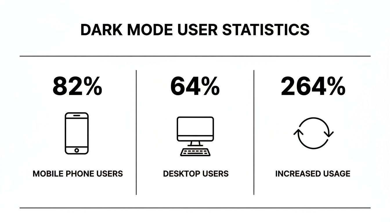
These numbers aren't trivial. They show that a huge majority of people on both mobile and desktop have already made dark mode their default choice. Ignoring this is no longer an option for businesses that want to stay competitive.
Dark Mode vs Light Mode User Experience
Here's a quick breakdown of how adding a dark mode option impacts both user experience and your business goals.
Feature | Light Mode (Only) | With Dark Mode Option |
|---|---|---|
Eye Strain | Can cause fatigue in low light | Reduces eye strain, improving comfort |
User Choice | Forces a single viewing experience | Empowers users to choose their preference |
Brand Perception | Can feel dated or incomplete | Appears modern, professional, and user-centric |
Engagement | May lead to shorter evening sessions | Encourages longer visits, boosting key metrics |
Accessibility | Limited to one contrast profile | Better serves users with light sensitivity |
Offering choice isn't just a feature; it's a signal that you respect your audience's preferences and needs, which builds stronger brand loyalty and supports your conversion funnel.
The real challenge isn’t whether to offer dark mode, but how to implement it perfectly without derailing your main business objectives.
This is precisely where a professional, pre-built solution offers a massive strategic advantage. Choosing a premium Framer template from FramerDevs means you can deliver a flawless, conversion-optimized dark mode experience from day one. Our templates have already solved these tough design and technical puzzles, saving you dozens of hours. Instead of wrestling with color variables and accessibility testing, you can focus on what really matters—growing your business.
Integrating dark mode reflects a much broader shift in user preferences. To see how this fits into the bigger picture, you can explore the latest key website design trends.
Crafting a Professional Dark Mode Color Palette
The biggest mistake I see designers make with dark mode is jumping straight to pure black and white. It seems logical, but it’s a rookie move that creates a harsh, high-contrast look that screams "amateur."
This intense combination actually strains the eyes, causing a “halation” effect where bright text seems to bleed into the dark background. It completely defeats the purpose of offering a comfortable viewing experience.
Professionals almost never use pure black (#000000) for backgrounds. Instead, the sweet spot is a dark gray or an off-black shade like #121212 or #1A1A1A. These tones are much softer on the eyes and prevent that fatiguing visual bleed, creating a more premium, high-quality feel.
Go Beyond Basic Black and White
A great dark mode isn't just about flipping a switch; it's about creating a sense of depth and hierarchy. You do this by establishing a range of surface tones—different levels of gray that signal elevation.
For instance, your main background might be a very dark gray. A modal window or a card could then use a slightly lighter gray to make it feel like it’s floating "above" the main page. It’s a subtle trick, but it makes the interface feel organized and intuitive.
This kind of color mapping takes careful planning. If you're starting from scratch, it can be a huge time-sink. We cover how to map out these early design choices in our guide on creating a Figma wireframe template.
The Science of Comfortable Accent Colors
Your brand’s accent colors also need a rethink for dark mode. That vibrant blue or green that looks perfect on a light background can suddenly become distractingly bright and overpowering.
This is where a technique called Adaptive Desaturation comes in. You create slightly muted or desaturated versions of your brand colors specifically for the dark theme. They’re still recognizable as your brand, but they don't scream for attention.
This isn’t just about aesthetics; it has a real impact on user behavior. Analysis from major fintech platforms found that dark mode interfaces using desaturated palettes saw a 22% increase in session duration during late-night hours. The data proves it: a well-designed palette reduces eye fatigue and keeps users engaged. You can dig into the science behind these findings on digital comfort here.
The takeaway is clear: a sophisticated dark mode palette isn’t just about making things dark. It’s about scientifically balancing contrast, saturation, and depth to create an experience that keeps users engaged and comfortable.
Getting this level of color engineering right is complex and takes a ton of testing. It requires a solid grasp of visual perception. This is precisely where a professional solution shows its value. Every FramerDevs template ships with a pre-perfected, conversion-optimized color system. We’ve already done the science and the meticulous setup, so you get a premium, business-ready dark mode right out of the box.
Implementing Your Theme with Framer Variables
Once your professional color palette is locked in, it's time to get technical. In Framer, this entire process revolves around a single, powerful feature: Variables. This is where you’ll translate your design decisions into a functional, switchable theme that actually works.
The real work starts with creating color variables for every single element on your site. And I don’t just mean one variable for "text" and another for "background." A professional setup demands granular control. You’ll need separate variables for primary text, secondary text, subtle borders, card backgrounds, hover states, button fills, and so much more. For a multi-page site, this can easily add up to dozens of individual variables.

Each of these variables needs two distinct values assigned to it: one for your light theme and one for the dark theme. This is where the meticulous, pixel-perfect work comes in. You have to manually map every single color from your palette to its corresponding variable for both modes. It’s a process that demands serious precision and patience.
Building the Logic Behind the Switch
With your variables finally established, you have to apply them. This means going through every component, every page, and every element of your website and connecting its color properties to the correct variable. Instead of setting a button’s background to a static hex code like #FFFFFF, you link it to your shiny new button-background variable.
This systematic connection is what allows the entire site to flip its theme in an instant. It's incredibly powerful, but it's also incredibly time-consuming. If you miss even a single element, you’ll break the seamless experience, leaving a jarring, light-colored component on an otherwise dark page.
The next piece of the puzzle is the theme toggle switch itself. This involves a few key steps:
Creating a Component: First, you’ll build a dedicated toggle switch component in Framer.
Adding Logic: Using Framer's built-in tools, you’ll add logic so that clicking the switch changes the active theme from light to dark and back again.
System Preference: For the best user experience, you also need to configure it to automatically detect and respect the user's operating system preference. A visitor with system-wide dark mode enabled should see your dark theme by default, no clicks required.
This multi-layered setup—defining, mapping, and building logic—is what separates a basic, thrown-together dark mode from a truly professional one.
The sheer volume of work involved in setting up a robust dark mode from scratch can take upwards of 20-40 hours for a standard business website. This includes creating all variables, testing every component, ensuring accessibility, and handling all media states.
This is the hidden cost of building a high-quality dark mode website from the ground up. It’s not just a design task; it's a significant development effort that pulls your focus away from other business-critical activities like marketing and sales.
This is precisely why a professional, pre-built solution offers such a compelling advantage. When you start with one of the premium, conversion-focused FramerDevs Framer templates, you get to sidestep this entire process. All the intricate variable mapping, component logic, and system preference detection are already built, tested, and optimized by our expert team. You get a perfect, business-ready dark mode from the moment you start, saving you dozens of hours of tedious work and letting you launch faster.
Meeting Accessibility and Contrast Standards
Let's be blunt: a dark mode with bad contrast is far worse than no dark mode at all. This is the single biggest mistake people make when building their own dark themes, and it turns a feature meant for comfort into a source of frustration.
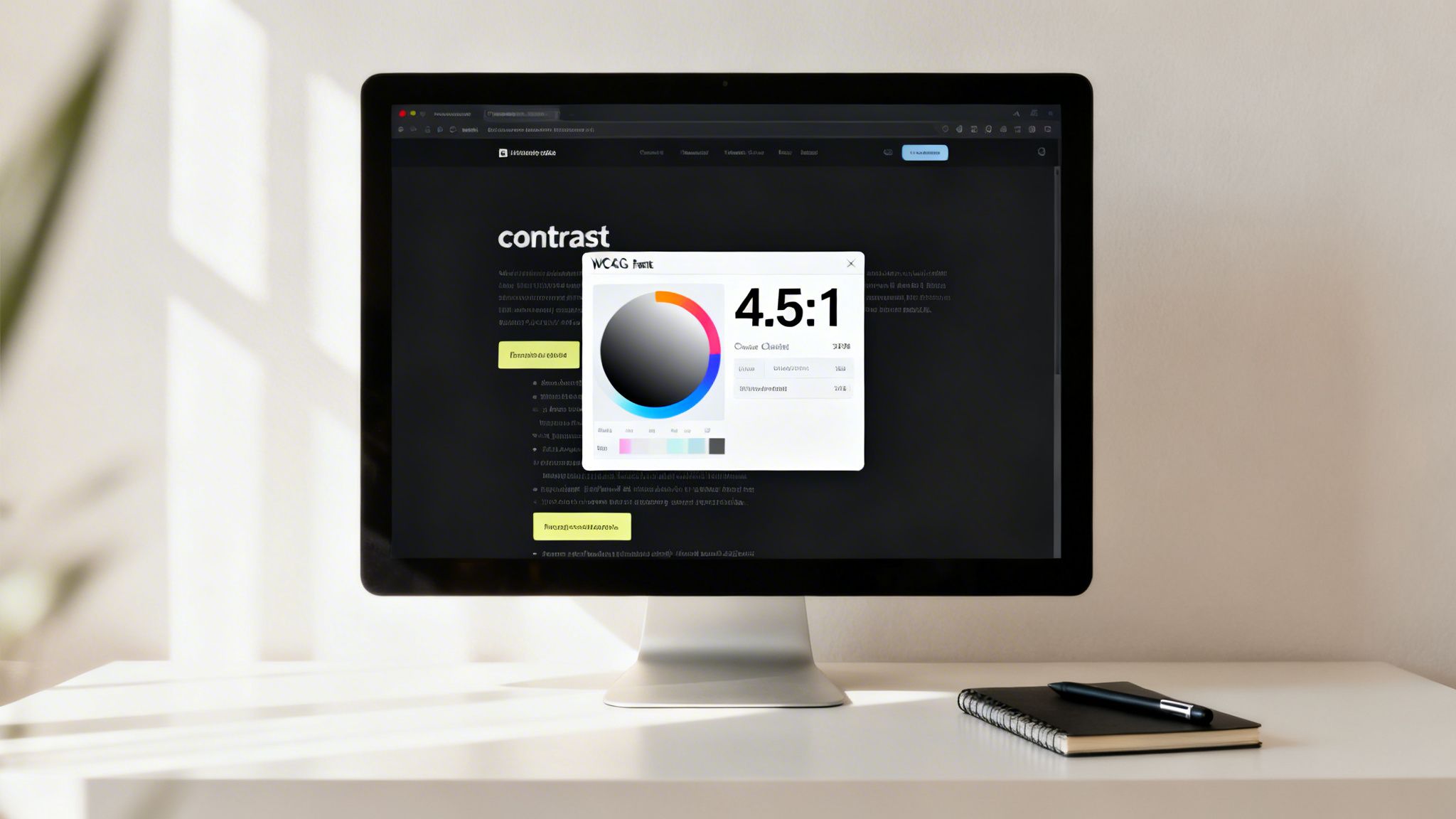
The official rulebook here is the Web Content Accessibility Guidelines (WCAG). In plain English, you need a minimum contrast ratio of 4.5:1 for normal text and 3:1 for large text, which is defined as 18.66px bold or 24px regular. This isn’t just a friendly suggestion; it’s a hard rule to ensure everyone, including people with visual impairments, can actually read your content.
Navigating Contrast and Readability
Getting contrast right in dark mode has its own unique set of traps. Just flipping your colors from light to dark is a recipe for disaster. For instance, putting pure white text on a pure black background creates a harsh "vibration" that tires the eyes out quickly.
Another common pitfall is using super bright or saturated accent colors. That vibrant brand color that looks fantastic on a white background can create a distracting "halation" effect on a dark one, making the color appear to bleed and making nearby text a struggle to read.
Achieving the perfect balance requires meticulously choosing font weights, sizes, and even opacities for every single element. It’s a demanding process that needs a deep understanding of visual accessibility and a ton of testing.
This is exactly where building from scratch can backfire. You have to check and re-check every single color combination to make sure it passes the test. To make sure your palette is up to snuff, you absolutely need to use a reliable WCAG Contrast Checker to validate your choices against the guidelines.
The Value of a Professionally Tested Solution
Making sure every button, link, and paragraph meets WCAG AA compliance across both light and dark themes is a massive time sink. It’s a tedious, detail-oriented job that involves:
Verifying every color pair: Checking all background and foreground colors for enough contrast.
Adjusting font weights: Making sure thin or light fonts don’t disappear on dark surfaces.
Testing all states: Confirming that hover, active, and disabled states are all still accessible.
This is precisely why a professional solution gives you such a huge head start. Every one of our FramerDevs templates is rigorously tested for WCAG AA compliance from day one. We’ve already put in the hours to balance color, contrast, and typography, guaranteeing an accessible and beautiful experience for every user. Instead of spending your time fixing accessibility bugs, you can launch with confidence, knowing your dark mode is built on a solid foundation of quality and inclusion.
Handling Images and Media for a Seamless Theme
You can spend hours perfecting a beautiful dark mode palette, only to have the whole experience ruined by one glaring element: a bright white logo that burns into your users' retinas. Getting the media right is one of those details that separates a truly professional site from an amateur attempt.
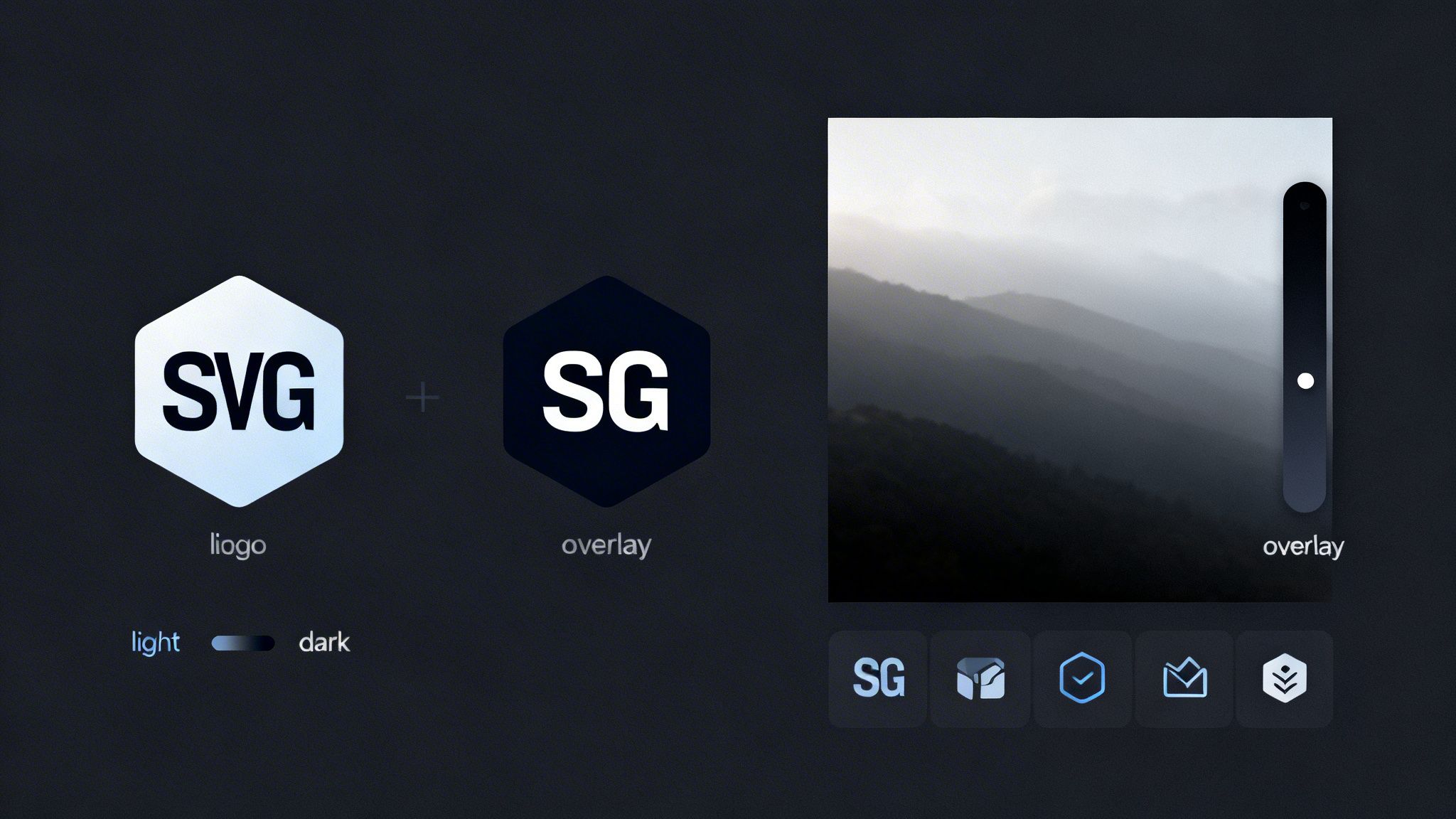
Don’t let jarring images or logos break the immersion. For logos, the smartest approach is often using Scalable Vector Graphics (SVGs). When you set an SVG's fill to currentColor, it automatically inherits the theme’s text color. This means your logo will seamlessly flip from dark to light right along with the rest of your UI. Simple.
Another option is to create two distinct versions of your logo—one specifically for the light theme and one for the dark. This is a bit more work, but it gives you maximum control over how your brand is presented. The key is to build this logic directly into your site’s core components so the switch happens automatically.
Subtly Adapting Photos and Icons
Photographs are another common blind spot. An image that looked perfectly balanced on a white background can feel overwhelmingly bright and out of place in a dark theme. But don't worry, the solution isn't to start editing every single photo.
A much more efficient technique is to apply a semi-transparent dark overlay to your images only when dark mode is active. In a tool like Framer, this can be done with a single style setting. A subtle 10-20% black overlay is usually all it takes to tone down the image just enough to feel harmonious with the interface.
Treat your icons with the same care you give your logo. Whenever possible, use SVGs that can inherit colors from your theme variables. This ensures every icon, from a simple arrow to a complex illustration, adapts perfectly. This level of detail is what makes a site feel truly polished.
This meticulous attention to media handling is what truly defines a high-end website. It’s a hallmark of FramerDevs templates, where these considerations are baked directly into the design system, saving you countless hours of manual adjustments.
By 2026, designing for dark mode has become as essential as mobile-first design was years ago. It signals a complete shift in web philosophy. The evidence is clear: 64.6% of users now expect websites to switch to dark mode automatically based on their system settings. They see it not as a bonus feature, but as a core part of an intelligent user experience. You can find more on the future of user experience in these 2026 web design trend insights.
For designers and businesses, meeting this expectation is a huge opportunity. But let’s be honest—building this level of polish from scratch is a massive time investment. A premium template gives you an incredible head start, delivering a conversion-optimized and seamless dark mode instantly, so you can focus on what really matters: growing your business.
Frequently Asked Questions About Dark Mode Websites
As you've seen, building a professional dark mode is about more than just flipping a color switch. So, let's tackle some of the common questions designers and business owners have when they're ready to add this feature.
These answers should clear up the practical side of things and reinforce why starting with a quality foundation is so important for your business.
Is Dark Mode Better for Every Website?
While dark mode is a huge win for most sites, especially content-heavy ones, it’s not always the right move. For example, if your site relies on data-heavy dashboards or has a very colorful, playful brand identity, a dark theme might actually compromise the design's core purpose.
The real goal isn't to force one mode over another; it’s about giving people a choice. Offering both light and dark themes is a sign of a great user experience, letting visitors decide what’s most comfortable for their eyes. That kind of flexibility is a hallmark of modern, user-focused design—and a standard feature in high-quality templates.
How Much Time Does Building a Dark Mode from Scratch Actually Take?
Let's be realistic: building a robust, accessible dark mode for a multi-page website is a serious time commitment. For an average project, you should expect to spend anywhere from 20-40+ hours.
That time estimate includes everything:
Setting up every color variable for both themes.
Applying those variables to every single component.
Testing all color combos for WCAG accessibility.
Handling all the different states for logos, images, and icons.
Building, styling, and testing the theme toggle switch itself.
This hidden time cost is exactly why starting with a professional FramerDevs template gives you such a massive head start. Our templates have a fully-realized dark mode built right in, saving you days or even weeks of tedious work so you can launch faster and focus on growing your business.
Can Dark Mode Actually Improve Website Conversions?
Yes, but the impact is usually indirect. A well-executed dark mode makes your site more comfortable to use by reducing eye strain. That comfort often leads to longer session durations and higher engagement—people simply stick around longer when they feel good using your site.
This improved experience helps build trust and creates a stronger perception of your brand's quality and professionalism. While dark mode isn't a magic button that instantly boosts sales, it's a key part of creating the positive user journey that comes before a conversion. To make sure you've covered all your bases for a successful launch, always run through a complete website launch checklist.
Ultimately, a polished dark mode signals that you care about quality. It shows you’ve invested in the user's experience, and that's what fosters the brand loyalty that drives real business growth.
Ready to skip the complexity and launch a stunning website with a flawless, conversion-optimized dark mode already built in? Explore the premium templates from FramerDevs and see how quickly you can bring your vision to life. Visit us at https://framerdevs.com.


