8 Essential Small Business Website design tips for 2026

For a small business, a website isn't just an online brochure; it's a 24/7 sales engine, your hardest-working employee. But if it's slow, confusing, or untrustworthy, it’s actively costing you customers and revenue. Many owners invest significant time building a site from scratch, only to discover it fails to convert visitors into leads. The problem isn't a lack of effort but a lack of a strategic design framework that prioritizes business goals.
This is where professional templates, especially those built on powerful no-code platforms like Framer, offer a game-changing advantage. Instead of starting with a blank canvas and guessing what works, you begin with a battle-tested foundation optimized for speed, quality, and conversions. As experts in premium Framer templates, we at FramerDevs see this as the fastest path to a professional result, letting you focus on your business, not on endless design tweaks that may not move the needle.
To truly address why your website might be underperforming and losing money, it's essential to understand the principles behind building a high-performance conversion optimization website. A well-designed site directs user attention, builds trust, and makes it easy for visitors to take action.
This guide provides critical small business website design tips with a focus on implementing them efficiently to see real business results. We'll explore actionable strategies that separate high-performing sites from the rest, showing you how to turn your website into a powerful asset for growth. These tips are designed to be practical, whether you're using a premium Framer template or refining an existing site. Let's dive in.
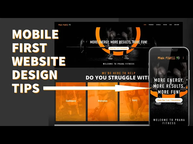
1. Implement Mobile-First Responsive Design
Ignoring mobile users is no longer an option. With over 60% of all web traffic originating from mobile devices, a mobile-first approach is not just a trend; it's a fundamental requirement for business success. This methodology reverses the traditional design process. Instead of designing for a large desktop screen and then trying to shrink it down, you start with the smallest screen first and progressively enhance the design for larger devices like tablets and desktops.
This strategy forces you to prioritize what truly matters. On a small screen, you have limited space, which compels you to focus on core content, clear calls-to-action, and an uncluttered user journey. The result is a more focused, efficient, and user-friendly experience for the majority of your visitors. As Google now prioritizes mobile-first indexing, this approach directly benefits your SEO, helping you rank higher in search results.
How to Implement Mobile-First Design
Building a responsive site from scratch can be complex and time-consuming. For small businesses needing to launch quickly without sacrificing quality, using a professionally designed template is the most efficient path. At FramerDevs, our premium Framer templates are built with a strict mobile-first philosophy, ensuring your site is perfectly optimized for every device right out of the box. This saves you hundreds of hours of design and development time, delivering a superior business result faster.
For those building or customizing, here are some actionable small business website design tips for a mobile-first approach:
Prioritize Above-the-Fold Content: The first screen a mobile user sees must immediately communicate your value proposition and guide them to the next step. Keep it concise and compelling.
Design for Touch: Use large, easily tappable buttons and interactive elements. A minimum touch target size of 44x44 pixels is recommended to prevent user frustration.
Simplify Navigation: A "hamburger" menu is the standard for a reason. It keeps navigation organized and accessible without cluttering the screen.
Test on Real Devices: Browser emulators are useful, but nothing beats testing on actual smartphones and tablets. This helps you spot performance issues and interaction quirks you might otherwise miss.
Key Insight: A mobile-first strategy doesn't just make your site look good on phones; it forces clarity and focus into your entire design, improving the user experience across all devices.
For a deeper dive into the principles of responsive design, the video below from its originator, Ethan Marcotte, provides excellent context on its importance and foundational concepts.
2. Optimize Website Speed and Core Web Vitals
Website speed is a critical factor that directly influences user experience, search engine rankings, and ultimately, your bottom line. Slow-loading pages frustrate visitors and lead to high bounce rates. To formalize the importance of performance, Google introduced Core Web Vitals: Largest Contentful Paint (LCP), First Input Delay (FID), and Cumulative Layout Shift (CLS). These metrics measure the real-world experience a user has on your page, and optimizing for them is a non-negotiable part of modern small business website design.
Focusing on speed delivers tangible business results. A fast website feels professional and reliable, building trust with your audience from the very first interaction. Conversely, a slow site can make your business appear amateurish, regardless of the quality of your products or services. A high-performance site is an investment in your brand's credibility and a direct driver of conversions.
How to Implement Speed Optimization
Achieving elite performance requires a deep understanding of web technologies, from asset compression to code delivery. This is a complex task for a small business to undertake from scratch. The most direct route to a high-performance site is starting with a foundation built for speed. At FramerDevs, our premium Framer templates are expertly engineered to score 90+ on Google PageSpeed Insights from the start, with built-in lazy loading, optimized assets, and global CDN delivery. This provides an immediate competitive advantage.
For those managing their own site, here are some actionable tips for improving speed and Core Web Vitals:
Compress All Images: Before uploading any images, run them through a compression tool like TinyPNG or ImageOptim. This drastically reduces file size without a noticeable loss in quality, speeding up page load times.
Limit Font Usage: Web fonts can be a major performance bottleneck. Stick to one or two font families and avoid using too many different weights (e.g., bold, italic, light). Using system fonts is the fastest option.
Defer Non-Critical Scripts: Use your website builder's settings to defer or delay the loading of JavaScript that isn't essential for the initial page view. This allows the core content to load first.
Regularly Audit Performance: Use free tools like Google PageSpeed Insights and GTmetrix to regularly test your key pages. These reports will pinpoint specific bottlenecks you can address.
Implement Lazy Loading: Ensure that images and videos located "below the fold" (outside the initial viewport) are set to lazy load. This prevents the browser from downloading all media at once, speeding up the initial render.
Key Insight: Website speed is not just a technical metric; it is a direct reflection of your brand's respect for a user's time. A faster site leads to better engagement, higher conversions, and improved search rankings.
3. Create Clear and Compelling Call-to-Action (CTA) Buttons
A call-to-action (CTA) is the most critical element for guiding visitors toward your business goals. It’s the bridge between a user browsing your content and them becoming a customer, whether that means making a purchase, signing up for a newsletter, or scheduling a consultation. Without clear, compelling CTAs, even the most beautiful website is just a digital brochure with no direction. Optimizing your CTAs is a high-impact strategy that directly influences user behavior and business outcomes.

The psychology behind a successful CTA involves a careful mix of design, copy, and placement. Companies that master this see significant gains. These buttons are a cornerstone of effective small business website design tips because small changes can dramatically improve conversion rates, turning passive visitors into active leads and customers.
How to Implement Effective CTAs
Creating a CTA that converts involves more than picking a bright color. It requires strategic thinking about user motivation and visual hierarchy. For small businesses looking to implement best practices without extensive A/B testing, starting with a professionally developed template is a smart move. As an expert provider, FramerDevs ensures our templates are built with conversion-optimized CTAs, incorporating proven principles of design and copywriting to ensure you're set up for success from day one.
For those customizing or building their own site, here are some actionable tips for creating powerful CTAs:
Use Action-Oriented Verbs: Replace passive words like 'Submit' or 'Click Here' with compelling commands that promise value. Try 'Get Your Free Quote,' 'Claim My Discount,' or 'Start My Trial.'
Create Visual Contrast: Your primary CTA button must stand out from the background and other page elements. Aim for a color contrast ratio of at least 4.5:1 to ensure it's both noticeable and accessible.
Make Secondary CTAs Less Prominent: If you have more than one CTA, guide the user toward the most important one. Use a less vibrant color, an outline style, or a simple text link for the secondary action (e.g., 'Learn More').
Size for Touch: On mobile, buttons need to be easy to tap. A minimum size of 44x44 pixels prevents frustration and accidental clicks, improving the user experience. You can find more details about this in our guide on landing page best practices.
Strategic Placement: Place CTAs where user motivation is highest. This is often after you’ve presented your value proposition, showcased social proof, or answered a key question.
Key Insight: Your CTA isn't just a button; it's the climax of your sales pitch. The copy should resolve the user's need, and the design should make taking the next step feel effortless and obvious.
4. Establish Trust Through Social Proof and Testimonials
When potential customers visit your site, their default setting is skepticism. Social proof, a concept popularized by psychologist Robert Cialdini, is the most effective tool to overcome this. It works by showing that other people, just like them, have trusted your business and had a positive experience. With research showing that a vast majority of consumers trust peer recommendations over advertising, integrating authentic testimonials, case studies, and reviews is a critical step in building credibility and reducing buyer hesitation.

For a small business, social proof acts as a digital word-of-mouth referral. Seeing logos of companies you've worked with, reading specific praise from past clients, or seeing user counts gives new visitors the confidence to take the next step. This is one of the most powerful small business website design tips for converting browsers into buyers, as it provides the third-party validation needed to close the trust gap.
How to Implement Social Proof
Manually collecting, designing, and updating testimonials can be time-consuming. To implement this effectively and professionally from day one, using a purpose-built template is a smart shortcut. Our premium Framer templates include beautifully designed and strategically placed sections for testimonials, client logos, and case studies. These pre-built components ensure your social proof is not just present but presented in a way that maximizes its impact, saving you critical design time and delivering a high-quality result instantly.
For those adding social proof to an existing site, here are some actionable tips:
Ask Specific Questions: Instead of asking, "What do you think?", prompt customers with, "What was the single biggest problem our product solved for you?" This gets you specific, powerful quotes.
Show Real People: Always include a name, title, company, and a high-quality photo with testimonials. This adds a layer of authenticity that generic praise lacks. Video testimonials are even more compelling if you can get them.
Feature Quantifiable Results: A testimonial that says, "We increased our conversion rate by 40%," is far more persuasive than one that just says, "It was great."
Place It Strategically: Don't hide your social proof. Position testimonials near relevant calls-to-action, on your pricing page, or directly below a key feature claim to reinforce your message at the moment of decision.
Integrate Third-Party Reviews: Embed widgets from trusted platforms like Google Reviews, Trustpilot, or G2. These unbiased, third-party ratings can feel more credible to new visitors.
Key Insight: Effective social proof is specific and visual. It moves a customer from thinking, "This business says it's good," to, "People like me are succeeding with this business."
5. Design Intuitive Navigation and Information Architecture
You have an average of 15 seconds to convince a visitor to stay on your site. If they can't quickly find what they're looking for, they'll leave. This is where intuitive navigation and solid information architecture (IA) become critical. IA is the practice of organizing and structuring content in a way that is logical and predictable, while navigation is the system of menus and links that allows users to move through that structure. Poorly organized content leads to user frustration and high bounce rates, directly impacting your business goals.
For a small business, a clear hierarchy is non-negotiable. Visitors should be able to understand your offerings and find answers to their questions without having to think. This involves grouping related information logically and using navigation patterns that are familiar to users. A website with a well-designed information architecture feels effortless to use, building trust and guiding visitors smoothly toward a purchase, a contact form, or a signup. This is a foundational element of all effective small business website design tips.
How to Implement Intuitive Navigation
Structuring a site's content from the ground up requires careful planning and user research. To accelerate this process and guarantee a professional outcome, many businesses opt for templates that already incorporate proven navigation patterns. The premium Framer templates from FramerDevs, for instance, are built with pre-validated information architectures for specific business types like SaaS and agencies, saving you from the guesswork and ensuring a high-quality user journey from the start.
If you're building a new site or refining an existing one, consider these actionable steps:
Limit Main Navigation Items: Keep your primary menu clean and focused, with 5 to 7 essential items. Any more than that can overwhelm users on both desktop and mobile.
Use Descriptive Labels: Avoid jargon or vague terms. Instead of "Solutions," use "What We Do." Instead of "Portfolio," try "Client Results." Clarity always wins over cleverness.
Conduct Card Sorting: A simple card sorting exercise with potential users can reveal how they naturally group your content, providing invaluable insight for structuring your site. You can start this process early by mapping it out in a Figma wireframe template.
Make the Logo a Home Button: This is a universal web convention. Users expect to be able to return to the homepage by clicking your logo in the top-left corner. Don't break this expectation.
Test Mobile Navigation Rigorously: A common failure point is a poorly implemented mobile menu. Ensure it's easy to open, read, and use on a small screen with a thumb.
Key Insight: Good navigation isn't about showing users everything at once; it's about showing them exactly what they need at each step of their journey, making the path to conversion feel natural and easy.
6. Implement Strong Visual Hierarchy and Whitespace
Visual hierarchy is the art of arranging elements to guide a visitor's eye through your content in order of importance. When combined with ample whitespace (or negative space), it creates an elegant, uncluttered, and professional design that communicates with absolute clarity. This principle is often what separates an amateur-looking site from a polished, high-end one. Small businesses that master this see significant improvements in user comprehension and, ultimately, conversions.
A strong hierarchy tells your user what to look at first, second, and third, reducing their cognitive load and making information easy to process. Instead of being overwhelmed by a wall of text and images, they are led on a deliberate journey through your key messages. This professional presentation builds immediate trust and reinforces the perceived value of your offerings.
How to Implement Strong Hierarchy and Whitespace
Achieving a balanced and effective visual hierarchy from scratch requires a trained eye and careful planning. This is a difficult skill to master quickly, which is why professionally designed templates offer a major advantage. Our premium Framer templates at FramerDevs are built by experts who have already solved these complex design problems. They incorporate proven hierarchy and spacing rules, giving your business a polished, credible look instantly without the cost of a custom design agency.
If you're customizing a design or starting from a blank canvas, here are some actionable small business website design tips for establishing a strong visual order:
Establish a Clear Typographic Scale: Make your primary headings (H1) 2-3 times larger than your body copy. For example, if your paragraph text is 16px, your heading should be 32-48px. This creates an immediate point of focus. Choosing the right typeface is equally important; you can explore our guide to the best free fonts for websites to find options that support a strong hierarchy.
Use Whitespace Strategically: Group related elements together (proximity) and use generous spacing to separate unrelated sections. This helps users mentally organize information. A good starting point is to use spacing values related to your base font size.
Limit Your Color Palette: Stick to the 60-30-10 rule. Use 60% for a dominant primary color, 30% for a secondary color, and 10% for an accent color to highlight key actions like buttons. This prevents visual chaos.
Prioritize Left Alignment: For blocks of text, left-aligned copy is far easier for Western audiences to read and scan than centered text, which should be reserved for short headlines.
Key Insight: Whitespace is not empty space; it's an active design element. Using it effectively makes your content more legible, focuses user attention, and makes your entire website feel more valuable and trustworthy.
7. Optimize for Search Engines (SEO Fundamentals)
Having a beautiful website is pointless if no one can find it. Search Engine Optimization (SEO) is the practice of refining your site so it appears higher in search engine results for relevant queries. With nearly 93% of all web traffic originating from search engines like Google, mastering SEO fundamentals is not just a marketing tactic; it’s a direct line to your future customers. For small businesses, organic search is a powerful, cost-effective channel for sustainable growth.
This process involves signaling to search engines what your content is about through specific on-page elements. These include meta tags, a logical heading structure, thoughtful keyword placement, and internal linking. Modern no-code platforms make these technical aspects far more accessible, but starting with an SEO-ready foundation is crucial for long-term success.
How to Implement SEO Fundamentals
Getting the technical SEO foundation right from the start is critical. Building a site with clean code, proper heading hierarchy, and fast performance is a complex task. This is where a professional template becomes a massive asset. At FramerDevs, our premium Framer templates are engineered with SEO best practices at their core. We handle the technical structure, like automatic sitemaps and semantic HTML, so you can focus on creating great content that ranks, giving your business a powerful head start.
For those implementing or fine-tuning their strategy, here are some actionable small business website design tips for on-page SEO:
Conduct Keyword Research: Use tools like Google Keyword Planner or Ahrefs to identify the primary and long-tail keywords your audience is searching for.
Optimize Your Meta Tags: Place your primary keyword near the beginning of your meta title. Write a compelling meta description that includes secondary keywords and encourages clicks from the search results page.
Structure Content with Headings: Use one unique H1 tag per page that contains your primary keyword. Use H2 and H3 subheadings to break up content and naturally include secondary keywords.
Add Descriptive Alt Text: Write descriptive alt text for all images. This not only helps search engines understand the image content but is also essential for web accessibility.
Build Internal Links: Link between relevant pages on your site using descriptive anchor text (e.g., link to your "pricing page" with that exact text, not "click here").
Key Insight: Effective SEO isn't about gaming the system; it's about making your content more organized, accessible, and valuable for both search engines and human visitors.
8. Streamline Conversion Path and Reduce Friction
The conversion path is the journey a user takes from their first interaction on your site to completing a specific goal, like making a purchase or signing up for a newsletter. Every extra step, confusing instruction, or unnecessary form field introduces friction. Reducing this friction is one of the most direct ways to improve your website's performance, as it directly impacts your revenue and lead generation.
Think of it like a physical retail store. If a customer has to fill out a long form, wait in a confusing line, and can't find the checkout counter, they are likely to abandon their cart. Your website is no different. By removing obstacles, you make it easy for motivated visitors to become loyal customers, maximizing the return on your marketing efforts.
How to Reduce Conversion Friction
Mapping and optimizing your user journey is a core part of conversion rate optimization (CRO). For small businesses that need a high-performing site without months of testing, starting with a foundation built for conversions is key. At FramerDevs, our templates are expertly designed with simplified, intuitive conversion paths that guide users naturally toward your most important business goals. This approach saves you time and ensures you launch with a funnel that works.
Once you have a solid starting point, or if you're refining an existing site, consider these small business website design tips for a smoother user experience:
Map the User Journey: Visually outline every step a user must take from a landing page to your confirmation page. Identify 3-5 potential friction points, such as an unclear value proposition, trust concerns, or too many choices.
Minimize Form Fields: Reduce forms to the absolute essentials, ideally 3-5 fields. Each additional field can decrease completion rates. You can always gather more information later through progressive profiling after the initial conversion.
Remove Checkout Navigation: Once a user enters the checkout or signup process, remove the main website navigation. This creates a focused environment and eliminates easy exit routes, keeping the user on task.
Offer Guest Checkout: Forcing account creation is a major point of friction for e-commerce sites. Allowing a guest checkout option respects the user's time and can significantly reduce cart abandonment.
Build Trust at the Point of Conversion: Display security badges (SSL, payment processors), privacy policy links, and money-back guarantees directly on your checkout or signup pages to reassure hesitant users.
Analyze User Behavior: Use tools like Hotjar or Microsoft Clarity to watch session recordings and analyze heatmaps. This will show you exactly where users are getting stuck or dropping off in the process.
Key Insight: A frictionless conversion path is not about tricking users; it's about respecting their time and attention by creating the clearest, most direct route to the value you offer.
Once visitors engage and become leads, ensure your backend processes are as smooth as your frontend. Implementing effective lead management software can help you track, nurture, and convert inquiries into customers.
8-Point Small Business Website Design Comparison
🔄 Implementation Complexity | ⚡ Resource Requirements | 📊 Expected Outcomes | 💡 Ideal Use Cases | ⭐ Key Advantages |
|---|---|---|---|---|
Implement Mobile-First Responsive Design — Moderate: planning and multi-breakpoint testing; template sites ~1–2 weeks | Designer/dev time, device testing, image & performance tools | Better mobile engagement, lower bounce, improved SEO and mobile conversions | Mobile-first audiences, small business sites, multi-device users | Single responsive codebase, consistent UX, future-proof |
Optimize Website Speed and Core Web Vitals — Moderate: technical tuning and ongoing monitoring | Performance tools, CDN, dev time, image compression, analytics | Higher rankings, reduced bounce, conversion uplift (~30–40%) | E-commerce, high-traffic sites, content-heavy pages | Faster UX, SEO advantage, lower bandwidth costs |
Create Clear and Compelling CTA Buttons — Low: design + copy changes and A/B tests | Designer, copywriter, A/B testing tooling | Significant conversion uplift (45–90%) when optimized | Landing pages, product pages, signup flows | High impact with low effort; easy to test and iterate |
Establish Trust Through Social Proof and Testimonials — Low–Moderate: collect, verify, and surface content | Customer outreach, content editing, review integrations | Increased credibility and conversions (up to ~34%); reduced buyer anxiety | New or growing brands, conversion pages, service providers | Builds authenticity, cost-effective social marketing |
Design Intuitive Navigation and Information Architecture — Moderate: UX research and validation required | UX research (card sorting), analytics, design resources | Reduced bounce, higher time-on-site, better findability (bounce down 8–15%) | Sites with many pages, e‑commerce, SaaS platforms | Improves discoverability and SEO; lowers support needs |
Implement Strong Visual Hierarchy and Whitespace — Moderate: disciplined design and testing | Skilled designer, typography and layout work, design system | Better comprehension and conversions (~35%); improved brand perception | Branding-focused sites, premium product pages, landing pages | Enhances scannability and perceived quality |
Optimize for Search Engines (SEO Fundamentals) — Moderate–High: ongoing content + technical work; effects in 3–6 months | Content creation, SEO tools (Ahrefs/SEMrush), analytics, schema | Sustainable organic traffic growth (100–300% claimed over months) | Businesses seeking long-term traffic and leads | Cost-effective long-term acquisition and authority |
Streamline Conversion Path and Reduce Friction — Moderate: analytics-driven UX changes and testing | Analytics tools, UX/dev time, A/B testing, form/checkout changes | Direct revenue impact; conversion improvements of 25–50% | Checkout flows, signups, lead-gen funnels, mobile checkout | Fewer steps → higher completion rates; reduces abandonment |
From Tips to Transformation: Launch a Website That Works
We've explored a detailed roadmap covering the essential small business website design tips, moving from foundational principles to specific, actionable strategies. The journey from a basic online brochure to a powerful business asset is built on a series of deliberate choices. Each tip, whether it's optimizing for Core Web Vitals, crafting intuitive navigation, or building trust with social proof, contributes to a single, overarching goal: creating a seamless and effective user experience.
The common thread connecting these strategies is a relentless focus on the visitor. A fast-loading, mobile-first design respects their time. Clear calls-to-action and a streamlined conversion path respect their attention. A logical site structure and strong visual hierarchy respect their cognitive energy. When you prioritize the user, the business results, from higher search rankings to increased conversions, naturally follow.
The Path from Theory to a High-Performing Reality
Mastering all these elements from scratch is a significant undertaking. It requires a deep understanding of user psychology, technical SEO, conversion rate optimization, and modern design principles. For a small business owner, the time and resources required can be a major barrier, pulling focus away from core business operations. This is the classic "build vs. buy" dilemma, and for web design, the answer is often found in a strategic shortcut.
This is precisely where professional, pre-built templates offer a decisive advantage. Instead of starting with a blank canvas and facing countless potential pitfalls, you begin with a foundation engineered for success. At FramerDevs, we provide premium Framer templates that are not generic themes, but complete systems designed by experts who have already solved the complex challenges we've discussed.
Key Insight: Starting with a professionally designed template isn't about cutting corners; it's about getting a head start. It allows you to bypass the steep learning curve and launch a site that incorporates industry best practices from day one.
Consider the immense business value packed into a premium template:
Performance by Default: The technical work of optimizing for speed and Core Web Vitals is already done. Your site is built on a lightweight, efficient framework for instant business credibility.
Conversion-Focused Layouts: The visual hierarchy, CTA placements, and user flows are designed based on proven conversion principles, guiding visitors toward action and maximizing your revenue potential.
Built-in Responsive Design: Flawless display across all devices is a core feature, not an afterthought, ensuring you capture valuable mobile traffic effectively.
Professional Aesthetics: You gain access to top-tier design without the expense of a custom agency project, establishing immediate credibility and trust with your audience.
By adopting a professional template, you transform your role from a technical builder into a strategic editor. Your time is spent refining your messaging, adding compelling content, and customizing the brand experience—not wrestling with layout bugs or performance issues. This approach drastically reduces time-to-market, allowing you to launch a polished, high-performing website in days, not months. Implementing these small business website design tips becomes a matter of smart selection and customization, rather than ground-up construction. Your website stops being a hurdle and starts being the growth engine it was meant to be.
Ready to skip the learning curve and launch a website that just works? The premium Framer templates from FramerDevs are built with every one of these tips in mind, giving you a world-class foundation for your business. Explore our collection at FramerDevs and see how quickly you can turn these expert insights into your new reality.


