The 12 Best Free Fonts for Websites in 2026

Typography is the foundation of web design, influencing readability, brand perception, and ultimately, conversions. The right font choice can elevate a user's experience, while the wrong one can create friction and undermine an otherwise beautiful layout. This is why a curated list of the best free fonts for websites is a critical asset for any designer or founder.
This guide moves beyond generic suggestions to provide a deep analysis of 12 top-tier free fonts. We'll explore each option's strengths, weaknesses, and ideal use cases, from crisp UI text to bold, attention-grabbing headlines. You will find practical implementation tips for Framer and Webflow, including quick copy-paste code snippets, to get you started immediately. For those looking to expand their typographic toolkit even further, this supplementary guide on the 15 Best Fonts for Websites offers additional high-quality recommendations.
However, selecting a font is just one piece of a complex puzzle. Building a truly high-performing, conversion-focused website from scratch demands significant expertise in UI/UX, responsive layout, and performance engineering. It’s a time-consuming and challenging process that can slow down your business growth.
At FramerDevs, we believe that while the right font is a great start, a professional Framer template provides a complete, conversion-optimized foundation. Instead of spending weeks on design and development, our premium templates allow you to launch a polished, high-quality site in a fraction of the time, allowing you to focus on what matters most: growing your business. Let's explore the fonts that can power these professional results.
1. Inter
Inter is a meticulously crafted sans-serif font family designed by Rasmus Andersson specifically for user interfaces. Its primary goal is exceptional legibility on computer screens, making it a standout choice and one of the best free fonts for websites focused on clarity, such as SaaS applications, dashboards, and content-heavy blogs. The font is engineered with a tall x-height to make mixed-case and lower-case text easy to read at small sizes.
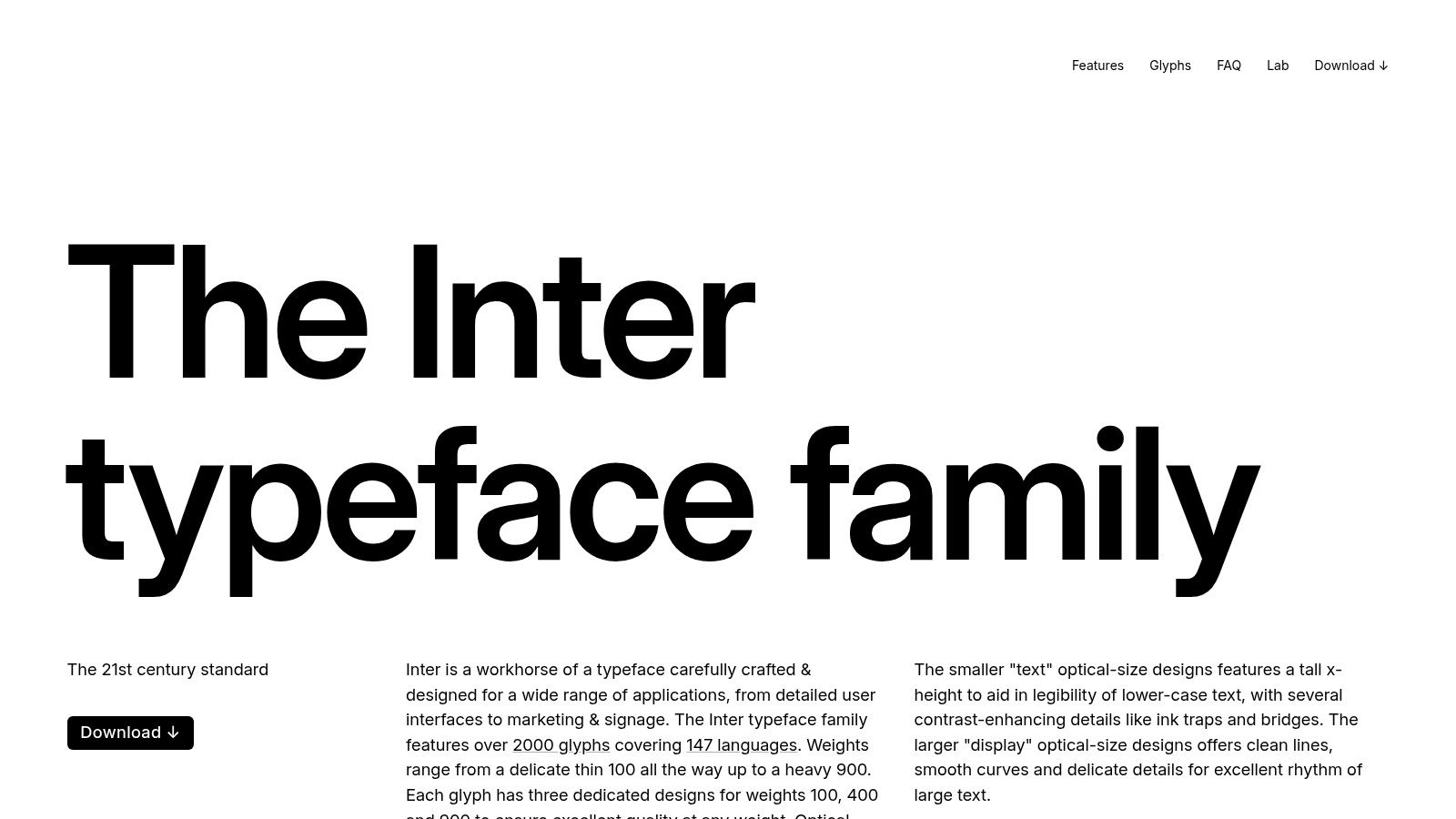
This typeface is a dependable workhorse, offering a mature variable font format that allows for fine-tuned weight and style adjustments without loading multiple files. This makes it a performance-friendly option for modern web development. Its clean, neutral aesthetic ensures it won't distract from your content, a critical factor when designing layouts from scratch.
Key Benefit: Inter’s optical sizing feature automatically adjusts the letterforms for optimal clarity at any given size, a detail that sets it apart for UI design.
Why It's a Top Pick
Inter's strength lies in its balance of neutrality and personality. It feels professional and modern without being cold or generic. While you can build a site from the ground up using a solid font like Inter, our experience at FramerDevs shows that starting with a professional template saves significant time. For instance, using a premium Framer Figma wireframe template ensures your project begins with a conversion-optimized and structurally sound foundation, allowing you to launch faster and achieve business goals more efficiently.
Primary Use Case: UI/UX design, body text, data-heavy interfaces.
Font Pairing: Pairs well with display serifs like Playfair Display or geometric sans like Poppins for headings.
License: SIL Open Font License (fully free for commercial use).
Website: rsms.me/inter/
2. Geist (Sans + Mono + Pixel)
Geist is a modern, open-source font family created by Vercel specifically for designers and developers. Its neutral, clean sans-serif is crafted for clarity in product websites, documentation, and UIs, making it an excellent free font for websites aiming for a technical yet approachable feel. The family also includes Geist Mono for impeccable code readability and a unique Geist Pixel variant for a retro-touch.
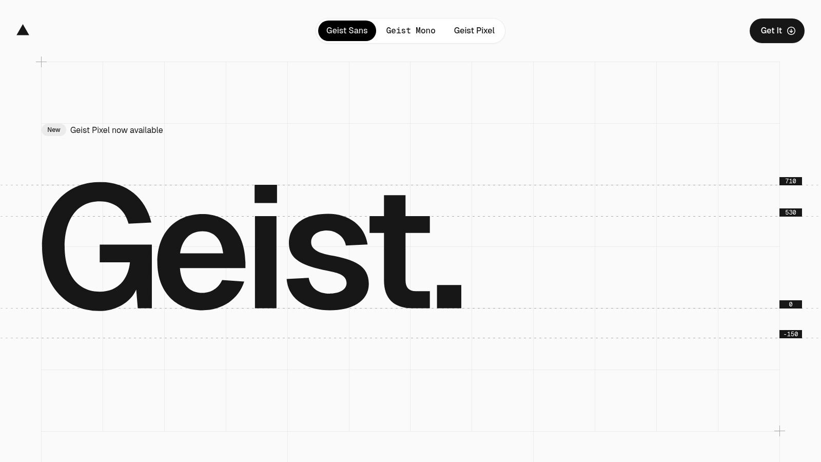
Designed with modern development workflows in mind, Geist is available as an NPM package, offering first-class support for Next.js projects. This direct integration simplifies font loading and optimization, a significant advantage for performance-focused teams. Its geometric precision and understated personality ensure your content remains the primary focus.
Key Benefit: The inclusion of Sans, Mono, and Pixel variants in one cohesive family provides exceptional brand consistency across a product website, its documentation, and even code examples.
Why It's a Top Pick
Geist’s main advantage is its developer-centric design and distribution. While Geist provides a strong typographic foundation, getting a project launched quickly often requires more than just a good font. Building on a conversion-focused base like a professional Framer portfolio template from FramerDevs can accelerate your timeline. Our templates are engineered for speed and quality, letting you apply great typography to a structure already optimized for business results.
Primary Use Case: Product websites, developer tools, documentation, code displays.
Font Pairing: Pairs well with a characterful serif like Lora for long-form articles or a slab serif like Zilla Slab for impactful headings.
License: SIL Open Font License (fully free for commercial use).
Website: vercel.com/font
3. Source Sans 3
Source Sans 3 is Adobe's open-source sans-serif typeface, engineered as the successor to the widely adopted Source Sans Pro. It was created with user interfaces and on-screen reading in mind, offering balanced letterforms and excellent clarity. This makes it a fantastic and reliable option among the best free fonts for websites, especially for applications, technical documentation, and product marketing pages where readability is paramount.
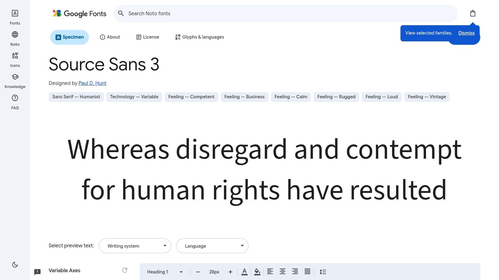
As a time-tested workhorse, Source Sans 3 is available as both a variable font for performance gains and a set of static fonts with an extensive range of weights. Its neutral yet professional voice works across countless industries without feeling overly opinionated. The font is well-hinted, ensuring it renders sharply and consistently on various devices and screen resolutions, a critical detail for professional-grade digital products.
Key Benefit: Its established ecosystem, including companion Source Serif and Source Code fonts, allows you to build a complete, harmonious typographic system with ease.
Why It's a Top Pick
Source Sans 3 shines due to its dependability and familiarity. While its character is more conservative, its strength lies in its versatility. Building a site with a solid font is a great start, but to accelerate your launch with a foundation built for conversions, consider a professionally designed template. Using a premium Framer portfolio template from FramerDevs can give you a business-ready, polished design in a fraction of the time, so you can focus on growing your business instead of design details.
Primary Use Case: UI/UX design, body copy, product websites, corporate communications.
Font Pairing: Works well with its counterpart, Source Serif, for a classic serif/sans-serif combination or with a more characterful display font for contrast.
License: SIL Open Font License (fully free for commercial use).
4. IBM Plex (Sans, Serif, Mono, Condensed)
IBM Plex is a distinctive open-source type system commissioned by IBM to reflect its brand history and design principles. The superfamily includes harmonious Sans, Serif, Mono, and Condensed versions, making it one of the best free fonts for websites needing a cohesive and versatile typographic system. It’s an excellent choice for technical brands, corporate sites, and extensive product documentation where consistency is key.
This font family was engineered to balance the human and the machine, resulting in letterforms that are geometric yet approachable. The multiple subfamilies and broad weight ranges give designers immense flexibility. You can use Plex Sans for UI elements, Plex Serif for long-form articles, and Plex Mono for code blocks, all while maintaining a unified brand feel. Its slightly more opinionated character makes it a strong choice for brands that want to stand apart.
Key Benefit: The complete Plex superfamily allows you to build a complex typographic hierarchy using a single, stylistically consistent font family, which strengthens brand identity and simplifies design system management.
Why It's a Top Pick
IBM Plex excels by offering a professional, enterprise-grade feel without the associated licensing costs. Its strong international language support and deep OpenType feature set make it a practical workhorse for global products. For complex projects, pairing a strong font system like Plex with a structured template is a smart move. At FramerDevs, we provide expertly crafted templates for specialized fields like automotive website design, giving you a solid, conversion-focused starting point and saving you from building complex layouts from the ground up.
Primary Use Case: Corporate websites, design systems, developer tools, technical documentation.
Font Pairing: Pairs perfectly within its own superfamily (e.g., Plex Sans for body, Plex Serif for headings).
License: SIL Open Font License (fully free for commercial use).
Website: www.ibm.com/plex/
5. Public Sans
Public Sans is a strong, neutral, open-source sans-serif developed by the United States government as part of its U.S. Web Design System. It was designed for maximum clarity and accessibility in digital interfaces, making it a stellar choice among the best free fonts for websites, especially for government, civic tech, or non-profit projects. Its primary goal is legibility, built to perform exceptionally well for both long-form text and UI elements.
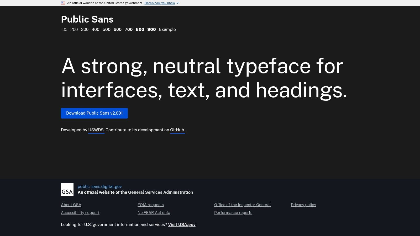
This typeface is a fork of the popular Libre Franklin, but it's been modified for improved performance and readability on screens. It offers a full weight range from Thin (100) to Black (900), providing extensive flexibility for creating a clear visual hierarchy. Its clean, almost conservative aesthetic ensures that it supports your content without demanding attention, a key trait for information-first designs.
Key Benefit: Public Sans is actively maintained and backed by the U.S. government, ensuring high standards for accessibility and long-term reliability.
Why It's a Top Pick
The main draw of Public Sans is its pedigree; it was purpose-built to meet federal accessibility and performance requirements. While you can build a site with a solid font like Public Sans, starting with a professional template can fast-track your project. For example, using a premium Framer SaaS template from FramerDevs ensures your site is built on a conversion-optimized foundation from day one, letting you focus on your business and content rather than design infrastructure.
Primary Use Case: Government websites, UI/UX for applications, body text, accessibility-focused projects.
Font Pairing: Complements well with a slab serif like Zilla Slab or a more characterful display font like Lora for headings.
License: SIL Open Font License (fully free for commercial use).
Website: public-sans.digital.gov/
6. Manrope
Manrope is a modern, semi-condensed grotesque sans-serif font that blends geometric and humanist forms. It was designed to offer excellent readability for both large headlines and small body text, making it a versatile choice for startups and tech companies wanting a clean, contemporary feel. Its accessible and friendly character makes it one of the best free fonts for websites focused on product marketing and user interfaces.
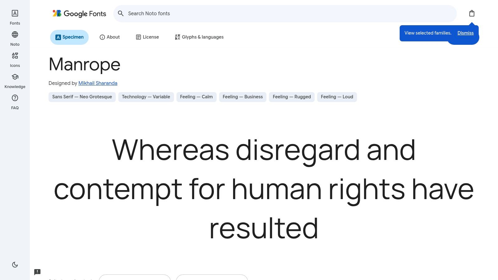
This typeface is a strong performer, available as a variable font that allows for a continuous range of weights from Thin to ExtraBold. This provides precise typographic control while keeping file sizes down, a key benefit for performance-focused sites. The font’s open counters and clear letterforms ensure it renders crisply on screens of all resolutions, from mobile devices to large monitors.
Key Benefit: Manrope combines the clarity of a geometric sans with a touch of humanist warmth, giving it a professional yet approachable tone perfect for brand communication.
Why It's a Top Pick
Manrope’s true value lies in its balance and modernity. It feels fresh and current without being overly trendy, ensuring longevity for your design. While a font like Manrope provides a solid typographic base, building an entire site from scratch is time-consuming. Using a premium Framer template from FramerDevs can accelerate your launch by providing a professionally designed, conversion-optimized structure. This allows you to focus on your content and business growth, not on tedious development work.
Primary Use Case: UI/UX design, marketing websites, headlines, and body copy.
Font Pairing: Complements elegant serifs like Lora for body text or pairs with a monospaced font like Fira Code for technical content.
License: SIL Open Font License (fully free for commercial use).
Website: fonts.google.com/specimen/Manrope
7. Plus Jakarta Sans
Plus Jakarta Sans is a modern geometric sans-serif with a friendly and approachable character. Originally commissioned for the Jakarta City brand, it was designed to be versatile, working effectively for both bold headlines and clean user interfaces. Its clean, geometric structure combined with humanist details makes it one of the best free fonts for websites aiming for a contemporary, clear, and engaging aesthetic, such as marketing sites, product landing pages, and tech startups.
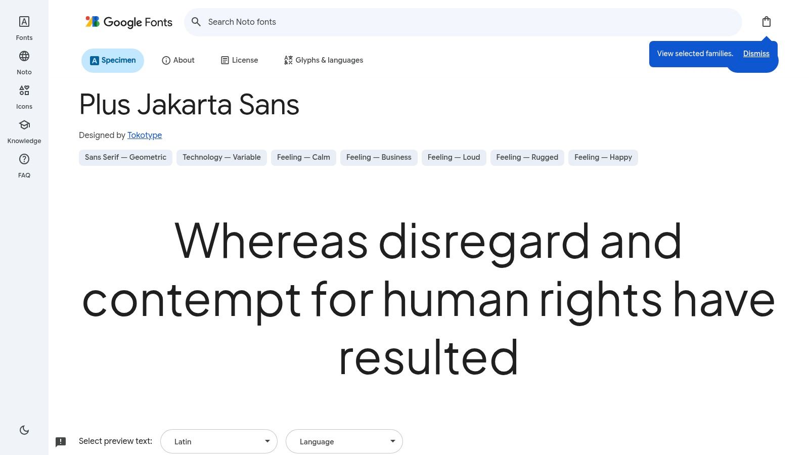
Available as a variable font on Google Fonts, it provides a wide spectrum of weights from ExtraLight to ExtraBold. This range offers exceptional design flexibility, allowing for strong typographic hierarchy without loading multiple font files, which is a significant plus for website performance. Its open letterforms and generous spacing contribute to its excellent readability, even in busy layouts.
Key Benefit: Plus Jakarta Sans offers a perfect middle ground between a neutral UI font and a stylized display font, giving modern brands a touch of personality without sacrificing clarity.
Why It's a Top Pick
The font's strength is its blend of professionalism and warmth. For businesses aiming to launch a visually polished site quickly, combining a strong font like this with a professionally designed structure is key. Using a high-quality Framer SaaS template can give you a head start. Our expert-built templates ensure your site's foundation is built for both visual appeal and user conversion from day one, letting you achieve professional results faster.
Primary Use Case: Headings, marketing copy, UI components, and short-to-medium length body text.
Font Pairing: Complements elegant serifs like Lora for body text or pairs well with a monospaced font like JetBrains Mono for code blocks.
License: SIL Open Font License (fully free for commercial use).
8. Space Grotesk
Space Grotesk is a characterful neo-grotesk font that brings a distinctive, tech-forward feel to any design. Based on Colophon Foundry's fixed-width Space Mono family, it was modified to be proportional while retaining its unique details. This makes it one of the best free fonts for websites aiming for a modern, slightly quirky aesthetic, perfect for technology startups, product showcases, and creative agency portfolios.
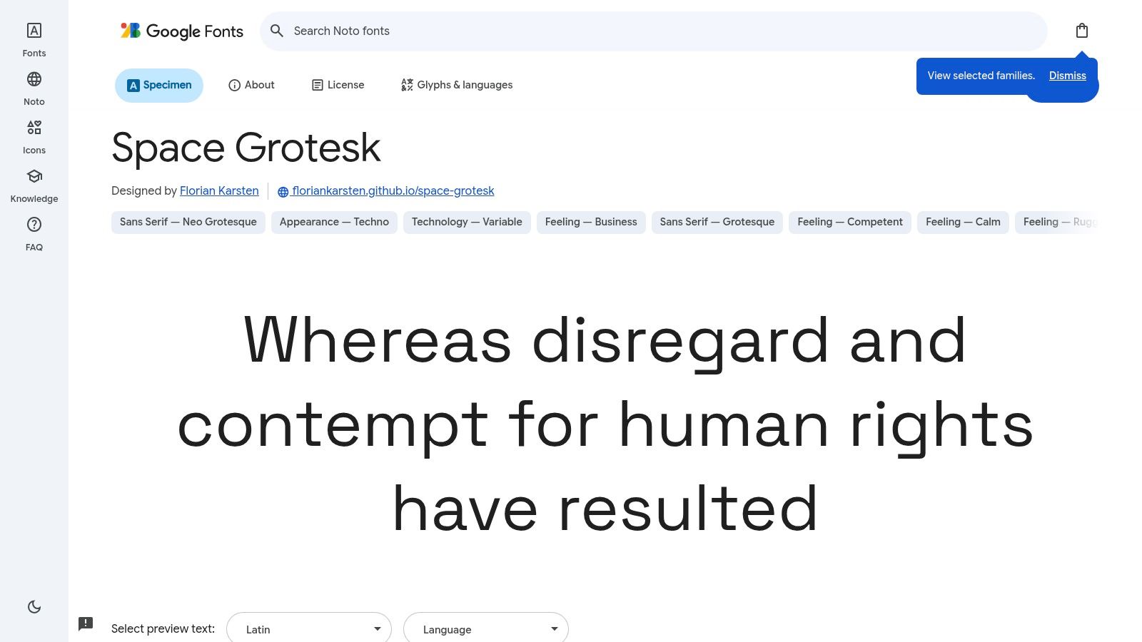
Available on Google Fonts, Space Grotesk is easy to implement and offers solid web performance. It's a variable font, giving you access to a range of weights from light to bold within a single file. While its wide letterforms and pronounced details shine in headings and short bursts of text, its proportions can feel loose for dense paragraphs, potentially requiring line-height adjustments for optimal readability.
Key Benefit: Space Grotesk provides a memorable personality that stands out from neutral sans-serifs, giving your site a confident and contemporary voice.
Why It's a Top Pick
This font strikes an excellent balance between being unique and professional. While an impactful font is a great start, the overall structure of your site is what drives results. Using a professionally designed template, such as a premium Framer template for businesses from FramerDevs, provides a conversion-optimized layout from the very beginning. This allows your content and font choices to truly shine without you needing to build the entire system from scratch, saving time and delivering a higher quality end product.
Primary Use Case: Headings, subheadings, short feature descriptions.
Font Pairing: Pairs well with a neutral body font like IBM Plex Sans or a workhorse serif like Merriweather.
License: SIL Open Font License (fully free for commercial use).
9. Noto Sans (Noto family)
The Noto family, spearheaded by Google, is an ambitious project designed to support all the world's languages with a harmonious look and feel. Noto Sans is its sans-serif component and stands as one of the best free fonts for websites requiring extensive internationalization. Its purpose is to eliminate "tofu" - the blank boxes (☐) that appear when a system cannot render a character. For global applications, news sites, or platforms serving a diverse user base, Noto Sans is an indispensable tool.
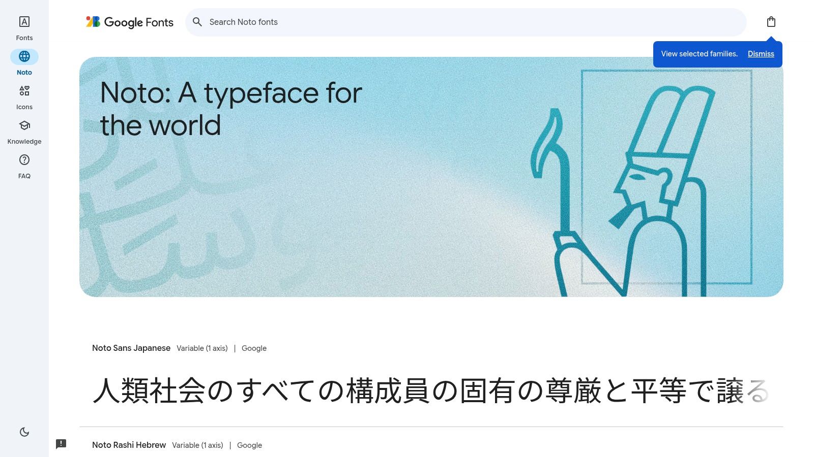
This typeface is a masterclass in consistency, offering uniform metrics and screen-optimized hinting across its massive script coverage. This ensures that when your interface switches from English to Japanese or Arabic, the layout remains stable and the text legible. Its neutral, friendly appearance makes it a safe and reliable choice for body copy where clarity across languages is the top priority.
Key Benefit: Noto’s unparalleled script coverage ensures your website provides a consistent, professional user experience for a global audience, preventing broken text.
Why It's a Top Pick
Noto Sans shines brightest in its intended role: global-first design. Managing its complexity, however, is a valid reason to start with a professionally built site. Using a high-quality Framer agency template ensures that technical details like font-loading strategies are handled correctly from the outset. As experts in Framer, we ensure our templates provide a robust foundation, letting you focus on content instead of complex implementation.
Primary Use Case: Multilingual websites, global applications, UI text for international audiences.
Font Pairing: Pairs well with its serif counterpart, Noto Serif, for a cohesive look. Can also be paired with a more characterful display font like Oswald for headings.
License: SIL Open Font License (fully free for commercial use).
Website: fonts.google.com/noto
10. Roboto
Roboto is Google's signature sans-serif, created to be the default system font for the Android operating system. Its primary purpose is to provide a consistent, legible, and friendly reading experience across a multitude of screen sizes and resolutions. As one of the best free fonts for websites, it is a safe and highly predictable choice, especially for applications where broad familiarity and cross-platform reliability are paramount.
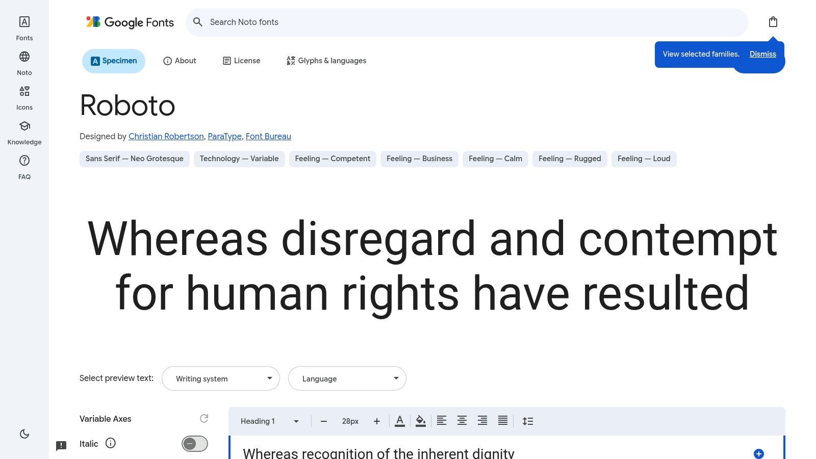
The font family is extensive, offering multiple styles like Roboto Condensed and Roboto Mono, which provides a cohesive typographic system out of the box. Due to its ubiquity on Android devices and its prominent place in the Google Fonts library, it is often pre-cached, potentially offering a slight performance benefit. Its geometric forms are balanced with open curves, creating a neutral yet approachable tone.
Key Benefit: Roboto's widespread use means it is a "no surprises" font. It renders predictably everywhere and is a dependable choice for projects prioritizing function over a distinct brand identity.
Why It's a Top Pick
Roboto excels as a foundational typeface. Its main drawback is its greatest strength: it’s so common that it can feel generic. For projects where clarity is the top priority, its familiarity is an asset. While a solid font is a good start, ensuring your site is ready for launch involves many steps; consulting a detailed website launch checklist can prevent critical oversights. Leveraging a professional template from FramerDevs, where these checks are already part of the design process, ensures a smoother, faster rollout.
Primary Use Case: General UI, body copy for blogs and articles, Android applications.
Font Pairing: Complements display fonts with more personality, such as Montserrat for headings or Lora for a classic serif contrast.
License: Apache License 2.0 (fully free for commercial use).
Website: fonts.google.com/specimen/Roboto
11. Merriweather
Merriweather is a highly readable serif typeface designed by Sorkin Type for comfortable on-screen reading. It was specifically created to be a dependable workhorse for body text, making it one of the best free fonts for websites such as editorial platforms, blogs, and documentation sites where long-form content is central. Its design features a strong x-height and generous spacing, which improve legibility even at smaller text sizes.
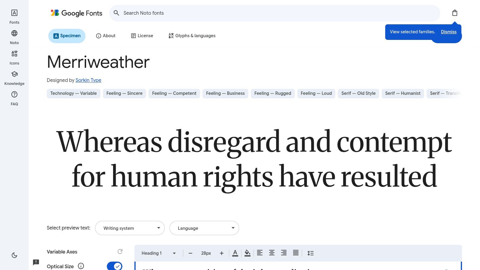
This font family offers a traditional and pleasant feel, providing a nice contrast to the sharp, geometric sans-serifs often used for headings. Its availability in multiple weights, from Light to Black, along with matching italics, gives designers the flexibility to establish a clear visual hierarchy. The typographic color it produces in paragraphs is even and not distracting, guiding the reader’s eye smoothly through the text.
Key Benefit: Merriweather is optimized for web use, delivering excellent legibility for extended reading sessions, making it a go-to choice for content-rich websites.
Why It's a Top Pick
Merriweather's primary advantage is its ability to make long articles feel approachable. Achieving this kind of typographic harmony can be complex, which is why starting with a professional foundation is often a smart business move. Using a purpose-built Framer portfolio template ensures your project’s typography is already optimized for readability and aesthetic appeal. Our premium templates are designed by experts to provide this harmony out-of-the-box, letting you focus on the content itself.
Primary Use Case: Body text for blogs, news articles, and publications.
Font Pairing: Pairs well with modern sans-serif headings like Lato, Montserrat, or Roboto.
License: SIL Open Font License (fully free for commercial use).
12. Lora
Lora is a contemporary serif font family with distinct calligraphic roots, making it one of the best free fonts for websites aiming for an elegant, editorial feel. It strikes a rare balance between artistic expression and on-screen readability, adding warmth and personality to brand showcases, portfolios, and blogs. Its moderate contrast and well-defined curves ensure it works beautifully for both headings and medium-length body text.
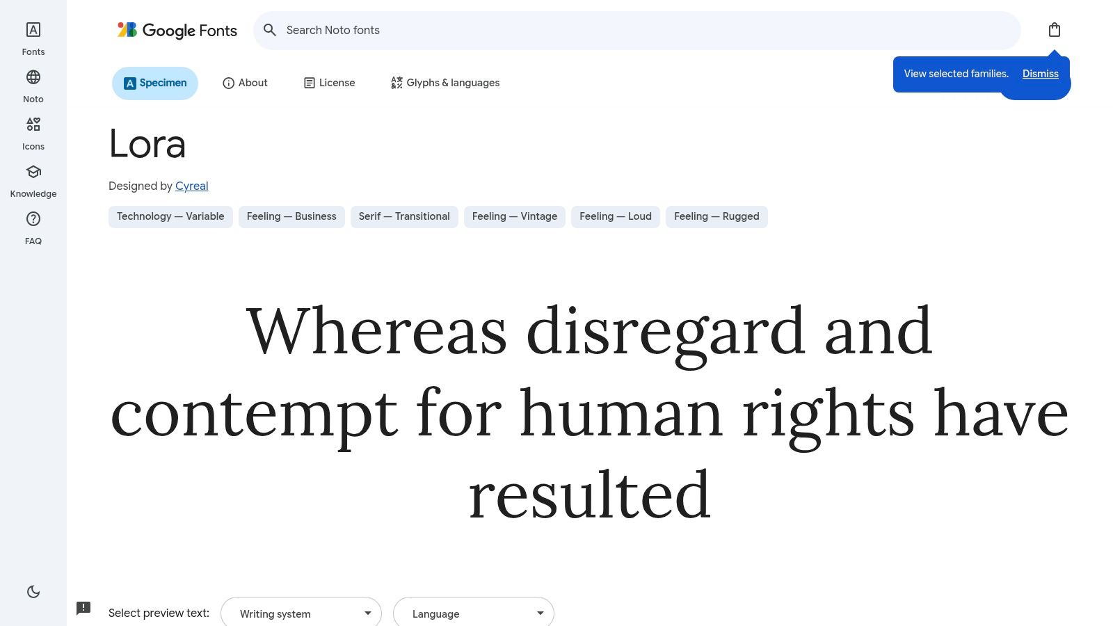
This typeface is ideal for projects that require a touch of classic sophistication without sacrificing modern web standards. As a variable font, Lora provides granular control over weight and style, which is great for performance and creative expression. Its gentle, flowing letterforms provide a pleasant reading experience, setting a welcoming tone for site visitors.
Key Benefit: Lora brings the expressiveness of print typography to the screen, offering an elegant alternative to standard sans-serifs for body copy.
Why It's a Top Pick
Lora’s strength is its ability to feel both classic and modern. It adds a sense of quality, perfect for brands in creative or lifestyle fields. While Lora can establish a strong brand identity, pairing it with the right structure is essential for business success. Instead of starting with a blank canvas, using a high-quality Framer template from FramerDevs provides a conversion-focused framework, allowing you to focus on branding and content while ensuring your site is built for business results from day one.
Primary Use Case: Blog post body text, article headings, brand storytelling websites.
Font Pairing: Pairs well with clean, geometric sans-serifs like Montserrat or Lato for UI elements and captions.
License: SIL Open Font License (fully free for commercial use).
Website: fonts.google.com/specimen/Lora
12 Best Free Web Fonts Comparison
Font | ✨ Core features | ★ Quality | 👥 Best for | 💰 Price / License | 🏆 Standout |
|---|---|---|---|---|---|
Inter | ✨ Variable font, optical sizing, true italics, wide glyph set | ★★★★★ Highly readable at small UI sizes | 👥 SaaS, dashboards, marketing sites | 💰 Free/open‑source; self‑host for full features | 🏆 UI readability & variable performance |
Geist (Sans + Mono + Pixel) | ✨ Multi‑family (Sans/Mono/Pixel), NPM & Google Fonts, Next.js guidance | ★★★★ Clean neutral tone, dev‑oriented | 👥 Dev docs, product sites, Next.js apps | 💰 Free; features vary by install method | 🏆 Seamless Next.js integration |
Source Sans 3 | ✨ Variable + static, extensive weights, OpenType features | ★★★★ Balanced, neutral for apps & docs | 👥 Cross‑industry apps, docs, marketing | 💰 Free via Google Fonts/GitHub | 🏆 Time‑tested neutral UI sans |
IBM Plex (Sans/Serif/Mono) | ✨ Superfamily with broad weights & international support | ★★★★ Professional, system‑ready | 👥 Technical brands, design systems, docs | 💰 Free/open‑source; usage guidance available | 🏆 Cohesive multi‑style system |
Public Sans | ✨ Full weight range, accessibility‑focused design | ★★★★ Clarity & accessibility optimized | 👥 Gov, nonprofit, civic tech, accessibility projects | 💰 Free; USWDS pedigree | 🏆 Built for accessibility & clarity |
Manrope | ✨ Variable geometric/grotesque hybrid, good spacing | ★★★★ Modern, crisp at display & body sizes | 👥 Startups, product & brand sites | 💰 Free; easy via Google Fonts | 🏆 Friendly modern tone |
Plus Jakarta Sans | ✨ Variable, geometric with humanized details, broad weights | ★★★★ Strong display presence without losing readability | 👥 Marketing sites, landing pages, product UIs | 💰 Free via Google Fonts | 🏆 Versatile display + UI balance |
Space Grotesk | ✨ Variable neo‑grotesk, distinctive letterforms, Google hosted | ★★★ Distinctive for headings; less ideal for dense body text | 👥 Headings, product sites, techy brands | 💰 Free via Google Fonts | 🏆 Characterful modern display face |
Noto Sans (Noto family) | ✨ Massive script coverage, consistent metrics, well‑hinted | ★★★★★ Best‑in‑class for multilingual consistency | 👥 Global apps, multi‑script audiences | 💰 Free; recommend subsetting per locale | 🏆 Industry leader for internationalization |
Roboto | ✨ Multiple optical styles (Condensed/Mono), broad language support | ★★★★ Extremely consistent across platforms | 👥 Android, general UI, fallback systems | 💰 Free; widely cached on Android devices | 🏆 Ubiquitous, predictable baseline |
Merriweather | ✨ Serif tuned for on‑screen body text, multiple weights & italics | ★★★★ Comfortable long‑form readability | 👥 Blogs, docs, editorial pages | 💰 Free via Google Fonts | 🏆 Serif optimized for web reading |
Lora | ✨ Contemporary serif with calligraphic roots, strong display feel | ★★★★ Warm, elegant for headings & medium reading | 👥 Brand sites, editorial headings, medium‑length text | 💰 Free via Google Fonts | 🏆 Warm, expressive serif for headings |
From Fonts to Launch: The Professional Template Advantage
Selecting the perfect typeface is a monumental step forward in defining your website's identity. Throughout this guide, we’ve explored some of the best free fonts for websites, from the clean neutrality of Inter and Public Sans to the distinctive character of Space Grotesk and the classic readability of Merriweather. You now have a curated arsenal of high-quality, no-cost options that can elevate your design.
However, a great font is just one ingredient in the recipe for a successful website. The real work begins when you integrate that font into a complete design system. This is where typography meets layout, color, spacing, and interaction design to create a cohesive and effective user experience.
Beyond the Font File: The Bigger Picture of Web Design
Building a professional website from a blank canvas involves countless micro-decisions that have a major impact on performance and conversions.
Typographic Scale: How do you define a harmonious and responsive hierarchy for your H1s, H2s, body copy, and captions?
Performance: Which font weights should you load to keep your site fast without sacrificing design flexibility? How do you implement font-display strategies to avoid layout shifts?
Responsive Design: How does your chosen font render across different devices and screen sizes? Does your layout break on mobile?
Conversion Optimization: Are your buttons, forms, and calls to action designed not just to look good, but to guide users toward a specific goal?
Answering these questions correctly requires deep expertise and, more importantly, a significant amount of time. This is where FramerDevs comes in. As experts in creating premium Framer templates, we solve these problems for you.
The Strategic Shortcut: Why Professional Templates Win
While building from scratch is rewarding, the reality for most businesses is that speed to market is critical. This is where a professional template from FramerDevs offers a decisive advantage. It’s not a shortcut on quality; it's about starting from a foundation that has quality built-in.
A premium template from an expert like FramerDevs is far more than just a pretty design. It's a complete, pre-engineered system. The fonts are already chosen and paired, the typographic scale is perfected, the responsive behavior is tested, and the performance is optimized. To truly optimize your site's aesthetics and functionality, consider integrating modern UI components and design systems, which can simplify the implementation of chosen fonts across your design.
By using a professional template, you bypass hundreds of hours of trial and error. You get to focus your energy on what you do best: crafting compelling content and engaging with your customers. Instead of wrestling with CSS or debugging layouts, you can launch a world-class, conversion-focused website in a fraction of the time. You inherit a system designed for business results, giving you a powerful head start.
Ready to launch a stunning, high-performance website without the headaches of building from scratch? The fonts we've discussed are a fantastic start, and they're even more powerful inside a professionally designed system. Explore our collection of premium templates at FramerDevs to find a design that’s already optimized for speed, conversions, and impeccable aesthetics.


