
Elevate Your Corporate Homepage Design in 2026

Excellent corporate homepage design comes down to one thing: clarity. Your page has to instantly answer what you do, who you do it for, and what action the visitor should take next. This clarity creates a straight line from first impression to conversion, steering clear of the cluttered, unfocused design that sinks so many sites.
Why Most Corporate Homepages Fail to Deliver Results
Let's be honest—most corporate homepages feel broken. They're often slow, confusing, and completely miss the mark on their one true job: turning visitors into customers. This widespread failure usually comes from a misguided belief that cramming every possible piece of information onto one page is a sign of being thorough.
This "more is better" approach actively works against your business goals. Instead of informing visitors, it just overwhelms them. The result is a frustrating user experience that leads directly to high bounce rates and lost opportunities. Your homepage isn't a filing cabinet; it's your most important salesperson.
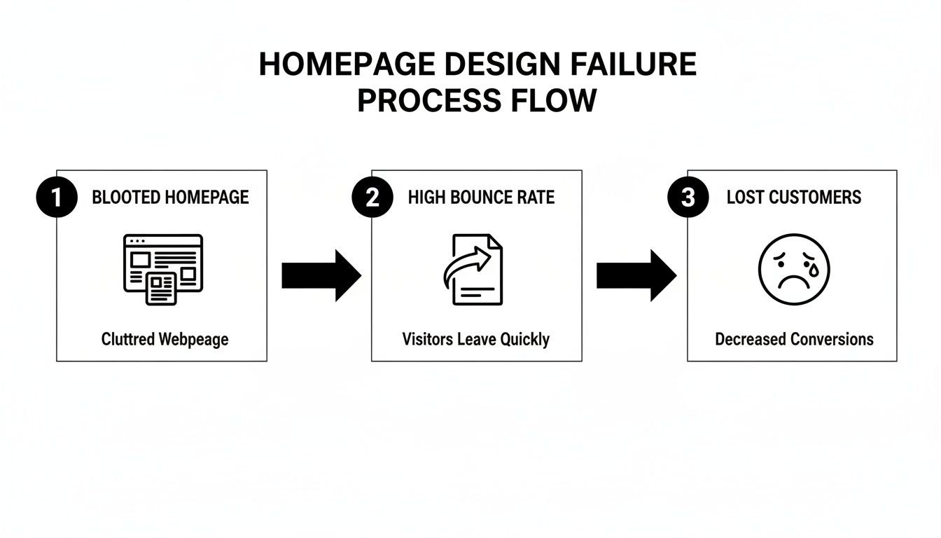
The Problem of Element Bloat
This trend toward complexity is only getting worse. In 2025, the average corporate homepage had ballooned to a staggering 1,257 elements, a 7.1% jump from the previous year. This has cranked up interface complexity and user frustration in a major way.
According to a huge analysis of over a million homepages, this trend is global, hitting everything from Fortune 500 companies to growing SaaS startups. The ripple effect? Slower load times and higher cognitive load for visitors, which directly causes higher bounce rates. You can dig into the full findings on web design statistics to see just how much this impacts performance.
This element bloat creates a terrible experience for everyone, but it’s especially damaging on mobile devices, where a majority of your audience probably is. A page cluttered with too many buttons, links, images, and text boxes becomes almost unusable on a smaller screen.
The Takeaway: Every element you add to your homepage that doesn't directly support your main conversion goal is actively working against you. It adds visual noise, slows the page down, and distracts visitors from the one action you want them to take.
The Smarter Alternative: A Professional Foundation
So, what’s the fix? A streamlined, strategic approach that puts speed, clarity, and conversion first from day one. This is exactly why starting with a professional template isn't a shortcut—it’s a smart business decision.
Choosing a premium template from a provider like FramerDevs means you're building on a foundation that has already solved these core problems. You get to bypass the common traps of DIY design and avoid months of expensive trial and error.
Speed and Performance: FramerDevs templates are built for elite speed, ensuring your page loads almost instantly.
Conversion-Optimized Layouts: The information architecture is pre-designed to guide users naturally toward a call-to-action.
Clarity by Design: You get a clean, modern look that puts your core message front and center, without all the noise.
Instead of fighting with element bloat, you start with a polished, high-performing asset. This frees you up to focus your energy on what really matters: crafting a compelling message for your audience, not wrestling with technical optimization and design theory. It's the fastest path to a corporate homepage that actually gets results.
Before you even dream about fonts or color palettes, you need to lay the strategic groundwork for your homepage. I’ve seen countless projects fail right here. They jump into design, and the result is a beautiful website that does absolutely nothing for the business.
A high-converting homepage doesn't just happen. It's engineered. And it all starts with answering one question: What is the single most important action you want a visitor to take?
Are you trying to capture qualified leads? Drive demo requests? Make a direct sale? If you can’t answer that in one sentence, your homepage is destined to become a cluttered mess that confuses visitors and tanks your conversions. This one goal will be the north star for every single design decision you make from here on out.
Get this wrong, and you create a domino effect of failure. A bloated, unfocused homepage leads directly to confused visitors, high bounce rates, and lost revenue.
Nail Your Value Prop and Know Your Audience
Once your primary goal is locked in, it's time to craft a value proposition so clear that a visitor gets it in 3 seconds. What’s in it for them? If they have to hunt for the answer, you've already lost.
At the same time, you need to know exactly what information your ideal customer needs to see to feel confident enough to act. Don't guess. Map out their journey, think about their pain points, and list the questions they’re asking themselves. For a deeper dive, using modern AI tools for website design can help you analyze user behavior and identify these critical information gaps much faster.
This homework ensures your homepage is built for your customer, not your internal team. If you want to get a head start on structuring this information, our guide on creating a solid Figma wireframe template is a great next step before you jump into Framer.
A homepage built on a weak strategy is like a skyscraper with no foundation. It may look impressive for a moment, but it’s destined to crumble under pressure. A template-first approach gives you a professionally engineered foundation from day one.
The Template-First Advantage: Skip the Guesswork
Building this entire strategic framework from scratch is a massive undertaking. We’re talking weeks of research, user journey mapping, and information architecture planning—all before you write a single line of code or drag a single element.
This is where a professional template becomes your secret weapon.
To see what I mean, let's compare the two paths to getting this foundation right.
Homepage Foundation Checklist
Strategic Element | DIY Approach (The Hard Way) | Template-First Approach (The Smart Way) |
|---|---|---|
Primary Goal | Debated endlessly in meetings, often resulting in a vague, unfocused mission. | Defined by a proven layout that already points users toward a clear action. |
Value Proposition | Crafted from scratch; risks being unclear or buried below the fold. | Placed prominently in the hero section, where it has the most impact. |
Information Architecture | Requires extensive user research to figure out what goes where. | Comes pre-built with a logical flow that meets user expectations out of the box. |
Audience Journey | You have to map the entire flow from awareness to conversion yourself. | The template's structure already guides users along a tested conversion path. |
As you can see, a template-first approach lets you start on third base.
A premium template from FramerDevs isn't just a pretty skin; it's a pre-built strategic framework. Our templates are designed around conversion principles we've seen work time and time again.
Proven Information Architecture: We’ve already placed the most critical information right where users expect to find it, so you don't have to guess.
Conversion-Optimized Flow: The page layout is intentionally designed to guide visitors from your value proposition straight to your main call-to-action.
Speed and Quality: You’re getting a high-performance, professionally vetted structure without burning months and thousands of dollars on custom development.
By starting with a FramerDevs template, you skip the most common structural mistakes that kill conversions. It’s simply the smartest, fastest path to launching a corporate homepage that actually delivers business results.
Crafting a Message That Captures and Converts
You’ve got about three seconds. That’s the window your homepage has to grab a new visitor and convince them to stick around. This fight is won or lost in the hero section—that very first screen they see.
Forget the generic mission statements and corporate fluff. Your message needs to be so sharp, so direct, that a visitor instantly gets what’s in it for them. We’re talking about a clear, powerful value proposition that answers their unspoken question: “Why should I care?”
This isn’t just about being clever with words. You have to nail the psychology. A strong headline hooks them, a benefit-focused subheadline pulls them in, and a crystal-clear call-to-action (CTA) tells them exactly what to do next. These aren’t optional; they are your most essential tools.
Beyond the Hero: Building Trust at Speed
Grabbing their attention is the first step. Keeping it requires trust. This is where social proof becomes your best friend. Displaying logos from clients they recognize, powerful testimonials, or links to in-depth case studies gives you immediate credibility. It’s third-party proof that you can actually deliver on your promises.
Here’s the problem: a lot of companies trying to build from scratch get this wrong. They scatter trust signals randomly, bury them at the bottom of the page, or format them so poorly they get ignored. A homepage that actually converts needs a deliberate flow that moves a visitor from interest, to trust, and finally, to taking action. Getting that messaging hierarchy right from a blank canvas is tough.
The Template Advantage: Launch with Speed and Quality
This is exactly where a professional template changes the game. Instead of burning weeks or months arguing over layouts and copy, you start with a structure that’s already optimized to convert. It's the quickest way to get a high-performing homepage live without the guesswork—or the high price tag of a ground-up build.
Templates from FramerDevs are more than just pretty designs; they’re designed to be a launchpad for your business. We’ve already done the hard work of planning the messaging architecture for you.
Conversion-Focused Flow: Our layouts are built to guide users seamlessly from your core value proposition to social proof and straight to your CTA. No dead ends.
Optimized Sections: We include beautifully designed, dedicated sections for testimonials, client logos, case studies, and feature benefits that are proven to work.
Launch in Days, Not Months: You get to skip the frustrating setup and focus on what matters—plugging in your unique message. You can launch with confidence, knowing the design foundation is solid.
Choosing a FramerDevs template isn't taking a shortcut; it's a strategic move. You're prioritizing speed, quality, and real business results by building on an elite foundation designed to help you connect with your audience from day one.
Designing for Action to Drive Conversions
Let's be honest: a beautiful corporate homepage is completely useless if it doesn't get people to do something. This is where we shift from just making things look good to making them work. It all comes down to conversion-centered design, and that starts with a powerful visual hierarchy.
Think of visual hierarchy as a tour guide for your visitor's eyes. It deliberately points them toward your most important elements—your Calls-to-Action (CTAs). Your job is to make your main CTA impossible to miss, but in a way that feels natural and helpful, not obnoxious. This isn’t about just slapping a bright red button on the page. It’s about strategically using color, contrast, whitespace, and size to create a focal point that tells users exactly what to do next.

From "Learn More" to "Request a Demo"
The words on your buttons are just as important as their design. I’ve seen so many sites fall flat with vague, low-commitment CTAs like "Learn More" or "Read More." They fail because they don’t promise a specific outcome and end up creating friction and uncertainty.
A high-converting CTA, on the other hand, is always action-oriented and crystal clear.
"Request a Demo" is a powerhouse. It offers a tangible, valuable next step for a qualified lead who is ready to see the product in action.
"Start Your Free Trial" immediately communicates a no-risk chance to experience your product firsthand.
"Get Your Free Proposal" works wonders because it offers a customized, high-value deliverable that speaks directly to a visitor's problems.
The perfect CTA aligns with your main business goal and what the user is actually looking for at that moment. This is why picking a premium FramerDevs template gives you such a massive head start—our layouts are built from the ground up around these proven, action-driving principles.
Creating a Frictionless User Flow
Even the best CTA won't work if the path to get there is a mess. Every extra click, confusing form field, or slow-loading page is another reason for a potential customer to give up and leave. A frictionless user flow means you've obsessed over removing every single point of resistance between the moment a visitor lands on your page and the moment they convert.
A frictionless journey isn't a luxury; it's a necessity. Even a one-second delay in page load time can lead to a 7% reduction in conversions. Every piece of your corporate homepage design must contribute to a fast, intuitive experience.
This is where the quality of your website’s foundation really shows. I've seen it happen time and again: teams build from scratch, only to discover hidden performance issues and usability roadblocks after they've already lost valuable leads. It’s a common pitfall we’ve specifically designed our templates to avoid.
All our FramerDevs templates go through meticulous testing to ensure the user flow is smooth, intuitive, and lightning-fast. The conversion pathways are already mapped out and optimized, so you don't have to worry about accidentally creating dead ends or frustrating loops. You can focus on your message, confident that the structure is already engineered for action. If you're keen to dig deeper into refining these pathways, we cover this and more on our blog about landing page best practices.
Ensuring Flawless Performance on Every Device
In 2026, a corporate homepage that isn't lightning-fast and perfect on every screen is practically invisible. Your site has to deliver a flawless experience, whether it’s on a massive desktop monitor or a smartphone. This isn't just about looking good; it's about core business performance.
Site speed is a massive ranking factor for Google, and a slow homepage directly torpedoes your revenue. Visitors have zero patience. Even a one-second delay can tank your conversions. The technical headaches of hitting a sub-two-second load time—like image compression and lazy loading—can be a huge drain on resources when you build from scratch.
The Problem with DIY Performance Tuning
Trying to bolt on performance to a custom-built site is a notorious time and money sink. It means digging deep into code, manually compressing assets, and testing across dozens of device and browser combinations. Every new image you add risks slowing everything down again, kicking off another round of technical whack-a-mole.
This is a reactive, defensive posture that pulls your focus away from what really matters: growing your business. Instead of spending weeks chasing performance bottlenecks, you should be focused on your marketing message and finding new customers.
A slow website is more than just an inconvenience; it’s a direct tax on your revenue. By prioritizing speed from the very beginning, you protect your investment and maximize your chances of converting every visitor.
Launch with an Elite, Performance-First Foundation
This is exactly why starting with a premium template from a provider like FramerDevs is such a smart business move. Our templates aren't just designed to look good; they are engineered from the ground up for elite performance and pixel-perfect responsiveness. We’ve already obsessed over the hundreds of technical details that go into a fast, modern website so you don't have to.
When you choose a FramerDevs template for your corporate homepage design, you get:
Built-in Speed: Our templates are obsessively optimized for lightning-fast load times, ensuring you meet and exceed user expectations from day one.
Flawless Responsiveness: Every template is meticulously tested to adapt perfectly to all screen sizes, providing a seamless, native-feel experience on any device.
Conversion-Ready Foundation: Because performance is already baked in, your visitors get a smooth, frictionless journey toward your CTA. This is non-negotiable for maximizing conversions.
By starting with a professionally built template, you get to skip the entire painstaking process of technical optimization. You can launch your new site in a fraction of the time, completely confident that its foundation is already best-in-class.
To make sure everything is perfect after you go live, our comprehensive website launch checklist will walk you through a smooth, stress-free rollout.
Your Post-Launch Plan for Continuous Improvement
Getting your new corporate homepage live is a huge win, but don't pop the champagne just yet. A great website isn't a static project; it's a living asset that needs to evolve. The only way to get real, long-term results is to shift your mindset from "set it and forget it" to one of continuous improvement.
This means you need to get comfortable with a cycle of testing, learning, and iterating. Your first move is to set up your analytics to track the metrics that actually matter—bounce rate, time on page, and most importantly, conversion rates. This data isn't just a bunch of numbers; it's direct feedback from your audience on what’s hitting the mark and what’s falling flat.
From Data to Action
Once you have a baseline, you can start running simple A/B tests to gather real-world insights. The key is to start small and focus on high-impact changes. Don't overcomplicate it.
Here are a few ideas to get you started:
Headline Variations: Pit a benefit-driven headline against one that's more feature-focused. See which one resonates more.
CTA Button Colors: Does a high-contrast color that pops get more clicks than one that’s perfectly aligned with your brand palette? Test it.
Social Proof Placement: Try moving your client logos or a powerful testimonial higher up the page. Does it build trust faster?
These small, targeted tests can lead to significant gains in engagement and conversions over time.
A homepage built on a quality foundation is far easier to improve. When the core structure is already optimized for speed and conversions, your A/B tests can focus on messaging and strategy, not on fixing fundamental flaws.
This is a massive advantage of working within the FramerDevs ecosystem. Our premium Framer templates aren't just pretty, one-and-done assets. They are built on a flexible, high-performance foundation that makes this kind of iterative improvement a breeze.
Instead of wrestling with a clunky custom build every time you want to test a new idea, you're working with a clean, professional system designed for growth. With ongoing updates and expert support, your site doesn't just start strong—it keeps getting better. This approach saves you countless hours and lets you focus on strategy, confident that your corporate homepage is always performing at its peak.
Frequently Asked Questions About Homepage Design
When you're diving into a homepage project, a few key questions always come up. Let's tackle the most common ones we hear from founders and marketing teams, with straight-to-the-point answers.
How Much Does a Good Corporate Homepage Design Cost?
The answer really depends on the route you take. A custom build from a top agency can easily run into the tens of thousands, while a decent freelancer might quote a few thousand. It's a huge range.
This is where professional templates create so much value. You’re getting a premium, conversion-focused design for a fraction of the price, and you can launch in days, not months. It’s the smartest way to get a high-end look without the massive budget.
How Often Should I Redesign My Corporate Homepage?
Forget the old playbook of painful, expensive redesigns every two or three years. The modern, smarter approach is all about continuous improvement.
When you build on a flexible no-code platform like Framer with a quality template, making small, iterative changes is simple. You can update a section, test new messaging, or add a new CTA whenever you need to. A full teardown should only happen if your entire brand or business model is changing.
Using a modular template from a provider like FramerDevs makes small, regular updates fast and simple. This iterative process delivers better results over time than huge, risky overhauls.
What Are the Most Important Homepage Elements?
Every business has its own story, but the best corporate homepages all nail these five core elements. A high-quality template will have these built-in, so you don't miss anything critical.
A Clear Value Proposition: Your headline and subheadline need to instantly answer "What do you do?" and "Who is it for?" No jargon.
A Primary Call-to-Action (CTA): One main button should stand out visually and guide the user to the single most important next step.
Social Proof: Nothing builds trust faster than client logos, real testimonials, or case study links. It shows you deliver on your promises.
Benefits-Focused Overview: Don't just list features. Quickly explain how your product or service solves your visitor's biggest problems.
Intuitive Navigation: Your menu should be clean, simple, and logical. If a user has to think too hard to find something, you've already lost them.
The fastest path to a homepage that actually drives business results is to start with an expert-designed foundation. FramerDevs offers a library of 100+ premium, conversion-focused templates that give you the speed, quality, and performance of a top-tier site without the custom-build price tag.
Browse our templates and launch your new site with confidence this week.


