
Mastering SaaS Landing Page Design in 2026

When it comes to SaaS landing page design, the goal is simple: create a single, focused web page that turns visitors into customers. It's not about showing off every feature. It's about driving a specific action—like a free trial sign-up—by communicating value clearly and cutting out all the noise.
A great landing page blends persuasive copy, compelling visuals, and a dead-simple user experience to transform marketing clicks into real business growth.
Why Most SaaS Landing Pages Underperform
Let’s be honest, a lot of SaaS landing pages just don't convert. You spend weeks, maybe even months, planning, designing, and building what you think is the perfect page. Then you launch, and visitor after visitor just drops off without signing up.
It’s not just a feeling; it’s a well-documented problem.
The data tells a pretty clear story. Recent benchmarks show the median conversion rate for SaaS landing pages is a sluggish 3.8%. That lags way behind other industries like events and entertainment, which can pull in rates as high as 12.3%. Sure, the top SaaS performers might hit 15-20%, but the industry average is low for a reason—products are complex and buyer journeys are long. You can explore more landing page statistics to see how different industries compare.
This gap proves a critical truth: a beautiful design isn't enough. Your landing page has to be a conversion machine, and most fail because they make a few common, costly mistakes.
Common Pitfalls That Sabotage Conversions
So many founders and marketers fall into the trap of thinking a custom-coded page is the only way to get something unique and effective. But that path is usually full of conversion-killing problems.
These issues almost always come down to:
Confusing Value Propositions: Your visitor lands and has no idea what your software does or why they should care. The core message is lost in a sea of jargon or clever-but-unclear marketing fluff. They're gone in five seconds.
Cluttered and Unfocused Design: The page is a visual mess. There are too many buttons, distracting animations, and no clear visual path. The user feels overwhelmed and can't find the one action you want them to take.
Sluggish Load Times: Every second matters. A page that takes forever to load—usually because of huge, unoptimized images or messy code—causes a massive drop-off. People just won't wait.
Ignoring Conversion Science: The layout doesn't tell a persuasive story. It just lists features instead of framing them as benefits that solve a real problem. It also fails to build trust with social proof placed in just the right spots.
The biggest mistake is treating a landing page like a digital brochure. Its real job is to be your most effective salesperson, guiding a prospect from curiosity to action with precision and clarity.
Here's a quick breakdown of what a high-performing page needs to include.
The Anatomy Of A High-Converting SaaS Landing Page
This table is a quick reference guide breaking down the essential components that drive sign-ups on a SaaS landing page.
Component | Purpose And Key Insight |
|---|---|
Clear Headline | Grabs attention and answers "What is this?" in 3 seconds. Must be benefit-oriented. |
Compelling Subheadline | Expands on the headline, explaining who it's for and the primary outcome. |
Hero Shot/Video | Shows the product in action. A clean screenshot or a short demo video works wonders. |
Primary Call-to-Action (CTA) | A single, unmissable button for the desired action (e.g., "Start Free Trial"). |
Social Proof | Logos, testimonials, or case studies that build trust and reduce friction. |
Key Benefits Section | Focuses on outcomes, not just features. Answers "What's in it for me?". |
How It Works | A simple 3-step visual breakdown of the process to reduce perceived complexity. |
Pricing Table | Clear, simple, and easy to compare. Highlights the most popular plan. |
FAQ Section | Addresses common objections and questions before they become deal-breakers. |
Secondary CTA | A lower-commitment offer in the footer for those not ready to sign up (e.g., "See a Demo"). |
Each of these elements plays a specific role in moving a visitor toward conversion. Omitting even one can create a leak in your funnel.
The Strategic Advantage of a Professional Foundation
These common mistakes are exactly why starting from a proven foundation is a smarter move. Building from scratch is a huge gamble on your time, budget, and design expertise. A tiny flaw in the layout or a slow-loading script can tank an entire marketing campaign.
This is where a conversion-first approach makes all the difference. Instead of trying to reinvent the wheel, you can start with a professional structure that has already solved these core problems. Using a premium Framer template from FramerDevs, for example, gives you this strategic edge right out of the box.
Our templates are built with a deep understanding of what makes a SaaS landing page design convert. They’re fast, high-quality, and designed with a clear path to sign-up. This lets you focus on what really matters—growing your business, not fixing costly design errors.
Building A High-Impact Hero Section
You have five seconds. Maybe less.
When a visitor lands on your SaaS page, that first screen—the hero section—is your only chance to grab their attention. If you fumble it, the rest of your perfectly designed page might as well be invisible. They’ll just leave.
This is the most valuable real estate on your entire website. Its job is to instantly answer three questions burning in your visitor's mind: What is this? Who is it for? And why should I care? A weak hero section just creates confusion, causing people to bounce before you ever get to show them your value.

This is exactly why so many founders and designers start with a professional template. Building a great hero section from scratch is deceptively hard. It's not just a big headline and a nice image; it's a careful mix of copy, visuals, and psychology engineered to drive one specific action.
Get Your Headline and Sub-headline Right
Your headline is the single most important piece of copy on the entire page. This is no place for clever taglines or vague corporate speak. It needs to be a crystal-clear, benefit-focused statement that hits on your ideal customer's biggest problem or desired outcome.
For instance, a headline like "The Future of Project Management" is just noise. It’s weak. A much stronger version cuts right to the point: "Finish Projects On Time, Without the Chaos." See the difference? The second one connects with a real, painful problem.
The sub-headline is there to back it up. It should expand on the headline, quickly explaining how your tool works or who it’s for. It’s the one-two punch that makes your value proposition stick.
Headline: Stop Losing Customers to Bad Onboarding.
Sub-headline: Our platform helps you create interactive product tours in minutes—no code required—so you can guide users to their 'aha!' moment faster.
A great hero section isn't just designed; it's engineered. Every single element, from the headline to the button color, works together to build immediate clarity and trust, pushing the visitor toward that first critical click.
Trying to get this right from a blank page is a massive time-sink. This is where a premium template from a place like FramerDevs makes all the difference. Our templates are built with conversion-optimized hero sections from day one. We’ve already tested the layouts and typographic hierarchies to make sure your message lands with maximum impact, letting you focus on perfecting your copy.
The Role of Visuals and CTAs
The visuals in your hero section are just as crucial as the words. Please, forget the generic stock photos of people in suits high-fiving. Your hero image or video has to build trust and help visitors see themselves succeeding with your product.
Think authentic, human-centric visuals. Show your product being used in a realistic context. An image of a relaxed, smiling professional using your software is infinitely more powerful than a sterile product screenshot. It creates an emotional connection.
Finally, the call-to-action (CTA) button. It has to be impossible to miss. Use clear, action-oriented words. "Start Free Trial" or "Get Your Free Demo" are so much better than lazy options like "Submit" or "Learn More." Your CTA is the logical next step to the promise you just made in the headline.
Building this cohesive unit takes experience. Founders can waste weeks tweaking hero sections and running A/B tests on tiny changes with zero effect. A professionally designed template gives you a launchpad built on proven best practices, so you can go live with a powerful hero section in a fraction of the time. You get the benefit of expert design without the custom-build price tag, letting you start turning visitors into customers, faster.
Crafting a Persuasive Page Structure
A great SaaS landing page tells a story. It doesn’t just dump a list of features on a visitor; it walks them from "What is this?" to "I need this." This journey isn't a happy accident—it's a carefully built structure designed to build trust and momentum with every scroll.
The whole thing flows from the 'Why' (the problem you solve), to the 'How' (your solution), and finally, the 'Who' (proof that it actually works). Nailing this structure is one of the toughest parts of SaaS landing page design. When you get it right, the page feels like a natural conversation that answers questions before the visitor even thinks to ask them.
From Problem to Solution
The best pages start by holding up a mirror to your visitor’s biggest frustration. Right after your hero section makes a big, bold promise, your next job is to twist the knife a little on the problem you solve. What’s life like without your tool? Describe the chaos, the wasted hours, or the lost opportunities.
A project management tool, for example, might paint a picture of missed deadlines and messages scattered across five different apps. This sets the stage perfectly for your product to swoop in as the hero. Once you’ve established that shared pain, you can introduce your solution—and this is where most people get it wrong.
Don’t just sell features; sell better outcomes. A feature is what your product does. A benefit is what your user can achieve with it. This distinction is the bedrock of persuasive copy.
Instead of just saying "Automated Reporting," frame it as "Save 10 Hours Every Month on Manual Reporting." That simple shift turns a boring technical spec into a tangible, desirable result. You want the visitor nodding along, thinking, "Yes, that's exactly what I need."
Translating Features into Benefits
To make this shift work, you need a clear structure for presenting your solution. Ditch the long, dense paragraphs that list everything at once. Instead, break it down into scannable, visually distinct sections.
A powerful way to do this is the "Feature-Benefit-Outcome" framework:
Feature: Name the function (e.g., "Real-Time Collaboration").
Benefit: Explain the direct advantage (e.g., "Work together on documents without messy version control issues").
Outcome: Describe the big-picture result (e.g., "Launch campaigns 30% faster with seamless teamwork").
This approach connects the dots for your visitors, making your value crystal clear. Honestly, building this from scratch is a grind. It takes tons of iteration to get the flow feeling just right—not just the words, but how it’s all laid out on the page. Using a high-quality template from a provider like FramerDevs can save you weeks of guesswork by giving you a pre-built, conversion-focused structure designed for this exact purpose.
Weaving in Social Proof
After you’ve shown your solution, it’s time to prove it works. Social proof is what turns a visitor’s skepticism into trust. But just slapping a few logos or a random testimonial on the page is lazy and ineffective. Where and how you place your social proof is what makes it persuasive.
You should sprinkle it throughout the page to back up your claims as you make them. For instance:
Client Logos: Put these high up, usually right below the hero section, to establish credibility the second someone scrolls.
Testimonials: Use specific, outcome-driven quotes. "We increased our sign-ups by 40% in the first month" is infinitely more powerful than "It's a great tool." Place these testimonials right next to the feature or benefit they’re talking about.
Case Studies: For more complex SaaS products, a quick summary of a case study with a link to the full story can be a great trust-builder.
Arranging all these pieces in a logical, persuasive flow is a serious design challenge. Before you ever open a design tool or write a line of code, you need a clear outline. You can learn more about this crucial planning stage by exploring how to create a Figma wireframe template for your project.
Designing a Clear and Compelling Pricing Table
Finally, you arrive at the pricing section. This is where the decision happens, and clarity is everything. A confusing pricing table is one of the biggest conversion killers out there. Your only goal here is to make it ridiculously easy for a visitor to pick the right plan for them.
Here are a few best practices that always work:
Keep It Simple: Stick to three or four plans, max. Analysis paralysis is real.
Highlight the Best Value: Use a visual cue like a colored border or a "Most Popular" badge to nudge users toward the plan you want them to choose.
Use Clear Headings: Name your plans based on who they're for (e.g., "Starter," "Pro," "Enterprise").
Focus on Key Differentiators: Don't list every single feature under each plan. Just show the features that separate one plan from the next.
The journey from problem to pricing is a delicate balance. Each section has to build on the one before it, creating a seamless story that guides your visitor to a confident "yes." This is exactly why a professionally designed template is so valuable—it gives you a battle-tested blueprint that’s already optimized for this essential flow.
Scaling Your Growth with Targeted Landing Pages
Years ago, you could get by with a single, all-purpose landing page. But in today's SaaS market, that "one-size-fits-all" approach is a surefire way to leave leads and revenue on the table. If you're serious about growth, you need to create multiple, targeted landing pages.
This isn't just a hunch; it’s a proven growth strategy. The data is clear: businesses with 31 to 40 landing pages generate a staggering seven times more leads than those with just one to five. That stat alone should tell you everything you need to know about where the market is headed. Variety and specificity are crushing the old-school, single-page model.
Think about it. A generic message speaks to no one. But a specific message that hits a niche audience’s exact pain point? That’s how you get conversions.
Identifying Opportunities for New Pages
Adopting this strategy doesn't mean you need a massive team or an unlimited budget. It's about being smart and identifying the low-hanging fruit where a targeted page will easily outperform a generic one.
Start by looking at your audience and marketing channels. You can almost always find opportunities to create dedicated landing pages for:
Specific Features: Just launched a new AI-powered analytics tool? Give it its own landing page. Focus entirely on its benefits, who it’s for, and how they can use it.
Audience Segments: A startup founder cares about speed and affordability. An enterprise manager worries about security, compliance, and scalability. They should never land on the same page. Create one for "SaaS for Startups" and another for "Enterprise Solutions."
Paid Ad Campaigns: This one is non-negotiable. Every Google or LinkedIn ad campaign needs its own landing page. If someone clicks an ad for a "CRM for Real Estate Agents," they better not land on your generic CRM homepage. The message match has to be perfect.
Every one of these pages should follow a simple, persuasive flow that guides the visitor from acknowledging their problem to seeing your solution as the only logical choice.
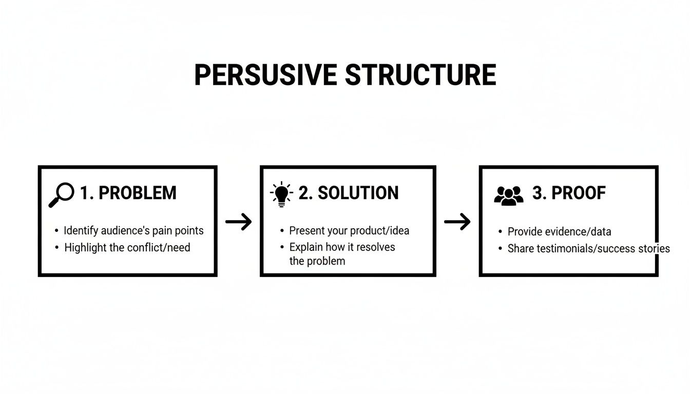
This Problem > Solution > Proof framework is the backbone of any landing page that actually converts. It's simple, powerful, and it just works.
The Challenge of Scaling Design and Development
So, the big question: how do you actually deploy dozens of high-quality pages without your budget and timelines spiraling out of control? Building every single page from scratch is a non-starter. It’s painfully slow, ridiculously expensive, and a nightmare for maintaining brand consistency.
This is where your workflow becomes your secret weapon. The goal is to produce on-brand, conversion-optimized pages at speed.
The ability to quickly launch targeted landing pages is no longer a "nice-to-have"—it's a core function of a modern growth team. The faster you can test new messaging for specific audiences, the faster you learn and grow.
But speed can't come at the cost of quality. Each page still needs to be blazing fast, fully responsive, and look professionally polished. Anything less erodes trust.
A Practical Roadmap for Rapid Deployment
The secret to scaling your landing page production isn't about working harder; it's about working smarter. Instead of starting from a blank canvas every time, the best teams build from a flexible, high-quality foundation.
This is the exact problem we solve with our premium Framer templates at FramerDevs.
Our templates are much more than just pretty designs. They are battle-tested starting points, already optimized for performance, conversion, and ridiculously easy customization. You can clone a master template, swap in the copy and visuals for your new campaign, and launch a pixel-perfect, targeted page in a matter of hours, not weeks.
Let’s be honest about the trade-offs. Here’s a quick look at what it takes to build from scratch versus using a professional template.
DIY Build Versus FramerDevs Template
Factor | Building From Scratch | Using A FramerDevs Template |
|---|---|---|
Time to Launch | 40-80 hours (1-2 weeks) per page. | 2-4 hours per page. |
Initial Cost | $3,000 - $8,000+ for freelance/agency design & dev. | $79 - $129 one-time template cost. |
Consistency | Risk of brand drift, inconsistent components. | Perfect brand consistency every time. |
Performance | Depends entirely on developer skill; often unoptimized. | Built-in 100/100 PageSpeed & SEO optimization. |
Maintenance | Complex updates require developer time. | Easy updates you can make yourself in minutes. |
Scalability | Extremely slow and expensive to scale to 10+ pages. | Launch dozens of pages without extra cost. |
The numbers speak for themselves. This approach empowers your team to act on every single marketing opportunity without being held back by design and development bottlenecks.
To see how this works in practice, check out our guide on choosing the perfect SaaS landing page templates and start building a real growth engine.
Ultimately, scaling your landing page strategy is a direct investment in better leads and faster growth. It shifts your team's focus from the tedious work of building pages to the high-impact work of driving results.
Optimizing for Performance and Technical SEO
Let's be brutally honest: a stunning SaaS landing page design is worthless if it's slow, broken on mobile, or invisible to Google. Technical performance isn't some "nice-to-have" detail you hand off to a developer. It's a core part of your business strategy, and getting it wrong will quietly kill your conversions.
Imagine a potential customer clicking your ad, ready to learn about your solution. They wait one second... then two... then three. By the time your beautiful page finally stutters into view, they've already bounced and are checking out your competitor. This happens thousands of times a day.

This is why speed and technical SEO are non-negotiable. They directly impact user experience, search rankings, and your bottom line. Getting it right is a huge competitive advantage, yet it’s often an afterthought when teams decide to build from scratch.
Mastering Core Web Vitals
Google’s Core Web Vitals are metrics that measure how it feels to use your page. They’re a huge ranking factor because they tell Google whether you care about your visitors' experience. Ignore them at your peril.
There are three big ones you need to nail:
Largest Contentful Paint (LCP): How long does it take for the main content (like a hero image or headline) to load? Your goal should be under 2.5 seconds.
First Input Delay (FID): How quickly does your page respond when someone clicks a button or link? Anything under 100 milliseconds is great.
Cumulative Layout Shift (CLS): This measures visual stability. Ever try to click something, only to have an ad load and push it down? That’s high CLS, and it’s infuriating for users.
Hitting these targets requires clean code, optimized images, and smart loading strategies. Building this from the ground up is a massive time sink that can easily derail a project.
The Problem with Building from Scratch
When you build a custom landing page, you’re not just designing it—you’re taking on the entire technical burden. Every script, every image, every line of code impacts performance. Without a seasoned developer, you can easily end up with a bloated page that frustrates users and gets punished by search engines.
This is the massive hidden cost of the DIY approach. You might save some money on a template upfront, but you’ll burn weeks debugging performance issues. That’s time you should be spending on getting customers.
The fastest way to market isn't just about launching quickly; it's about launching with a technically sound foundation that won't hold you back. Performance should be a feature, not a fix.
This is exactly why starting with a professional foundation is a smarter move. At FramerDevs, we obsess over performance. Our Framer templates are engineered from day one to be incredibly fast and SEO-friendly. We handle the technical headaches so you can focus on your message and your business.
The Mobile-First Imperative
In 2026, well over half of all web traffic comes from mobile devices. If your SaaS landing page provides a clumsy experience on a smartphone, you’re telling the majority of your audience you don't value their time. A "mobile-friendly" design isn't enough; you need a truly mobile-first approach.
This means your page shouldn't just shrink to fit a small screen. It needs to be designed for the mobile context from the very start.
This includes:
Responsive Layouts: Elements must reflow perfectly on any screen, from a small phone to a massive desktop.
Touch-Friendly Targets: Buttons and links need to be big enough and spaced out so a thumb can easily tap them.
Optimized Performance: Mobile networks can be flaky. Fast load times are even more critical here.
Designing and building a truly responsive page is complex. It demands careful planning and testing across dozens of devices. A poor implementation leads to broken layouts, hidden text, and a frustrating experience that sends visitors running.
Using a premium template from FramerDevs eliminates this entire headache. All our templates are built with a mobile-first philosophy, ensuring a pixel-perfect experience on every device right out of the box. Before you go live, run through our comprehensive website launch checklist to make sure all your bases are covered.
Common Questions About SaaS Landing Page Design
Even with a solid plan, a few big questions always pop up when you're in the trenches building a landing page. Let's tackle the ones we hear most often from SaaS founders and marketers who are trying to get it right.
How Long Should a SaaS Landing Page Be?
There’s no magic number here. The real answer is: your page should be as long as it needs to be to persuade someone to act, and not a word longer. The complexity of your product and the size of the "ask" are what really dictate the length.
For simple offers, like a free trial for an easy-to-use tool, shorter pages often win. A killer hero section, a bit of social proof, and a clear call-to-action can be enough to get the job done.
For complex or expensive products, you'll almost always need a longer page. You need the space to translate features into real-world benefits, handle objections with a solid FAQ, and build trust with case studies or detailed examples.
The only way to know for sure is to test it. What works for one SaaS won’t necessarily work for yours. Start with your best guess based on your offer, then let the data guide you.
What Is the Most Important Element on the Page?
The hero section is your most critical real estate. No question about it. This is the very first thing visitors see—your headline, sub-headline, visuals, and primary CTA. You have about five seconds to convince them to stick around.
If your hero section misses the mark, the rest of your beautifully designed page doesn’t matter. Your headline must immediately resonate with your visitor’s biggest problem and show them you have the solution. Everything else on the page is there to back up the promise you make right at the top.
A landing page is not a project to be designed by committee. It needs a single, obsessive focus. If your headline, CTA, and visuals aren’t all singing the same tune, your conversion rate will pay the price.
Can I Use a Template or Should I Build Custom?
Going fully custom is a tempting path. You get total creative control, but it's a slow, expensive, and surprisingly risky route for most SaaS companies. The process is filled with hidden costs—not just the initial build, but all the ongoing maintenance, performance tweaks, and content updates.
For most founders, especially those in the early and growth stages, starting with a high-quality template is a much smarter move. The advantages are just too big to ignore.
A premium template gives you a solid foundation that is:
Faster to Market: You can launch a professional, on-brand page in a matter of hours, not weeks or months. This speed lets you start getting feedback from real users almost immediately.
Conversion-Optimized: These templates are built on proven design patterns and structures that are already designed to guide visitors toward your CTA.
Technically Sound: You get best-in-class performance, mobile responsiveness, and SEO fundamentals baked in from the start, without hiring a developer to handle it.
Cost-Effective: It’s a way to get a world-class design for a tiny fraction of what an agency or freelancer would charge for a custom build.
This isn’t about cutting corners; it’s about being strategic. A professional template frees up your time and budget to focus on what really drives growth: marketing your product and talking to your customers. It's the most direct path from idea to conversion.
Building a high-performing SaaS landing page doesn't have to be a long, expensive process. At FramerDevs, we provide a library of premium, conversion-focused Framer templates that empower you to launch beautiful, fast, and effective landing pages in record time. Explore our templates and launch your next campaign with confidence.


