
How to Improve Website Conversion Rate in 2026: A Founder's Guide

Improving your website's conversion rate really just boils down to one thing: making it easier for visitors to do what you want them to do. It’s all about finding and squashing the friction points in their journey, from the second they land on your site to the moment they click “buy” or “submit.”
Building Your Conversion Foundation
Staring at low conversion numbers can be seriously frustrating. It often feels like you’re just guessing what to fix. Let's cut through that noise and build a solid starting point, moving from guesswork to data-backed decisions. This is where Conversion Rate Optimization (CRO) really begins.

The goal here is simple: build a foundation based on real data. You can't improve what you don't measure. We need to see exactly where users get stuck, what they ignore, and what makes them bounce.
Start With A Conversion-Focused Structure
Before you even touch an analytics dashboard, your website's structure is already doing a lot of the heavy lifting—or it's holding you back. Building a site from scratch is a great learning experience, but it’s easy to accidentally create conversion blockers along the way. Things like slow load times, a clunky mobile layout, or poor visual hierarchy are silent conversion killers.
This is exactly where a professional, conversion-optimized template gives you a massive advantage. For no-code creators on platforms like Framer, starting with a premium template from a marketplace like FramerDevs embeds conversion best practices from day one.
These templates aren’t just about looking pretty; they are engineered for performance and a smooth user experience. Experts have already done the hard work on speed, responsiveness, and intuitive navigation, letting you launch faster and with way more confidence.
Instead of spending weeks fixing foundational issues, you get to focus on what matters most: your content, your offer, and your growth strategy. It’s a shortcut that gives you a powerful head start. You can find more essential pre-launch tips in our complete website launch checklist.
Define Your Conversion Goals
Next up, you have to get crystal clear on what a "conversion" actually means for your site. It’s not always a sale. Tracking smaller actions, often called micro-conversions, is just as crucial for understanding the complete user journey.
Your goals will likely fall into two buckets:
Macro-Conversions: These are the big-ticket items that directly impact your bottom line. Think of a completed purchase, a submitted demo request, or a paid subscription.
Micro-Conversions: These are the smaller steps that signal user engagement and interest. This could be signing up for a newsletter, downloading a resource, or even just adding an item to the cart.
Defining both goal types gives you a much richer picture of how people interact with your site. You'll start to see which paths lead to success and which ones are dead ends. By setting up a high-quality foundation and clear goals, you’re creating the perfect stage for meaningful improvements that will actually move the needle for your business.
Alright, with your analytics humming along, it's time to put on your detective hat. You're no longer just setting things up; you're hunting for the hidden friction points that are quietly killing your conversions. Your website might look amazing, but tiny, almost invisible roadblocks can have an outsized impact on your bottom line.
These blockers often hide in plain sight. They’re not usually big, site-breaking errors, but small, subtle issues that pile up, creating a frustrating experience for your visitors. Learning to spot them is the real secret to unlocking huge gains.
Uncovering the Common Culprits
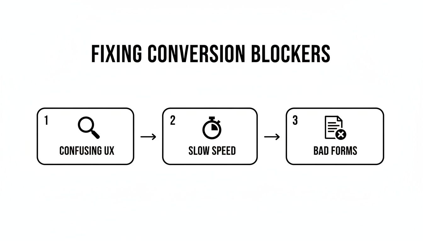
Most conversion problems boil down to a handful of usual suspects. Instead of getting overwhelmed trying to fix everything at once, focus your investigation on these four high-impact areas:
Confusing User Experience (UX): Is your navigation a mess? Are key buttons buried? A confusing layout makes people think too hard, and when they have to think too hard, they just leave. Session recordings are pure gold here—you can literally watch real users get stuck or "rage click" on things they wish were interactive.
Uninspired Copywriting: Does your message actually connect with anyone? If your headlines are generic or your value isn't crystal clear, visitors won't know why they should bother sticking around. Your copy needs to speak directly to their pain points and confidently show them the way forward.
Frustrating Forms: Is your signup or checkout process a total chore? Long, clunky forms are a classic conversion killer. Form analytics tools are great for this, pinpointing the exact field where people give up and abandon the process. That's your bullseye for simplification.
Slow Website Performance: Does your site feel sluggish? Speed isn't just a nice-to-have; it's everything. Even a tiny delay can send potential customers straight to your competitors.
A well-designed website isn't just about looking good; it's about systematically removing these obstacles before a user ever sees them. When you build a site from the ground up, you're often creating and solving these problems at the same time, which is a slow, expensive way to learn.
This is exactly why starting with a professional foundation makes so much sense. A premium Framer template from a provider like FramerDevs, for instance, is engineered to sidestep these common pitfalls from day one. Experts have already obsessed over speed, intuitive UX, and mobile responsiveness, giving you a massive head start.
The Business Cost of Slow Speed
Of all the conversion blockers, a slow website is one of the most destructive and easily overlooked. It’s not a minor annoyance; it's a direct shot to your revenue. The data doesn't lie: every 1-second delay in page load time can slash conversions by up to 20% on mobile.
When Google made its Core Web Vitals a ranking factor, it hammered this point home, effectively punishing slow sites. Pages that fail these metrics see a 24% higher bounce rate, which is a screaming signal to search engines that your site delivers a poor user experience. You can dig into more data on how speed impacts user behavior and CRO statistics on WeAreTenet.
The big challenge for most founders is that optimizing for speed is a deeply technical job. It means diving into image compression, code minification, and server-side tuning—things that are way outside the wheelhouse of most marketers and entrepreneurs.
This is where the business case for a professionally built template becomes undeniable. At FramerDevs, our library of over 100 templates for SaaS, agencies, and events is performance-tuned for Framer and Webflow. We’ve helped over 5,000 users slash their load times and nail their Core Web Vitals without writing a single line of code.
By starting with a template that’s already optimized for peak performance, you’re not just buying a pretty design. You're buying speed, reliability, and a higher conversion rate from day one. This frees you up to focus on what you do best—your business, your content, and your customers—instead of getting bogged down in technical tweaks better left to the pros.
Creating Your Experimentation Roadmap
You’ve done the detective work and now have a running list of conversion blockers. So, where do you start? A scattered, “fix-it-all” approach rarely works. You’ll just end up with burnout and mediocre results.
To see real, meaningful improvements in your conversion rate, you need a plan. This is where you transform that messy list of ideas into a structured experimentation roadmap. Top-performing teams don't guess; they use a simple system to decide what to tackle first, focusing their energy on changes that actually move the needle.
Prioritize Your Ideas With the PIE Framework
A brilliant tool for this is the PIE framework. It helps you score and rank your optimization ideas logically, taking all the guesswork out of what to do next. PIE stands for Potential, Importance, and Ease.
Here’s how it works. For each idea on your list, you give it a score from 1 to 10 across three categories:
Potential: How much room for improvement is there? High-traffic pages with surprisingly low conversion rates are your sweet spot.
Importance: How valuable is the traffic to this page? Your pricing and checkout pages are obviously far more important than a blog post from three years ago.
Ease: How quickly can you get this done? A simple copy tweak is a quick win. A complete checkout flow redesign is a major project that requires a lot more resources.
Once you score your ideas, you’ll have a data-informed priority list right in front of you. This simple exercise ensures you're putting your time and energy where they'll generate the biggest return.
It's not about finding the one 'perfect' idea to test. It's about systematically tackling the most promising ones first. This structured approach builds momentum and turns optimization from a chaotic guessing game into a predictable growth engine.
Formulate Strong Hypotheses
Once you've picked a high-priority idea, you need to turn it into a testable hypothesis. A vague goal like "improve the homepage" is completely useless for testing. A strong hypothesis is specific, measurable, and built on a clear "why."
A solid hypothesis always follows this structure: "By making [this change], we will achieve [this outcome] because [this reason]."
Let's look at an example:
Weak Idea: "Make the CTA button better."
Strong Hypothesis: "By changing the CTA button color from gray to a high-contrast orange, we will increase clicks by 15% because the new color will create a stronger visual anchor, drawing more user attention."
That level of clarity is non-negotiable. It forces you to think through the logic behind your test, making it much easier to analyze the results later and learn from both your wins and your losses.
This is all about targeting the specific blockers holding your conversions back—things like confusing UX, slow page speed, or poorly designed forms.
Each of these blockers requires a specific solution, which you can then frame as one of these strong, testable hypotheses.
The Power of A/B Testing (And When to Skip It)
A/B testing is the gold standard for validating your hypotheses. You create two versions of a page—an 'A' and a 'B'—and show them to different segments of your audience to see which one performs better. It’s a direct head-to-head competition.
But hold on. Not every single change needs a full-blown A/B test. If you find something that's obviously broken, like a checkout button that doesn't work or a form that won't submit on mobile, just fix it. Don't waste time testing it.
The real power of A/B testing comes into play when you're making strategic changes to high-impact pages. This is where professional templates give you a massive leg up. When you start with a premium template from a provider like FramerDevs, you aren't just getting a beautiful design. You also get the included Figma source files.
This is a huge advantage for experimentation.
Instead of building test variations from scratch, your team can use the Figma files to quickly design and prototype changes. This dramatically speeds up the entire process of creating and launching A/B tests. You can run more experiments, learn faster, and run a sophisticated CRO program without needing a huge team or budget.
High-Impact Landing Page Optimizations

While a full-blown CRO program is a long game, you can get some of your biggest wins right now by fixing your landing pages. These are the front lines where conversions happen. This is especially true on no-code platforms like Framer, where you can make immediate, high-impact changes that get you real results, fast.
The trick isn't to scrap everything and start over. It’s about making small, surgical tweaks—finding the weak spots and reinforcing them with principles that are proven to work. Most of the time, the gap between a page that converts and one that flops comes down to just a few key elements.
Nail Your Headline and Value Proposition
The moment someone hits your page, a clock starts ticking. You have about five seconds to answer their silent question: "What’s in it for me?" Your headline and sub-headline are your only shot to make that first impression stick. If they're vague, generic, or just a list of features, you've already lost them.
A great headline isn’t clever; it’s crystal clear. It has to instantly spell out the main benefit and resonate with the visitor's problem.
Don't: "Next-Gen Task Management Solution"
Do: "Stop Juggling Tasks. Organize Your Entire Workflow in Minutes."
See the difference? The second one speaks directly to a pain point and promises a clear outcome. It's about them, not you. This is a core philosophy we build into every FramerDevs template—the messaging hierarchy is engineered for clarity from the second the page loads.
Design a Compelling Call-to-Action
Your Call-to-Action (CTA) is the single most important button on your page. It needs to be impossible to miss, both visually and psychologically. Too many sites cripple their conversions with weak, passive CTAs like "Submit" or "Learn More." Those words create zero urgency and communicate no value.
Instead, your CTA should be an action-oriented command that reminds the user of the value they're about to get.
Instead of "Sign Up," try "Get My Free Account."
Instead of "Submit," try "Start My 7-Day Trial."
The button itself has to pop. Use a high-contrast color that stands out from the rest of your design and give it plenty of white space so the eye is drawn right to it. If your CTA blends in, it will be ignored.
Build Trust With Social Proof and Security
Before anyone hands over their email or credit card, they need to trust you. Social proof is the fastest way to build that credibility. It works by showing visitors that people just like them have already trusted you and had a good experience.
You're not just selling a product; you're selling confidence. Social proof is the most powerful currency for building that confidence, especially for a new visitor who has never heard of you before.
Make sure to place these trust-builders near your main CTA to crush any last-minute hesitation:
Testimonials: Use real quotes from actual customers. Add names and photos for an instant dose of authenticity.
Case Studies: Show concrete results. "Increased leads by 45%" is far more powerful than a generic positive review.
Partner Logos: Displaying logos of well-known companies you've worked with creates a credibility "halo effect."
Security Badges: If you process payments, showing security seals (like Norton or McAfee) reassures users that their information is safe.
For an even faster path to a high-converting site, you can check out our deep dive into more landing page best practices.
Add Instant, On-Page Support
Another powerful way to improve your website's conversion rate is to answer user questions in real time. Adding a live chat or a well-configured chatbot can boost conversions by 20-40%, simply by being there to resolve doubts instantly. By 2026, 48% of buyers will expect to see live chat on a website; without it, 57% will just leave.
When building with Framer, our team at FramerDevs often integrates chat solutions for clients through our free customization service. We make sure the placement feels natural and doesn't hurt the ultra-fast performance of our designs.
These high-impact optimizations aren't just random tweaks. They're grounded in a deep understanding of user psychology and behavior. While you could build all these elements from scratch, it often involves a ton of trial and error. A premium template from a trusted provider like FramerDevs comes with these conversion-focused principles already baked in, saving you countless hours of guesswork and letting you launch a high-performing site in a fraction of the time.
How to Measure, Iterate, and Scale Your Success
Running an A/B test is the easy part. The real work—and the real growth—begins after the test ends. This is where you transform one-off experiments into a reliable, data-driven system for improving your site.
Conversion rate optimization isn’t a one-time fix; it's a continuous cycle of learning and refinement. Done right, it becomes a powerful engine that consistently lifts your conversions.

Let's break down how to analyze your results, build on what you've learned, and scale your success.
Analyzing and Learning From Your Test Results
Every test you run is a goldmine of information, whether it’s a huge win or a disappointing flop. The secret is to analyze the results with discipline. A test isn't really “done” until it hits statistical significance, which is usually a 95% confidence level.
This step is non-negotiable. It confirms your results aren't just random luck. Calling a test early just because one version is pulling ahead is one of the most common mistakes in CRO—it’s a recipe for acting on false data.
Once a test is officially complete, document everything. Seriously, everything.
Hypothesis: What did you predict would happen, and why?
Results: What was the actual impact on your key metrics? Did sign-ups go up? Did bounce rate go down? Be specific.
Learnings: What did this teach you about your visitors? Did they prefer simpler language? Did a new button color grab more attention?
This documentation becomes your internal playbook. Over time, you build an invaluable knowledge base on what actually moves the needle for your audience.
Building a Culture of Data-Driven Decisions
True CRO success happens when testing becomes part of your company’s DNA. It’s about shifting from decisions based on gut feelings or the "highest-paid person's opinion" to strategies backed by cold, hard evidence.
A culture of testing doesn't just improve your website; it improves your business. It forces you to stay close to your customers, understand their needs deeply, and build a company that adapts and evolves based on real-world feedback, not internal assumptions.
When you create this loop of testing, learning, and iterating, you build momentum. Each win gives you the confidence and buy-in for bigger, bolder experiments, creating a powerful growth cycle. Understanding the top benefits of workflow automation can also help streamline these processes and keep your team focused on high-impact work.
The FramerDevs Advantage for Strategic Optimization
Here’s a hard truth: you can't focus on high-level strategic optimization if you’re constantly putting out fires. If your team is stuck fixing slow page speeds, wrestling with a clunky mobile layout, or untangling confusing navigation, you’re playing defense. You have no time or energy left for the strategic work that drives real growth.
This is where starting with a solid foundation makes all the difference. Our premium Framer templates at FramerDevs are engineered by experts to be a high-performing, conversion-ready base from day one.
Speed: Our templates are built for elite performance, so you’re not fighting against slow load times that kill conversions.
Quality: They follow proven UX principles and best practices, meaning you’re not starting the race by fixing rookie usability mistakes.
Optimization-Ready: With included Figma files, your team can design, build, and launch A/B test variations with incredible speed.
By choosing FramerDevs, you skip the frustrating foundational fixes. Instead, you get to focus your energy where it generates the most value: on strategic testing, deep customer learning, and scaling what works. This approach doesn't just give you a better website—it leads to faster growth and a stronger business.
Common Questions About CRO
Diving into conversion rate optimization can feel overwhelming, especially if you're a founder or designer wearing multiple hats. You've got questions, and you need clear answers to start making progress. Let's break down some of the most common queries we hear from people just getting started.
What Is a Good Conversion Rate to Aim For?
This is easily the most popular question, and the honest answer is always: it depends. A "good" conversion rate is all about context. It shifts dramatically based on your industry, traffic source, what you're asking users to do, and even how much your product costs. You might see people throwing around global averages like 2-4%, but chasing a generic number is usually a waste of time.
Instead of getting hung up on industry averages, focus on setting your own baseline and then working to beat it. That's the only benchmark that really matters.
To put it in perspective, here’s how different goals can have wildly different success rates:
B2B SaaS Demo Request: A 2% conversion rate here would be fantastic.
E-commerce Purchase: For a high-ticket item, a solid 1.5% is a great achievement.
Newsletter Signup: You might aim for something closer to a 5% conversion rate.
Your goal is to improve your own numbers, month after month. The best way to start from a higher baseline is to build on a foundation engineered for conversions. For instance, launching with a premium template from a provider like FramerDevs means your site already benefits from expert-led design choices, giving you a much stronger starting point than a blank canvas.
How Long Should I Run an A/B Test?
How long an A/B test should run comes down to two things: your website traffic and hitting statistical significance. You're aiming for a 95% confidence level, which is just a fancy way of saying you're sure the results are from your changes, not random luck.
Whatever you do, don't stop a test early just because one version is pulling ahead. This is a rookie mistake that leads to bad decisions based on false positives. User behavior can be completely different on a Tuesday than it is on a Saturday, so you need to let the test run long enough to see the full picture.
As a rule of thumb, run your test for at least two full business cycles—which usually means a minimum of two weeks. This helps iron out any weird spikes or dips in traffic and user behavior.
If you want to get more precise, use an A/B test duration calculator online. You can plug in your current numbers to estimate how long you’ll need to run the test to get data you can trust. The goal here is confidence, not speed.
Build From Scratch or Use a Template for Better Conversions?
Building from scratch gives you total creative control, but it's a minefield of conversion traps. It’s incredibly easy to accidentally introduce slow load times, a messy mobile experience, or a confusing user flow—all silent killers for your conversion rate.
For most startups, marketing teams, and agencies, starting with a premium, conversion-focused template is faster, safer, and just plain smarter.
Here’s why a template-first approach almost always wins for getting results:
Speed to Market: You can launch a polished, professional site in days, not months.
Built-in Best Practices: These templates are already optimized for speed, UX, and SEO by experts who know what actually converts.
Smarter Resource Use: It frees you up to focus your time and money on your copy, your offer, and your marketing—not on reinventing the wheel with basic site structure.
A professional template isn't a design shortcut; it's a strategic business move. You're leveraging expert knowledge to get better results, faster.
When you choose a trusted provider like FramerDevs, your site is engineered for performance right out of the box. You get to skip the painful (and expensive) learning curve of fixing foundational mistakes and jump straight to high-impact optimization.
What's the Difference Between UX and CRO?
User Experience (UX) and Conversion Rate Optimization (CRO) are two sides of the same coin, but they aren't the same thing. Knowing the difference is key to building a strategy that actually works.
User Experience (UX) is all about the big picture. It’s the overall feeling a user gets on your site. Is it easy to use? Is it intuitive? Is it pleasant? The main goal of UX is to make the user happy and reduce friction.
Conversion Rate Optimization (CRO) is focused and data-driven. It's a systematic process for getting more users to take one specific action, whether that’s buying a product, signing up, or booking a demo.
Here's an easy way to think about it: UX builds a smooth, wide-open highway for your users. CRO adds the clear, compelling signs that guide more of those cars to your desired exit.
You simply can't have good CRO without a solid UX foundation. It’s impossible to optimize conversions if your site is frustrating, slow, or confusing. A great user experience makes the journey easy, while CRO fine-tunes the messages along the way to make sure more people reach the final destination.
Ready to stop worrying about foundational conversion issues and start focusing on growth? With a library of 100+ conversion-optimized templates, FramerDevs provides the professional foundation you need to launch a high-performing site in record time. Explore our premium Framer templates and launch with confidence.


