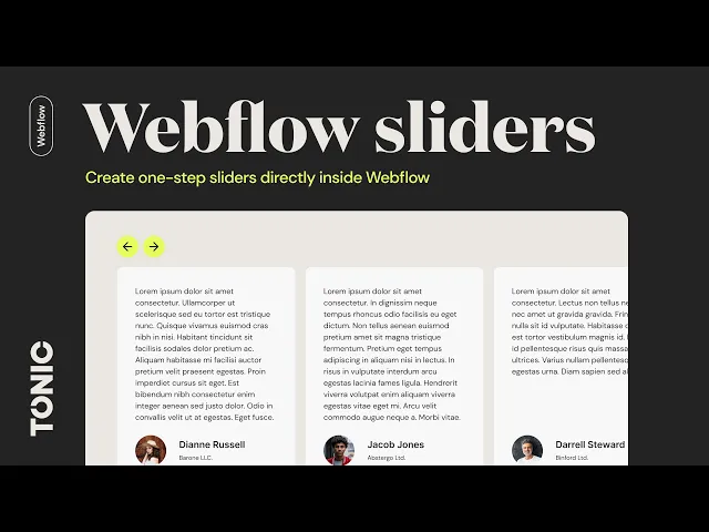
Build a Stunning Before and After Slider in Framer

A before-and-after slider is one of the most compelling ways to show a transformation. It’s a simple interactive component that lets users drag a handle to compare two images, revealing the change in real-time. It’s perfect for showing off a website redesign, a photo edit, or the impact of a physical product.
Why Visual Transformation Sells
That simple slider is more than just a neat trick; it's a storytelling tool. We’re all naturally drawn to change, and an interactive slider puts the user in control of that discovery. When they drag the handle themselves, the transformation feels more personal and impactful. It’s an engaging experience they won't forget.
Whether you’re demonstrating a sleek redesign, a home renovation, or the effects of a photo filter, a slider offers immediate, undeniable proof of value. It directly answers the question, "So, what's the real difference?"
The Big Problem with Generic Website Sliders
But let's be clear—not all sliders are good sliders. The web is full of those auto-playing carousels that everyone has learned to ignore. It’s a real phenomenon called "banner blindness," and these sliders often do more harm than good by hiding key information and slowing down your site.
The data on this is pretty damning. One study found that only 1% of visitors actually click on a website carousel, and most of those clicks land on the very first slide. On the other hand, sites that replaced generic sliders with a single, focused static hero image saw engagement jump by over 60% and conversions increase by 30-50%.
To help you decide, here’s a quick comparison of how a typical slider stacks up against a static image.
Slider vs. Static Image: A Quick Comparison
Metric | Typical Website Slider | Static Before-and-After Image |
|---|---|---|
User Engagement | Very Low (<1% clicks) | High (when well-chosen) |
Page Load Speed | Slower (multiple large images) | Faster (single optimized image) |
Information Retention | Poor (hides content) | Excellent (clear and focused) |
Conversion Impact | Often Negative | Often Positive |
This table makes it clear: a generic, multi-image carousel is often a conversion killer. But a focused, single-comparison before-and-after slider? That’s a totally different story.
A generic, multi-image carousel is a conversion killer. A purposeful, single-comparison before-and-after slider is a conversion driver.
A Smarter, Conversion-Focused Approach
The secret is to use interaction with a clear purpose. A great before-and-after slider isn't a carousel; it's a specialized tool for showing one powerful transformation. This is where professional execution is make-or-break.
Building one from scratch seems like a fun challenge, but it’s easy to run into some all-too-common issues:
Poor Performance: Sliders often rely on large, unoptimized images that can kill your page speed, hurting both SEO and user experience.
Accessibility Gaps: Without the right ARIA attributes and keyboard navigation, your slider becomes completely unusable for visitors with disabilities.
Responsiveness Issues: A DIY slider might look great on your desktop but break completely on a phone or tablet, creating a mess for mobile users.
This is exactly why we, at FramerDevs, engineer our premium Framer templates with pre-optimized components like the before-and-after slider. We believe your time is better spent growing your business than debugging code. Our templates provide tools that are already fast, fully responsive, and built with accessibility best practices in mind.
Instead of wrestling with code and optimization, you can just drop it in and focus on telling your story, knowing the mechanics are flawless and align with modern landing page best practices.
Creating Your Before and After Slider Without Code
Building your own interactive components is a fantastic way to get your hands dirty and really understand how Framer works. Let's quickly cover the basics of creating a before and after slider on the canvas, so you can appreciate what goes into a high-quality component.
The concept is pretty clever. You essentially stack your "before" and "after" images inside a parent Frame. The magic comes from using a second Frame as a clipping mask over the top image. You then link a draggable handle to control the width of that mask, revealing the image underneath as you drag it. It’s a smart use of Framer’s native tools to create a dynamic effect.
The Trade-Off Between Building and Buying
While building this from scratch is an excellent learning exercise, it’s also where the real-world trade-offs hit you. Getting a basic version working might take an hour or two. But then the real work begins: making it fully responsive, adding accessibility features, and optimizing it so it doesn't slow down your site. A simple project can quickly balloon into a multi-day headache.
This is where you start to see the huge value in a professionally engineered solution. For business owners and agencies, time is money. Spending ten hours perfecting a single component is ten hours you’re not spending on client work, strategy, or growing your business.
Building a slider yourself is an investment in learning. Using a premium template is an investment in your business. It’s about choosing the right tool for the right goal—education versus execution.
This simple flow chart shows the direct path from a visitor interacting with your slider to a real business outcome.
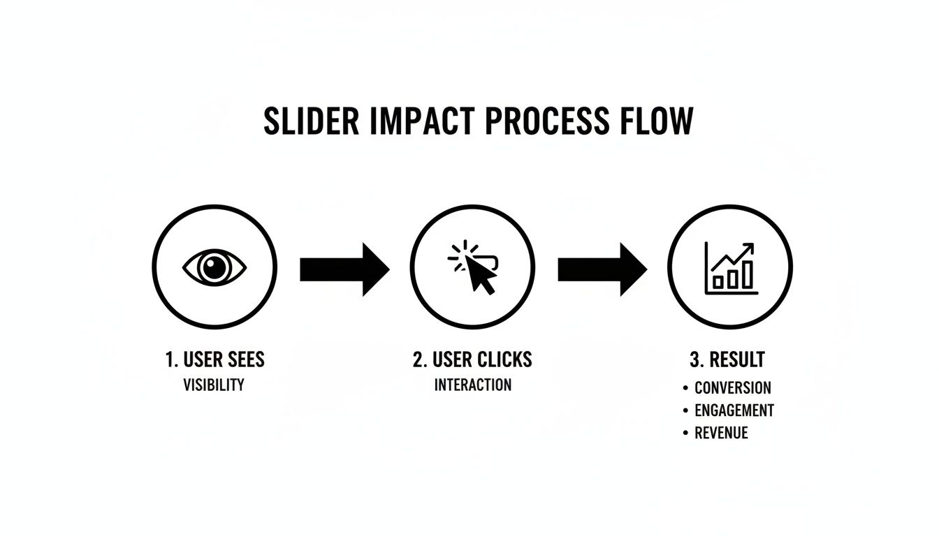
It proves that a well-made slider isn't just a cool visual. It's a tool that drives engagement and leads directly to measurable results.
The Unseen Work Behind a Premium Component
When you grab a component from a FramerDevs template, you’re not just getting a pre-built element. You're getting a product that has already gone through hundreds of hours of design, development, and testing by our team of experts.
Here’s a glimpse of what happens behind the scenes:
Performance Optimization: Every script and image is compressed and optimized for near-instant loading. We make sure our components never hurt your Core Web Vitals.
Total Responsiveness: The slider is battle-tested across dozens of screen sizes, from the smallest phone to a massive 4K monitor, ensuring a flawless experience everywhere.
Accessibility Compliance: We build with ARIA attributes and keyboard navigation from the very start. This makes your site inclusive and usable for everyone.
Conversion-Focused Design: Every detail—the handle's design, the animation smoothness, the caption placement—is based on UX principles proven to maximize engagement.
Achieving this level of quality requires a deep understanding of design, development, and user behavior—expertise that is baked into every single one of our templates.
For any freelancer or agency, presenting a client with a polished, high-performing site is non-negotiable. A clunky, slow, or broken slider can completely undermine the credibility of an entire project. Starting with a professional FramerDevs template lets you sidestep all those risks. You get to deliver top-tier quality at speed, reinforcing your reputation as an expert and freeing you up to take on more projects with confidence. It transforms the before-and-after slider from a potential headache into a powerful asset.
Taking Your Slider from Functional to Flawless
Getting a before-and-after slider to work is one thing. But making it feel premium, polished, and fast? That's where the real work begins. The small details—like the style of the drag handle, the clarity of the labels, and the smoothness of the animation—are what separate a clunky DIY component from a professional-grade asset.
This is also where performance becomes non-negotiable. A slow-loading slider can be worse than having no slider at all. Your images must be ruthlessly optimized to keep your page load instant. Slow pages don't just frustrate users; they actively drag down your search rankings.

Refining the Style and Interaction
Your slider's design needs to feel like a natural extension of your brand. Think about the drag handle—is it a simple line, or could it be a branded icon? You can also add subtle "Before" and "After" labels that guide the user without creating visual clutter. These touches make the interaction feel intentional.
The animation itself is what sells the experience. A buttery-smooth drag effect feels satisfying and high-quality. A jittery one feels cheap. These are the details that build trust and communicate the quality of your work to your audience.
A well-designed slider doesn't just show a transformation; it provides a seamless, high-quality interaction that reflects the quality of your brand.
Why Image Optimization Is Not Optional
The single biggest performance killer for any image slider is, without a doubt, the images themselves. Forcing a browser to load two massive, uncompressed photos can add whole seconds to your page load time, especially on a mobile connection.
Here are the absolute must-dos for keeping your slider images fast:
Use Modern Formats: Ditch JPEGs and PNGs for your slider. Convert your images to WebP, a modern format that delivers excellent quality at a much smaller file size.
Resize Before Uploading: Never use a 4000px wide photo for a slider that only needs to be 800px wide. Resize your images to their maximum display dimensions on your computer before you upload them.
Compress, Then Compress Again: Run your resized images through a tool like TinyPNG or Squoosh. You can often cut the file size by 70% or more with almost no visible difference in quality.
Getting this right is crucial, and it’s one of the most common mistakes people make when building from scratch. It’s also where a professional template gives you an immediate leg up. Every FramerDevs template is built for speed, with all image assets and components already optimized by our experts. You might be interested in our guide on how a well-optimized site, even with dynamic elements like a dark mode option, contributes to a better user experience.
Context is everything. While auto-playing carousels on a homepage often tank conversions, a purposeful before-after slider can increase sales by 500% and dramatically boost how long users stay on your page. The key is that it’s an interaction with a clear purpose, which is why expert implementation matters so much. You can discover more insights about the impact of image carousels on The Good to understand this better.
Making Your Slider Responsive and Accessible
A slick-looking slider that breaks on mobile or can't be used with a keyboard is worse than no slider at all. It frustrates users and makes your site feel unprofessional.
For any interactive component, especially a before-and-after slider, you have to get two things right: responsiveness and accessibility. These aren't just "nice-to-haves"; they are what separate a cool gimmick from a genuinely useful tool that works for everyone.

Building an Inclusive Experience
Accessibility can't be an afterthought you tack on at the end. It has to be baked in from the start. A slider that only works with a mouse is simply broken for a huge part of your audience.
Here’s what it takes to make a slider truly accessible:
Keyboard Navigation: Users need to be able to tab to the slider handle and move it with the arrow keys. This is absolutely fundamental for anyone who doesn't use a mouse.
Screen Reader Support: Without the right ARIA attributes, a screen reader has no idea what's happening. Using tags like
aria-valuenowtells the user the slider's position (e.g., "45%"), making the interaction clear.Clear Labeling: Both the "before" and "after" images need descriptive
alttext. This ensures users with visual impairments understand what comparison is being shown.
Let's be honest—building this from scratch is a massive headache. It means diving deep into web standards and testing across countless devices and screen readers. This is one of those areas where a pre-built, professional solution really shows its value.
Mastering Responsiveness in Framer
Framer’s responsive tools are incredibly powerful, but you still have to put in the work to configure them correctly. You need to think through how your slider will adapt across every breakpoint. Does it shrink proportionally? Does the drag handle get bigger on mobile for easier tapping?
Getting responsiveness and accessibility right is tedious but non-negotiable. It’s the difference between a component that just looks good on your Mac and one that works for every single user, everywhere.
This is precisely why so many agencies and startups turn to FramerDevs templates. We’ve already poured hundreds of hours into perfecting these details. Every component we build has been battle-tested to be fully responsive and accessible right out of the box.
Instead of fighting with breakpoints and ARIA attributes, you can drop in a slider knowing it already meets professional standards. This frees you up to focus on what actually moves the needle—like generating leads and closing deals—confident that your site delivers a world-class experience to everyone. You launch faster with a better, more inclusive product.
Exploring Alternatives for No-Code Builders
While Framer’s component-based approach makes creating a before and after slider feel almost effortless, plenty of designers live and breathe in other no-code tools like Webflow. It’s worth looking at how you’d build the same effect there, because it really highlights the different philosophies behind each platform.
In Webflow, you’re in for a more hands-on, layered process. You'll start by structuring your images inside a div block, carefully setting position properties like relative and absolute, and then rolling up your sleeves for a dive into Webflow’s IX2 interaction engine.
Building the Slider in Webflow
Getting this done in Webflow requires a much more manual approach. You have to explicitly link what the user does (moving their mouse) to what the elements on the page do (resizing an image). It's a fantastic way to learn the raw mechanics of web interactions, but it's definitely not a quick job.
Here’s a rough idea of the steps involved:
Trigger Setup: You'd kick things off by creating a "Mouse move over element" trigger on your main slider wrapper.
Action Configuration: From there, you configure an action that grabs the cursor's X-position and uses that value to dynamically change the width of the top image’s container or clipping mask.
Custom Code: Want a draggable handle that follows the cursor? You’ll likely need to drop in some custom JavaScript to make that happen smoothly.
This setup gives you a ton of control, but it also shows the trade-off. Every hour spent fine-tuning interactions and debugging custom code is an hour you’re not spending on other critical parts of the project.
The core difference lies in workflow efficiency. Framer's component-based system often simplifies creating complex interactions, whereas Webflow provides granular control through its interaction engine, which can require a deeper setup.
For many projects, the sheer speed and quality you get from a pre-built solution is a no-brainer. Our library of premium Framer templates gives you access to perfectly optimized components right out of the box. This frees up your team to focus on the bigger picture—strategy, content, and client needs—not wrestling with interaction settings.
And while no-code tools are incredibly powerful, there are times when a project's complexity calls for a different approach. For highly unique integrations or a completely bespoke build, exploring professional website design services can deliver results that are tailored to your exact needs.
Ultimately, knowing how to get things done across different platforms makes you a smarter, more efficient designer. You learn to recognize when a custom build is a valuable learning exercise versus when a professional template is the fastest path to delivering a top-tier result for your clients or your own business.
Answering Your Top Questions About Before-and-After Sliders
Whenever I talk to designers about adding a before-and-after slider, the same few questions always pop up. They’re great questions, too, because the answers directly impact your project’s success. Let's get them answered.
Can a Slider Hurt My Website's SEO?
Absolutely—if it’s built the wrong way. The number one killer is page speed. If your slider is loaded with huge, unoptimized images, it will drag your site's performance down. That’s a massive red flag for Google and an instant turn-off for visitors.
To prevent this, you have to be relentless about image optimization. Compress everything and use modern formats like WebP. An even smarter move is to start with a component built by pros who live and breathe performance.
The fastest way to get a performant, SEO-friendly slider is to use a premium template. At FramerDevs, our components are engineered from the ground up for speed, ensuring your visuals enhance UX without tanking your search rankings.
What Are the Best Use Cases for a Slider?
A before-and-after slider really shines when it shows a clear, high-impact transformation. It’s not for subtle tweaks; it’s for the kind of dramatic reveal that makes people stop and say, "Wow."
Think about these scenarios:
Design Agencies: Showing off a complete website or brand redesign.
Renovation Companies: Displaying a stunning room makeover.
Aesthetic Services: Highlighting the results of a cosmetic treatment.
Photo Editors: Demonstrating the power of a filter or editing technique.
If your "after" version provides an immediate and obvious upgrade, a slider is a fantastic, engaging tool.
Is It Better to Build It Myself or Use a Template?
Building your own slider is a great way to get your hands dirty and learn Framer's tools. I'd even recommend it as a personal learning project.
But for a live business or a client project? The DIY approach is risky. Suddenly, you're on the hook for performance tuning, cross-browser testing, accessibility compliance, and making it perfectly responsive. It’s a ton of work, and it's easy to get wrong.
For most professionals, the math is simple. Your time is better spent on growing the business, not reinventing a complex component. A premium template from FramerDevs gives you a battle-tested, fully optimized, and accessible slider right out of the box. You'll launch faster with a higher-quality result and can focus your energy where it matters most—on business growth and client success.
Ready to skip the headaches and launch a stunning, high-performing website? With FramerDevs, you get access to a library of premium templates featuring perfectly optimized components like the before-and-after slider. Start your project with confidence and quality at https://framerdevs.com.


