
Elevate Your Framer Site: Expert Conversion Optimization Tips

A beautiful website is no longer enough; it needs to convert. For no-code designers and marketing teams using powerful tools like Framer, turning visitors into customers is the ultimate measure of success. Yet, many teams spend countless hours building sites from scratch, only to see high bounce rates and low engagement. This is rarely a design problem, but a conversion problem. The key to bridging this gap lies in proven conversion optimization principles.
This guide provides 10 powerful conversion optimization tips tailored specifically for the Framer ecosystem. We'll move beyond generic advice and give you actionable strategies to improve everything from page speed and value propositions to CTAs and social proof.
More importantly, we'll show you how starting with a professionally architected foundation, like a premium FramerDevs template, can shortcut your path to a high-performing site. This approach saves you months of trial-and-error, bypassing the common pitfalls of building from a blank canvas. By using a pre-optimized structure, you can focus on what truly matters: growing your business. Let's get started.
1. Optimize Landing Page Load Speed and Performance
Page speed is one of the most critical conversion optimization tips because a slow site directly costs you customers. Research consistently shows that for every second a page takes to load, bounce rates increase dramatically. A visitor who leaves before your offer even appears is a lost conversion, making performance a fundamental prerequisite for success.
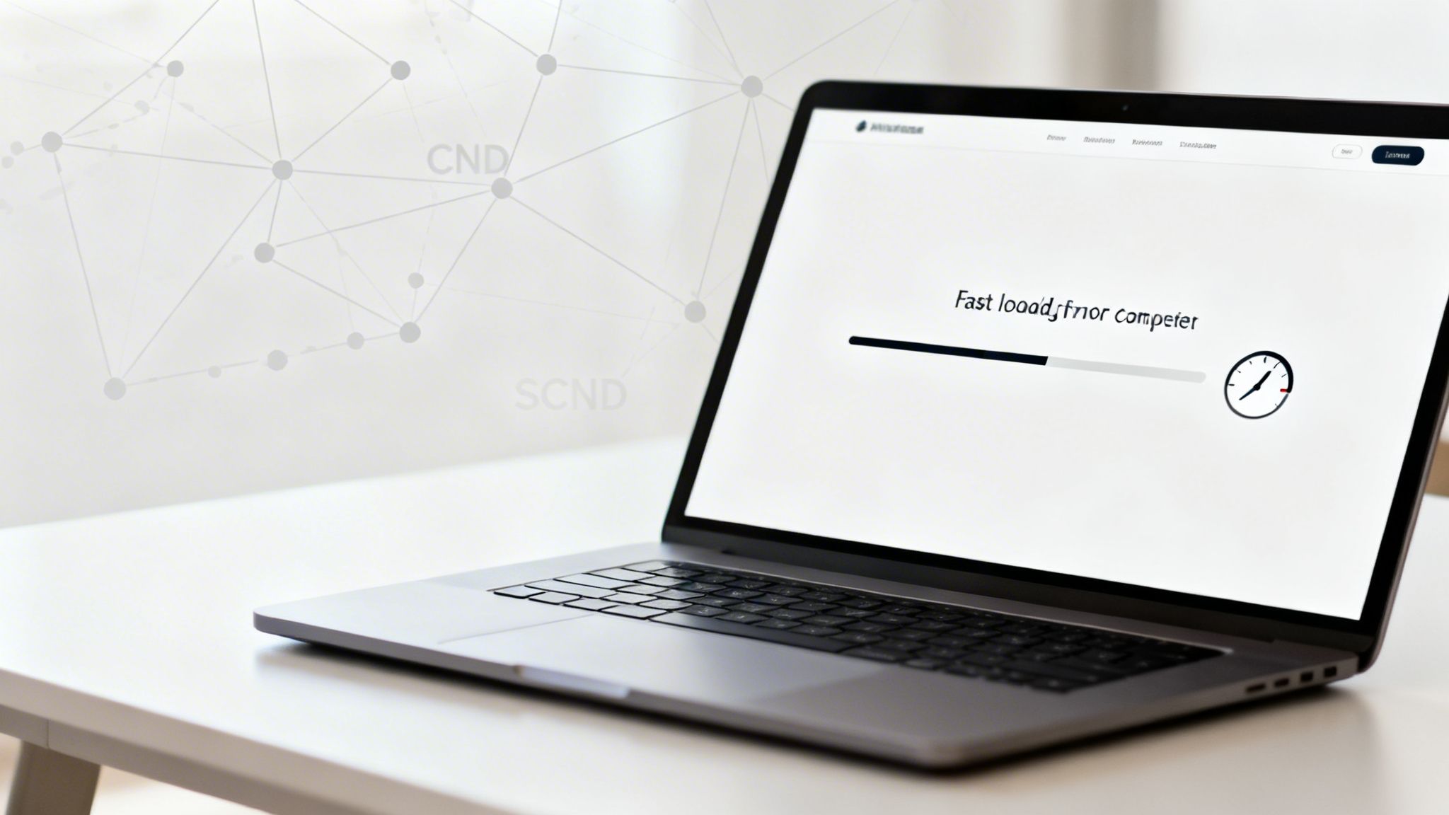
For no-code creators on Framer, achieving elite performance is more accessible than ever. The platform includes powerful built-in optimization features, but how you build matters. A fast-loading site feels trustworthy and respects the user's time. Instead of building from a blank slate and risking performance pitfalls, starting with a professionally engineered template is a more strategic approach. For example, FramerDevs premium templates are built with performance as a top priority, often achieving load times under two seconds right out of the box, ensuring you launch with an immediate competitive advantage.
Actionable Tips for Better Performance
Test and Monitor: Regularly run your site through Google PageSpeed Insights and GTmetrix to identify bottlenecks.
Optimize Media: Use Framer’s built-in image compression for all visuals. Choose modern formats like WebP where possible.
Mind Your Scripts: Limit third-party integrations (like analytics or chat widgets) to only what is absolutely necessary. Each script adds to your load time.
Start with a Fast Foundation: Choose a template built for speed. This ensures your site has a solid performance baseline from day one, which is one of the core landing page best practices for conversions.
2. Clear and Compelling Value Proposition Above the Fold
Your value proposition must be immediately visible and understandable within the first viewport, before a user scrolls. This core message communicates why someone should care about your product or service. A weak or confusing headline is one of the quickest ways to lose a potential customer, making a strong opening one of the most essential conversion optimization tips to master.
For SaaS founders and agencies, a powerful hero section ensures visitors instantly grasp your key benefit. Framer’s design flexibility allows for visually stunning layouts, but crafting a truly effective value proposition from a blank canvas is difficult. A professionally designed template from a provider like FramerDevs solves this by structuring the hero section around proven conversion principles. These templates build in the visual hierarchy and messaging framework, giving you a massive head start in communicating your value clearly from the moment a visitor lands.
Actionable Tips for a Better Value Proposition
Focus on Differentiation: Start with what makes you unique, not a list of features. Use power words like "Fast," "Proven," or "Exclusive" to grab attention.
Test and Iterate: Don't settle on your first headline. Use A/B testing tools to compare different versions and see what resonates with your audience.
Prioritize Mobile: Ensure your headline and sub-headline are perfectly readable on mobile devices. This often means increasing font sizes for smaller screens.
Add Quick Proof: Reinforce your claim by including a trust signal near the headline, such as "Trusted by 10,000+ creators" or "Featured in Forbes."
3. Strategic Calls-to-Action (CTAs) with Contrast and Clarity
Calls-to-action are the pivotal mechanisms of conversion, guiding users from passive browsing to active engagement. A CTA is not just a button; it's a clear directive telling your visitor what to do next, whether it's signing up, buying a product, or booking a demo. Effective CTAs are one of the most powerful conversion optimization tips because they eliminate ambiguity and directly impact your bottom line.
Designing CTAs with strong visual contrast, clear copy, and strategic placement can dramatically improve click-through rates. A well-designed CTA journey is essential, guiding users through incremental steps. Instead of relying on a single, generic button, a professional approach can build momentum. Using a FramerDevs template gives you a pre-built, conversion-focused CTA structure, ensuring your most important actions are always front and center without requiring extensive trial and error. This expert-led design ensures your site is ready to convert from day one.
Actionable Tips for Better CTAs
Prioritize Clarity and Action: Use first-person, action-oriented words like “Get My Free Trial” or “Start Building” instead of generic terms like “Submit.”
Ensure High Contrast: Your button color must stand out from the background. Aim for a WCAG AA contrast ratio of at least 4.5:1 to ensure visibility for all users.
Strategic Placement: Place your primary CTA above the fold where it’s immediately visible. Repeat it further down the page for longer landing pages.
Test and Refine: Don't settle for your first idea. A/B test different button copy, colors, and placements to discover what resonates most with your audience. This approach is a core part of building high-converting pages, much like those found in our collection of event landing page examples.
4. Social Proof and Trust Signals (Reviews, Testimonials, Logos)
People are naturally inclined to follow the actions of others, a principle that makes social proof one of the most powerful conversion optimization tips available. Instead of trusting your marketing claims, potential customers look for unbiased proof that your product or service delivers on its promises. Integrating elements like testimonials, user counts, and client logos signals that others have already found value, reducing friction and building instant credibility.

For SaaS founders and designers, this is non-negotiable. Your landing page must answer the visitor’s question: "Can I trust this company?" Social proof provides a clear, affirmative answer. Using a professionally designed Framer template makes implementing this simple. Premium templates, such as those from FramerDevs, include pre-built sections for testimonials and client logo walls. This professional structure ensures your social proof is displayed prominently and effectively from the start, reinforcing trust without requiring custom design work.
Actionable Tips for Better Performance
Be Specific: Instead of generic praise, feature testimonials with real metrics, like "Increased our lead flow by 30%."
Time Your Request: Ask for a review right after a customer has a successful experience, such as after a project is completed or they achieve a key milestone.
Show Real Faces: Accompany testimonials with high-quality headshots of your customers. This small detail significantly boosts authenticity.
Display Trust Badges: Prominently feature SSL certificates, secure payment processor logos (like Stripe or PayPal), and any industry certifications near your CTAs and forms.
5. Mobile Optimization and Responsive Design
With over 60% of all web traffic coming from mobile devices, a subpar mobile experience is a direct barrier to conversions. This is one of the most critical conversion optimization tips because a site that is difficult to use on a phone leads to immediate frustration and abandonment. True mobile optimization goes beyond a simple responsive layout; it involves creating a seamless, touch-friendly journey with readable text, fast performance, and streamlined navigation tailored to smaller screens.
While Framer's powerful mobile design tools make creating responsive sites straightforward, a mobile-first philosophy is what separates good sites from great ones. To avoid the common pitfalls of responsive design, building from a professional foundation is a smart move. All FramerDevs templates are constructed with a mobile-first approach, ensuring a perfect, conversion-ready experience on any device right from the start. This guarantees your design is not just an afterthought but a core part of your conversion strategy, saving you countless hours of tedious adjustments.
Actionable Tips for Better Mobile Design
Design Mobile-First: Start your design process with the smallest screen and then expand to larger ones. This forces you to prioritize core content.
Test on Real Devices: Browser emulators are helpful, but nothing beats testing on actual smartphones and tablets to find real-world usability issues.
Simplify Mobile Forms: Limit forms to three fields or fewer on mobile to reduce friction and increase completion rates.
Use Large Touch Targets: Ensure all buttons and links have a minimum touch area of 44x44 pixels (48x48 is even better) to prevent accidental taps.
6. Conversion-Focused Form Design and Optimization
Forms are the final step before a visitor becomes a lead, making their design one of the most impactful conversion optimization tips you can implement. High-friction forms are a primary cause of abandonment; every unnecessary field adds hesitation and increases the chance a user will leave. Reducing friction can directly increase signups, demos, and sales.
For designers using Framer, optimizing forms is about balancing data needs with user experience. The goal is to make the process feel effortless. A poorly designed form can undermine all other optimization efforts. To avoid this common pitfall, it's wise to start with a structure proven to work. The forms integrated into FramerDevs premium templates, for instance, are pre-optimized for minimal friction, typically using just two or three essential fields to maximize completion rates and accelerate your lead generation.
Actionable Tips for Better Form Conversions
Be Minimalist: Start with only the absolute essentials, like an email address. Avoid asking for a phone number unless it's critical for your sales process.
Use Smart Fields: Replace open-text fields with dropdowns, selections, or smart inputs like date pickers to make filling out the form faster.
Implement Inline Validation: Provide real-time feedback and clear error messages right below the field so users can correct mistakes instantly.
Build Trust: Display trust signals like privacy policy links or security badges near the submit button to reassure users their data is safe. This is a core feature of professionally designed SaaS landing page templates.
7. A/B Testing and Data-Driven Optimization
A/B testing, or split testing, is one of erections most powerful conversion optimization tips because it replaces guesswork with hard data. The process involves creating two versions of a page element (like a headline or button) and showing each to a different segment of your audience to see which performs better. This scientific approach allows you to make decisions based on actual user behavior, not assumptions.
For no-code creators on Framer, A/B testing is an essential practice for continuous improvement. By testing one variable at a time, you can incrementally increase your conversion rates, whether that means more sign-ups, sales, or form submissions.
While setting up tests is straightforward with tools like Google Analytics and Hotjar, your starting point matters. A professionally designed template from FramerDevs gives you a high-converting baseline, allowing you to test smaller, high-impact variables rather than fixing major structural issues. This lets you focus on refinement and optimization from day one, rather than basic problem-solving.
Actionable Tips for A/B Testing
Start with High-Impact Elements: Begin by testing your main headline, call-to-action (CTA) button text and color, and form fields. These have the most direct influence on user actions.
Test One Variable at a Time: To get clear results, only change one thing per test. For example, test two different headlines while keeping the rest of the page identical.
Ensure Statistical Significance: Run your test long enough to get a sufficient sample size (usually 100+ conversions per variation) and aim for a 95% confidence level before declaring a winner.
Document Everything: Keep a log of every test, including your hypothesis, the variations, the results, and what you learned. This creates a valuable knowledge base for future optimization efforts.
8. Clear Navigation and Logical Information Architecture
Visitors should always know where they are on your site and how to find what they need. Clear navigation is one of the most fundamental conversion optimization tips because it directly reduces friction, guides users toward conversion paths, and improves the overall user experience. When a user is confused, they leave.
For no-code creators building multi-page sites, logical information architecture means organizing content hierarchically so the most important pages are the most accessible. A well-organized site feels professional and builds trust by making information easy to find. Instead of guessing how users will navigate, it's better to use a template that already has a proven, user-tested structure. FramerDevs premium templates are designed with logical information architecture, guiding users from discovery to purchase with an intuitive layout from the start, which is a key business benefit of choosing quality over building from scratch.
Actionable Tips for Better Navigation
Simplify Your Main Menu: Keep your primary navigation to 5-7 essential items, including your logo.
Use Descriptive Labels: Choose menu labels that match what your users are actually searching for, like "Pricing" instead of "Investment."
Organize Logically: Group related pages together in your menus. If you have a complex site, consider using a mega-menu to show subcategories clearly.
Test with Real Users: Conduct simple usability tests to see where visitors get stuck. Ask someone to find a specific piece of information on your site and watch them try.
Guide Users Internally: Use internal links within your body copy to guide visitors to other relevant pages, reinforcing your site's structure and improving SEO.
9. Scarcity, Urgency, and FOMO-Driven Copy
Procrastination is a conversion killer, and psychological principles like scarcity and urgency are powerful tools to combat it. By signaling that an offer is limited by time, quantity, or access, you motivate visitors to act now rather than later. This is one of the most direct conversion optimization tips for reducing hesitation and encouraging immediate decisions.
The key to using this principle ethically is authenticity. False scarcity quickly erodes trust. Integrating these triggers requires more than just adding a "Buy Now" button; it demands strategic placement and authentic messaging. Instead of wrestling with code to add timers or custom banners, a professional template can provide these features out of the box. FramerDevs templates are designed with sections ready for these persuasion elements, allowing you to implement urgency without compromising your site's integrity or design.
Actionable Tips for Better Urgency
Base It in Reality: Only use scarcity if it's true. Anchor it to real inventory, genuine early-bird pricing deadlines, or limited capacity for a service.
Use Visual Timers: For time-sensitive promotions, a visible countdown timer is highly effective at creating a sense of urgency.
Emphasize Exclusivity: Use copy like "Exclusive access for the first 100 customers" or "VIP offer" to make users feel like they are getting a special deal.
Communicate Value: Always pair urgency with a clear reminder of the benefit. It's not just about the deadline; it’s about what they will miss if they don't act.
10. Clear Value Stack and Benefit Communication (Not Feature Dumping)
Visitors don’t buy features; they buy better versions of themselves. This is one of the most vital conversion optimization tips because it shifts focus from what your product is to what it does for the user. Feature-dumping overwhelms and confuses. A clear value stack, on the other hand, communicates the direct benefits a user will gain, like saving time, increasing revenue, or reducing stress.
Communicating value effectively respects the visitor’s core motivation: solving their problem. For those who want to implement this strategy quickly, starting with a FramerDevs template is a smart shortcut. Our premium templates are designed with benefit-first copy and structure, ensuring your message connects with users' goals from the moment they land on your site. This expert-driven approach helps you avoid the common mistake of feature-dumping and instead focus on what truly drives conversions.
Actionable Tips for Better Benefit Communication
Identify Core Benefits: Pinpoint the top 1-3 outcomes your product delivers. Is it speed, growth, or simplicity?
Map Features to Benefits: For each benefit, list the specific features that make it possible. This creates a logical and compelling narrative.
Rewrite for Outcomes: Frame all headlines and copy around what the user will achieve. Use "you" language focused on their success.
Quantify When Possible: Use concrete numbers like "Save 40+ hours per project" or "Launch 3x faster than coding" to make benefits more credible.
10-Point Conversion Optimization Comparison
Item | Implementation Complexity 🔄 | Resource Requirements ⚡ | Expected Outcomes ⭐📊 | Ideal Use Cases 💡 | Key Advantages ⭐ |
|---|---|---|---|---|---|
Optimize Landing Page Load Speed and Performance | Moderate 🔄 — technical tuning & ongoing monitoring | Low–Moderate ⚡ — CDN, image tools, performance audits | High ⭐⭐⭐ 📊 — reduced bounce, better SEO, higher conversions | High-traffic launches, global audiences, SaaS templates 💡 | Faster loads, improved SEO, lower bandwidth costs ⭐ |
Clear and Compelling Value Proposition Above the Fold | Low 🔄 — copy + design clarity work | Low ⚡ — copywriter, basic testing tools | High ⭐⭐⭐ 📊 — lower bounce, stronger engagement | New landing pages, hero sections, product intros 💡 | Instant clarity, stronger first impressions ⭐ |
Strategic Calls-to-Action (CTAs) with Contrast and Clarity | Low–Moderate 🔄 — design + iterative testing | Low ⚡ — design assets, A/B tools | High ⭐⭐⭐ 📊 — higher CTRs and conversion lift | Signup flows, pricing pages, demo/checkout funnels 💡 | Clear next steps, easy A/B testing, measurable impact ⭐ |
Social Proof and Trust Signals (Reviews, Testimonials, Logos) | Low–Moderate 🔄 — collection and curation | Moderate ⚡ — outreach, media assets, permissions | High ⭐⭐⭐ 📊 — increases credibility and conversions | Pricing pages, enterprise sales, new visitor trust-building 💡 | Boosts trust, reduces perceived risk, social validation ⭐ |
Mobile Optimization and Responsive Design | Moderate 🔄 — device design & thorough testing | Moderate ⚡ — device testing, performance tools | High ⭐⭐⭐ 📊 — better mobile engagement, SEO gains | Mobile-first audiences, e‑commerce, checkout flows 💡 | Improved mobile conversions, compliance with mobile-first indexing ⭐ |
Conversion-Focused Form Design and Optimization | Moderate 🔄 — UX design + backend integration | Moderate ⚡ — form services, CRM, validation tools | High ⭐⭐⭐ 📊 — higher completion rates, improved lead quality | Lead-gen, trial signups, gated content flows 💡 | Reduced abandonment, better data quality, easier follow-up ⭐ |
A/B Testing and Data-Driven Optimization | High 🔄 — statistical rigor & ongoing program | Moderate–High ⚡ — analytics, testing platforms, traffic | Medium–High ⭐⭐⭐ 📊 — validated improvements, compounded gains | Mature sites with traffic, ongoing CRO programs 💡 | Eliminates guesswork, prioritizes high-impact changes ⭐ |
Clear Navigation and Logical Information Architecture | Moderate 🔄 — taxonomy design & usability testing | Low–Moderate ⚡ — UX research, content restructuring | Medium–High ⭐⭐⭐ 📊 — improved discoverability & lower bounce | Multi-page sites, docs, marketplaces, e‑commerce 💡 | Easier findability, guides users to conversion paths ⭐ |
Scarcity, Urgency, and FOMO-Driven Copy | Low 🔄 — copy + timers; must be authentic | Low ⚡ — countdown widgets, messaging updates | High (short-term) ⭐⭐⭐ 📊 — immediate uplifts, risk of fatigue | Limited launches, cohorts, promotions, early-bird offers 💡 | Quick conversion boost, low implementation cost ⭐ |
Clear Value Stack and Benefit Communication (Not Feature Dumping) | Low–Moderate 🔄 — audience research & editing | Low ⚡ — copywriting, simple layouts | High ⭐⭐⭐ 📊 — clearer value perception, improved conversions | Complex products, decision-stage pages, comparison pages 💡 | Stronger differentiation, outcome-focused messaging ⭐ |
Build a Conversion Machine, Not Just a Website
Transforming a website into a high-performing asset is a continuous process, not a destination. The ten conversion optimization tips we've explored provide a robust framework for turning your Framer site into a predictable growth engine. From the immediate impact of sub-second load times to the psychological power of well-placed social proof, each element contributes to a single, critical goal: guiding your visitors toward meaningful action.
You now have a clear checklist. Does your site immediately communicate its value? Are your calls-to-action impossible to miss? Is your form design frictionless? These aren't just design choices; they are business decisions that directly influence your bottom line. Mastering these concepts means moving beyond aesthetics and focusing on the strategic architecture of persuasion.
From Theory to Action: Your Next Steps
Putting these powerful conversion optimization tips into practice requires a combination of design skill, copywriting prowess, and analytical rigor. While building from a blank canvas in Framer is tempting, implementing every best practice from scratch is a significant commitment of time and resources. You risk spending weeks on details that have already been perfected by experts.
This is where a strategic shortcut becomes your greatest advantage. Instead of starting from zero, consider a foundation built on proven principles. A professionally designed template isn't just a skin; it's an inherited framework engineered for performance and results. It allows you to:
Launch Faster: Skip the hundreds of hours spent on structural decisions, responsive tuning, and performance tweaks.
Build with Confidence: Start with a site already optimized for speed, clear value propositions, and strategic CTA placement.
Focus on Your Business: Dedicate your energy to what you do best: crafting compelling content and growing your brand, not debugging micro-interactions.
Ultimately, your goal is to create a site that works for you. By adopting these strategies, you're not just making small improvements; you're building a system that turns traffic into tangible business outcomes. The journey from a simple online presence to a conversion powerhouse begins with the first step you take today.
Ready to launch a Framer site that's built to convert from day one? The premium templates from FramerDevs are meticulously crafted based on the very conversion optimization tips covered in this article. Stop building from scratch and start with a foundation designed for speed, quality, and business growth by exploring the collection at FramerDevs.


