7 High-Converting Event Landing Page Examples for 2026

Planning a conference, workshop, or webinar is tough. The last thing you need is to waste weeks building a landing page from scratch, only for it to fail at its one job: getting registrations. A high-converting event landing page isn't just about looking good; it's a strategic machine designed to build hype, clarify value, and drive action. But what separates a page that flops from one that sells out? It comes down to proven patterns—strategic layout, compelling copy, and a seamless user experience.
While it's tempting to build your own site, the fastest path to a professional, conversion-optimized page is by starting with an expert-built template. It saves you hundreds of hours and costly design mistakes. At FramerDevs, we specialize in premium Framer templates that give event organizers a critical business advantage, embedding conversion-focused design from the very first click. This approach allows you to focus on the content and promotion, not on reinventing the wheel. To understand broader principles that influence how effectively your event landing page turns visitors into attendees, delve into strategies on how to improve website conversion rates.
This guide dissects 7 powerful event landing page examples to give you a blueprint for success. For each example, we'll provide screenshots and a direct link, then break down exactly why it works:
Layout & Flow: How the structure guides users toward the registration button.
Copy & Messaging: The specific words and phrases that create urgency and communicate value.
CTAs & Social Proof: The calls to action and trust signals that convince visitors to sign up.
We will also include links to professional templates and cloneable projects so you can implement these successful strategies immediately. Let's explore the pages that get results.
1. Evara – Event Management Template
Website: Evara – Event Management Template
As our featured choice, the Evara template from FramerDevs represents a powerful starting point for anyone serious about creating a professional event website without writing a single line of code. It’s an ideal solution for organizers who need to move quickly but refuse to compromise on design quality or conversion effectiveness. Evara provides a complete, purpose-built system for launching event sites on the Framer platform, making it one of the strongest event landing page examples for its blend of speed, polish, and strategic design.
Rather than starting from a blank canvas, which consumes valuable time and resources, a premium template like Evara delivers an immediate structural and strategic advantage. It’s built by an Official Framer Partner, ensuring it adheres to best practices for performance, responsiveness, and usability.
Why It Works: A Strategic Breakdown
Evara’s design isn't just about looking good; it's a carefully constructed system designed to guide visitors toward a single goal: registration. Every component serves a specific purpose, from building excitement to eliminating friction.
Conversion-First Architecture: The template offers multiple homepage variations, each with a clear, above-the-fold call to action (CTA). This focus is maintained throughout the page with dedicated sections for the schedule, speakers, and venue, all reinforcing the event's value and leading back to the registration button.
Dynamic Content Management: A core strength is its integration with Framer’s Content Management System (CMS). Organizers can add, update, and manage speaker profiles, agenda items, and blog posts through a simple interface. This means you can keep your content fresh and your audience engaged without ever touching the design canvas.
Built-in Social Proof: The speaker section is designed to highlight industry leaders, instantly building credibility. The layout gives prominence to headshots and titles, allowing attendees to see the value they’ll receive at a glance.
Key Takeaway: The structure of a professional template like Evara is its biggest asset. It provides a proven, conversion-focused flow out of the box, letting you focus on the event itself instead of reinventing the fundamentals of web design and user psychology.
Actionable Takeaways & Implementation Tips
Getting the most out of Evara involves thinking like a marketer. Your goal is to fill seats, and this template gives you the tools to do it effectively.
Choose Your Hero: Start by selecting the homepage variation that best fits your event's tone. A speaker-forward hero is great for expert-led conferences, while a date-and-location focus works well for community meetups.
Populate the CMS First: Before you tweak any colors or fonts, load your core content into the CMS. Add all your confirmed speakers and fill out the event schedule. Seeing the site with real content will make the design and copy process much more effective.
Integrate Your Ticketing Tool: Evara is a frontend template, so its "Register" buttons need to point somewhere. Link them directly to your preferred ticketing platform, such as Luma, Eventbrite, or Tix. This creates a direct path from interest to action.
Feature Comparison | Evara Template | Building From Scratch |
|---|---|---|
Launch Speed | Hours to days | Weeks to months |
Conversion Design | Built-in, tested layouts | Requires extensive A/B testing |
CMS Integration | Pre-configured and ready | Requires setup and data mapping |
Support & Updates | Included (Partner support) | Self-managed or agency-dependent |
Initial Cost | One-time template fee | High development & design costs |
For teams seeking similar functionality but with a different aesthetic, the FramerDevs ecosystem offers alternatives. For instance, you can explore their Evenzi template, which provides another expertly crafted option for event management websites.
Evara requires the Framer platform, which has both free and paid plans. The template itself is a one-time purchase from FramerDevs, which includes the Figma design files, lifetime updates, and a complimentary 30-minute customization session to help you get started. This level of support significantly lowers the barrier to entry for launching a polished, high-performing event landing page.
2. Lapa Ninja
For those who believe that great design starts with great inspiration, Lapa Ninja is an essential resource. It's a massive, meticulously curated gallery of high-quality landing pages, and its dedicated "Event" category is a goldmine for anyone building an event website. With over 130 real-world event landing page examples, it offers a panoramic view of current design trends across conferences, festivals, and exclusive gatherings.
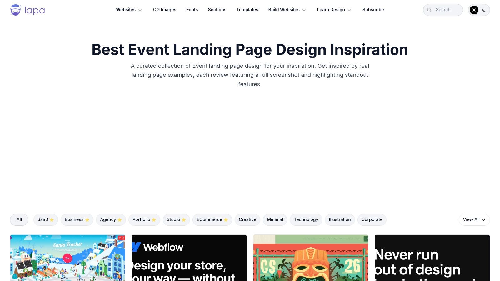
What makes Lapa Ninja so effective is its focus on visual patterns and its direct relevance to no-code builders. The platform preserves full-page screenshots, ensuring you can study the entire user journey even if the original site goes offline. This archival approach is perfect for deconstructing layout, information hierarchy, and visual storytelling from beginning to end.
Strategic Breakdown & Key Takeaways
The real power of Lapa Ninja comes from its filter system. You can narrow down the inspiration pool by platform (Framer, Webflow), style (e.g., minimalist, colorful), and year. This is exceptionally useful for a Framer designer who wants to see what's possible within the tool's ecosystem before starting a build.
Key Insight: The best way to use Lapa Ninja is for pattern recognition. Scan 20-30 examples in the event category and you'll quickly spot recurring structures: the hero section with a clear value proposition and CTA, the "featured speakers" grid, the multi-day schedule, and the tiered pricing table. This is far faster than starting from a blank canvas.
Instead of building these common sections from scratch, which can be time-consuming and error-prone, a more efficient approach is to identify a pattern you like and then find a professional template that already has it built-in. High-quality templates from providers like FramerDevs are designed for conversion and speed, letting you focus on branding and content instead of reinventing the wheel.
Actionable Tips for Using Lapa Ninja
Filter for Your Stack: Immediately filter by "Framer" or "Webflow" to see designs built with the same tools you use. This provides realistic inspiration.
Study Information Architecture: Pay attention to how different pages organize their content. Where do they place the agenda? How do they introduce speakers? Note the flow from section to section.
Deconstruct the Hero: Analyze the first screen of several examples. What's the headline? What's the call to action? How do they use imagery or video to create immediate impact?
Don't Copy, Synthesize: The goal isn't to replicate a single site. It's to gather ideas on typography, color palettes, and component layouts that you can combine into a unique design.
Lapa Ninja is completely free to use. Its strength lies in its breadth and design-forward curation, making it the perfect starting point to gather ideas before committing to a design direction for your next event landing page.
Website: https://www.lapa.ninja/category/event/
3. One Page Love
For designers who value efficiency and impact, One Page Love offers a tightly curated gallery focused exclusively on single-page websites. Its "Event" category, with over 370 entries, is a fantastic resource for anyone tasked with creating a concise yet comprehensive event landing page. It showcases how to communicate all critical event information within a single, elegant scroll.
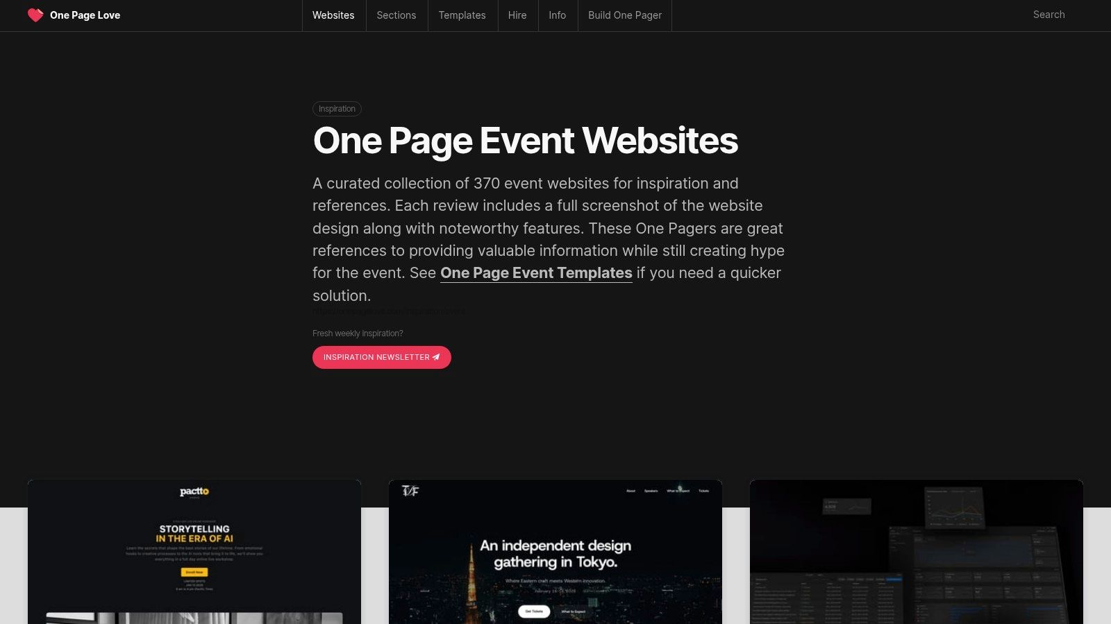
What makes One Page Love a standout is its long-standing commitment to quality curation, dating back to 2008. Each entry includes a full-page screenshot and a short commentary on what makes the design notable. This archival approach ensures that even if a live event site is taken down, the inspiration remains, making it a reliable source for studying effective one-page event landing page examples.
Strategic Breakdown & Key Takeaways
The strength of One Page Love is its focus on information density. Single-page sites force designers to be ruthless with prioritization. By studying the examples here, you learn how to tell a complete story, from the initial hook to the final call to action, without forcing users to navigate a complex multi-page site. This is perfect for single-day workshops, webinars, or exclusive promotions where speed and clarity are key.
Key Insight: The one-page format excels at creating a linear narrative. Use One Page Love to see how successful designs guide a user from "What is this event?" to "Who is it for?" to "Why should I attend?" and finally, "How do I register?" all in a seamless, downward motion. Notice the use of anchor links to help users jump to specific sections like the schedule or pricing.
Building this kind of tight, logical flow from scratch requires careful planning. Instead of guessing at the optimal section order, a faster route is to adopt a structure proven to work. Premium Framer templates from sources like FramerDevs are designed with this narrative flow already built-in, allowing you to plug in your event details and focus on marketing instead of layout mechanics.
Actionable Tips for Using One Page Love
Study the Narrative Flow: Pick five examples and map out their section order. You'll likely see a pattern: Hero > Problem/Benefit > Speakers > Schedule > Social Proof > CTA.
Analyze the Call to Action: How many CTAs are on the page? Where are they placed? Note how many pages use a sticky header with a persistent "Register Now" button.
Focus on Visual Separators: Pay attention to how designers use color blocking, full-width imagery, and typography to visually separate sections and prevent the page from feeling like one long, monotonous scroll.
Read the Curation Notes: Each entry has a short write-up. These notes often point out a clever design choice or a unique interaction you might otherwise miss.
One Page Love is completely free to browse. Its specialization in one-page design makes it an invaluable tool for creating focused, high-impact landing pages that drive registrations without overwhelming visitors.
Website: https://onepagelove.com/inspiration/event
4. Swipe Pages
While broad inspiration galleries are great for visual ideas, Swipe Pages zooms in on the most critical part of an event website: the registration page. This platform is an inspiration hub focused specifically on conversion-driving event landing page examples for webinars, conferences, and workshops. It offers a curated list of over 20 pages, summarizing the key patterns that convince users to sign up or buy a ticket.
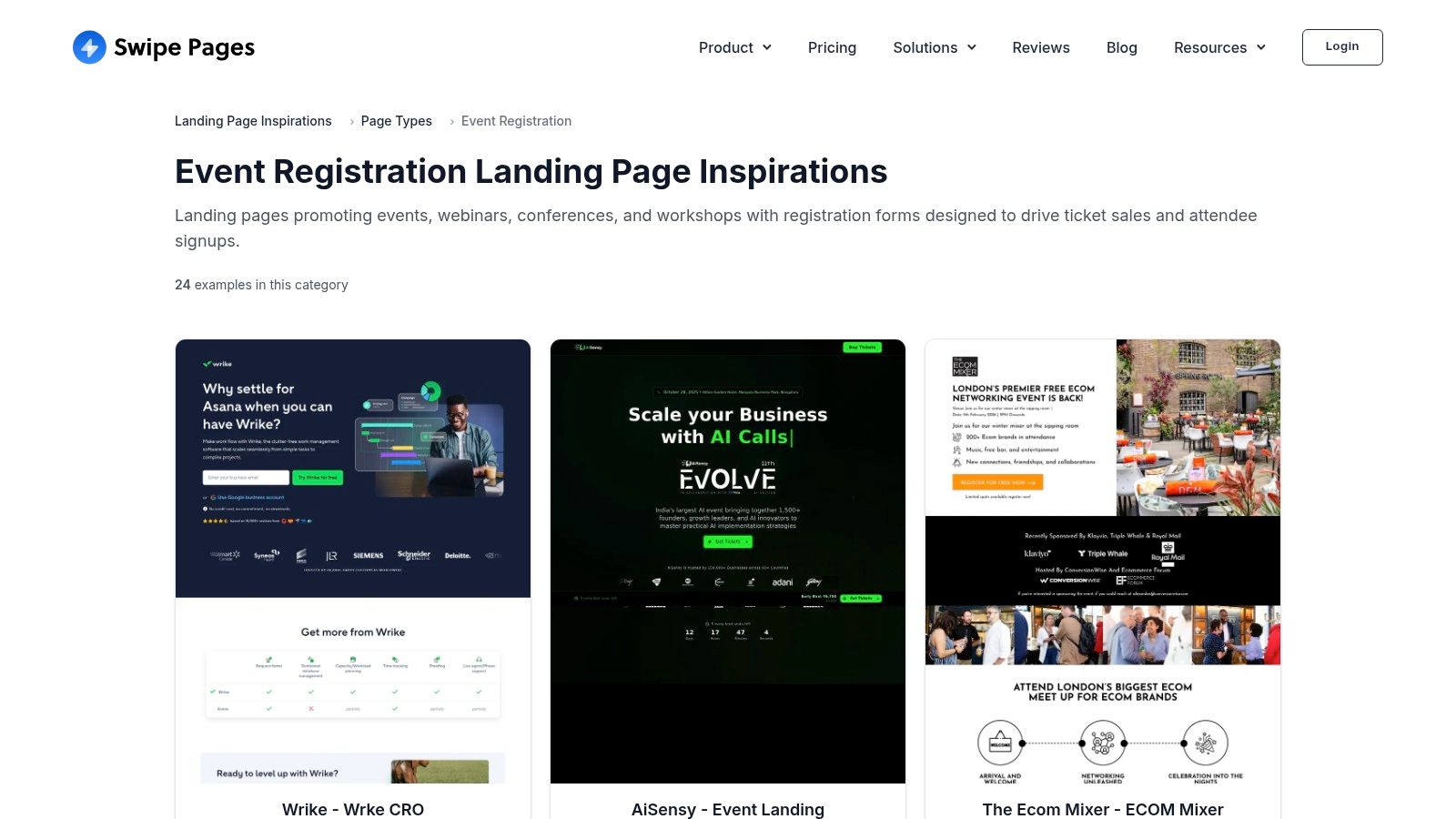
What makes Swipe Pages different is its laser focus on the mechanics of conversion. Instead of just showing you a pretty design, it distills why a page works into actionable summaries. The platform highlights recurring elements like urgency timers, prominent speaker bios, and crystal-clear logistics, making it a practical checklist for anyone aiming to reduce friction and maximize sign-ups.
Strategic Breakdown & Key Takeaways
The main value of Swipe Pages lies in its "Key Patterns" summaries. These act as a quick-reference guide for the essential, high-impact elements every event registration page needs. For designers and marketers, this is a fast way to audit a design and ensure no critical conversion component is missing, like social proof or a clear value proposition.
Key Insight: Use Swipe Pages as a final check before you launch. Its pattern-based approach helps you move from broad design concepts to the specific details that drive action. Does your page clearly state the date and time? Is there a sense of scarcity? Are the speakers positioned as authorities? Answering these questions is fundamental to a successful launch.
While this analysis is useful, building these conversion-focused sections from scratch can be tedious. A more direct path is to start with a professional template from a provider like FramerDevs. These templates already incorporate proven conversion patterns, allowing you to focus on your event's specific content and branding rather than worrying about foundational layout and functionality.
Actionable Tips for Using Swipe Pages
Create a Conversion Checklist: Review the "Key Patterns" on Swipe Pages and turn them into your own pre-flight checklist. Before your page goes live, check it against this list to spot any gaps in your conversion strategy.
Analyze Above the Fold: Study how their examples handle the hero section for registration pages. Note the directness of the headlines and the singular focus of the call-to-action buttons.
Focus on Logistics: Pay attention to how top pages present logistical information like date, time, location (or virtual access), and price. Clarity here is crucial for building trust and reducing user anxiety.
Adapt, Don't Just Adopt: While Swipe Pages’ examples are effective, remember they are often tied to their own builder. Take the strategic principles, not the exact implementation, and apply them within your tool of choice, like Framer.
Swipe Pages is free to browse and provides a focused, practical resource for improving the most important page of your event funnel.
Website: https://swipepages.com/landing-page-inspiration/page-type/event-registration/
5. MailerLite (Event landing page examples)
MailerLite’s event landing page gallery offers a different, more grounded perspective compared to design-centric showcases. It features a live collection of pages built by its own customers, providing a look into how small businesses, nonprofits, and community organizers approach event promotion. This gallery is a great resource for seeing practical, conversion-focused event landing page examples that prioritize clarity and action over complex design.
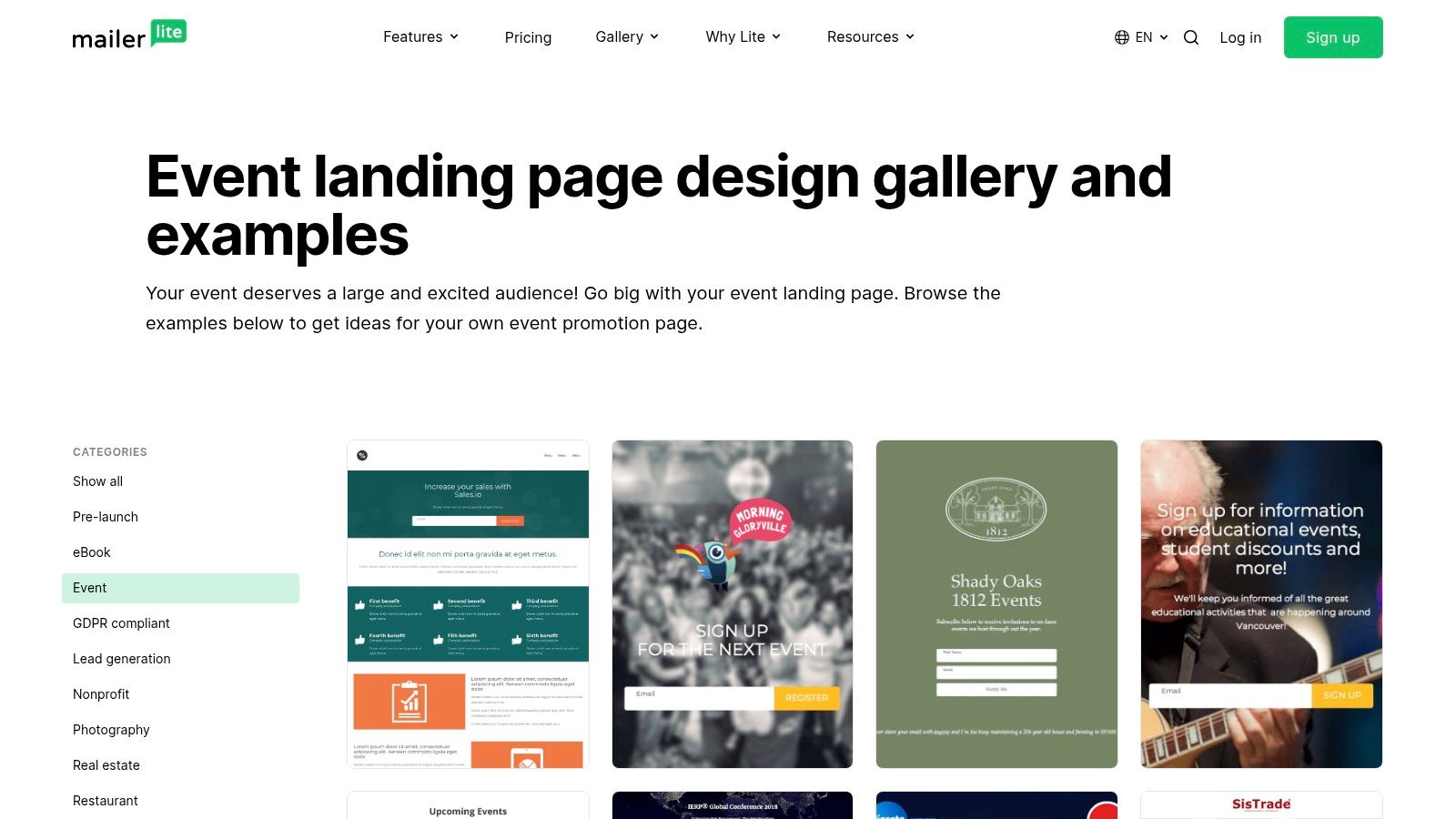
What makes the MailerLite gallery useful is its authenticity. Since the pages are from real users, they reflect real-world constraints and objectives, like clear lead capture forms, prominent date and location details, and straightforward value propositions. Each example links to the live page, allowing you to inspect its structure and information hierarchy firsthand and see how it functions for an actual audience.
Strategic Breakdown & Key Takeaways
The strength of MailerLite's collection is its focus on function. These pages aren't just for show; they are built to convert visitors into attendees. You can filter by "Event" or "Webinar" to see how different organizations solve common challenges, such as displaying a compelling agenda, collecting RSVPs, or integrating a simple payment button.
Key Insight: The MailerLite gallery is a masterclass in 'Minimum Viable Page' design. Notice how many examples succeed with just a strong headline, essential event details (what, when, where), a clear benefit, and a single call-to-action button. They prove you don't need elaborate animations to fill seats.
This practical approach highlights the value of starting with a solid foundation. Instead of trying to construct these core conversion elements from scratch, a more efficient method is to adopt a professionally designed Framer template. A premium template from FramerDevs already includes optimized sections for sign-ups, schedules, and speaker bios, letting you achieve a polished, high-performing result much faster.
Actionable Tips for Using MailerLite's Gallery
Study Form Design: Analyze how different pages structure their registration forms. Do they ask for just an email, or more? How are the forms integrated into the page flow?
Observe Information Hierarchy: Click through to the live examples and note what information is presented first. Successful pages prioritize the most critical details above the fold.
Analyze the Call to Action: Look at the button copy. Is it a generic "Submit" or an action-oriented phrase like "Save My Spot" or "Register for Free"?
Find Inspiration in Simplicity: Many of these pages are made by non-designers. Identify how they use simple layouts, clear typography, and a single strong image to create an effective page.
Access to the MailerLite landing page gallery is completely free. Its value lies in its pragmatic, real-world examples that demonstrate how to build an effective event page even with limited resources.
Website: https://www.mailerlite.com/landing-page-examples/event
6. Landingi
While inspiration galleries are great for visual ideas, sometimes you need a more structured analysis to inform your design brief or wireframe. Landingi’s curated article does exactly that. It's an in-depth piece that breaks down 20 different event landing page examples, spanning conferences, festivals, and webinars, with a focus on why specific sections work.
Unlike a pure design gallery, this resource acts as a strategic playbook. It moves beyond just showing pretty designs and explains the functional purpose of components like speaker bios, agenda layouts, and urgency timers. This approach is perfect for marketers and designers who need to justify their structural choices and build a page optimized for registrations.
Strategic Breakdown & Key Takeaways
The main benefit of Landingi's roundup is its focus on transferable content blocks. It highlights recurring sections that appear across different event types, such as the agenda, speaker introductions, hall maps, and ticketing tables. This makes it a practical tool for planning the information architecture of your own landing page. The article’s key takeaways for each example are concise and actionable, making them easy to drop into a design brief.
Key Insight: Landingi’s analysis helps you build a "content-first" outline. Before you even think about colors or fonts, you can use its takeaways to list the essential sections your event page needs. For instance, you'll see how top-tier events clarify ticket value and use countdowns to drive action, giving you a ready-made checklist for conversion.
Identifying these crucial sections is the first step. The next is implementation. Building complex layouts for agendas or multi-tier pricing from scratch is difficult and time-intensive. A smarter move is to select a professional template where these components are already built and optimized for you. Premium Framer templates are specifically designed with these conversion-focused sections included, allowing you to get a high-performing site live in a fraction of the time.
Actionable Tips for Using Landingi
Create a Section Checklist: As you review the examples, create a list of all the content blocks you'll need (e.g., Hero, Value Props, Speakers, Agenda, Sponsors, FAQ, CTA).
Analyze Urgency Tactics: Note the different ways urgency is created, from "Early Bird" pricing deadlines to explicit countdown timers. Decide which method fits your event’s tone.
Study Ticketing Clarity: Pay attention to how the examples present their pricing. Look for clear feature comparisons between ticket tiers and prominent calls to action.
Translate Takeaways to Your Brief: Copy the most relevant "Key Takeaway" points directly into your project brief to guide your design and development process.
Landingi’s article is free to access, though it's important to note it's vendor content promoting its own page builder. Despite this, its structural analysis provides solid, actionable advice for anyone planning an event website.
Website: https://landingi.com/landing-page/event-examples/
7. Bizzabo
For a more strategic, practitioner-focused approach, Bizzabo’s guide offers a masterclass in building high-stakes event landing pages. Instead of a gallery, it presents a deep-dive analysis of five concrete examples from major industry events like INBOUND and TechCrunch Disrupt. This resource is perfect for marketers and designers aiming to understand the psychology behind enterprise-level event registration and user engagement.
What makes Bizzabo's guide so valuable is its focus on reducing registration friction and clarifying logistics, two of the biggest hurdles for any event. It moves beyond just aesthetics to explain the why behind the design choices, connecting them directly to conversion goals. The included checklists and breakdowns are directly applicable, whether you're building a site in Framer or drafting a project brief for a client.
Strategic Breakdown & Key Takeaways
The guide’s real strength is its emphasis on benchmarking against successful, large-scale events. By deconstructing pages from SaaStr Annual and others, it provides a blueprint for what a trustworthy, informative, and persuasive event landing page example looks like. The content is organized around clear, tactical steps for improving copy, visuals, and calls to action.
Key Insight: The most crucial takeaway from Bizzabo is the importance of a "checklist-driven" design process. Before you even open a design tool, you should have a list of essential elements: a clear value prop, a prominent CTA, a detailed agenda, speaker bios, social proof, and logistical information. This ensures nothing critical is missed.
Building these distinct sections from the ground up can be a tedious process. A smarter method is to adopt this checklist approach and then select a professional Framer template that already includes these pre-built, conversion-optimized sections. A premium template from a source like FramerDevs allows you to simply plug in your event's content, saving immense time and ensuring the underlying structure is solid.
Actionable Tips for Using Bizzabo
Create Your Pre-Build Checklist: Use Bizzabo's article to create a master checklist of all the sections and information your event page needs.
Benchmark Your Hero Section: Compare your planned headline and CTA against the examples provided. Are you being as clear and compelling as INBOUND or TechCrunch?
Analyze Information Hierarchy: Study how the featured events structure their pages. Note the order of sections and how they guide the user from initial interest to registration.
Focus on Reducing Friction: Identify every element Bizzabo points out that reduces friction (e.g., clear pricing, simple forms, visible dates) and ensure your design incorporates them.
Bizzabo's guide is a free resource that combines inspiration with direct, actionable advice. While it offers fewer examples than a gallery site, its depth and focus on proven marketing principles make it an essential read before starting any serious event website project.
Website: https://www.bizzabo.com/blog/event-registration-landing-page-examples-tips
Top 7 Event Landing Pages Comparison
Item | Implementation Complexity 🔄 | Resource Requirements ⚡ | Expected Outcomes 📊 | Ideal Use Cases 💡 | Key Advantages ⭐ |
|---|---|---|---|---|---|
Evara – Event Management Template | Low — no‑code Framer template; some Framer familiarity to customize | Moderate — Framer account (may be paid), optional integrations for ticketing | High — conversion‑focused, responsive sites with fast time‑to‑launch | Event organizers, agencies, community leads needing an editable event site quickly | Conversion‑first blocks, CMS pages, Figma files, partner support |
Lapa Ninja | None to browse; implementing examples requires designer/developer work | Low — web access and time to review curated screenshots | Medium — strong pattern discovery; no performance data | Design research and rapid pattern scanning for layout ideas | Very large, design‑forward gallery with platform/year filters |
One Page Love | None to browse; applying one‑page patterns requires design effort | Low — time to review archive; optional template use | Medium — excellent single‑page inspiration; clean communication patterns | Single‑scroll event promos and one‑page registration pages | Deep, consistent archive with high design quality |
Swipe Pages | Low — curated examples and pattern summaries; templates available | Moderate — may favor Swipe Pages tooling if using templates | High (for registration) — focused on conversion patterns for signups | Registration‑focused pages (webinars, conferences, workshops) | Clear "key patterns" summaries and conversion checklists |
MailerLite (Event examples) | Low — browse live customer pages; rebuild with builder if desired | Low–Moderate — free gallery; MailerLite account to recreate templates | Variable — practical, real‑world designs but inconsistent quality | Small businesses, nonprofits, community events looking for pragmatic examples | Real customer examples reflecting common constraints and form patterns |
Landingi | Low — article with 20 curated examples and actionable takeaways | Low–Moderate — time to read; Landingi builder if reusing templates | High — section‑level recommendations useful for briefs and wireframes | Designers/marketers converting inspiration into structured pages | Concrete takeaways per example and recommended sections to emulate |
Bizzabo | Low — practitioner guide with five benchmark examples and checklist | Low — reading time; applies to enterprise tooling | High for enterprise benchmarking — reduces registration friction | Enterprise and large U.S.‑centric events needing best‑practice guidance | Checklist-driven guidance and examples from major events |
Your Next Step: From Inspiration to a Live Event Page in Record Time
We've explored a wide range of high-performing event landing page examples, from the clean designs on Lapa Ninja to the comprehensive layouts of Bizzabo. Across conferences, workshops, and virtual gatherings, a clear pattern emerges: the most effective pages do more than just announce an event; they create an experience. They build anticipation, answer questions before they are asked, and make the path to registration effortless.
The strategic playbook is now yours. You've seen how powerful storytelling, prominent speaker bios, clear value propositions, and trust-building social proof work together to drive conversions. Each example we dissected demonstrates that success isn't about a single magic bullet, but a combination of proven design principles and psychological triggers that guide a visitor from initial interest to a confirmed ticket.
Key Takeaway: A winning event landing page is a masterclass in clarity and persuasion. It anticipates user needs, removes all friction from the registration process, and consistently reinforces the value of attending.
The Crossroads: Build from Scratch or Launch in Hours?
You are now at a critical decision point. You have the inspiration and the strategic knowledge. The next step is execution. You could take these insights and begin the long process of building a page from a blank canvas. This journey often involves weeks or even months of wireframing, designing, developing, debugging responsive layouts, and optimizing for site speed. It's a resource-intensive path that pulls your focus away from what truly matters: planning a great event and promoting it.
However, there is a more efficient path. The smartest founders, marketers, and creators don't reinvent the wheel. They use a professional foundation that has all the best practices baked in from the start. This approach frees you from technical headaches and allows you to launch in a fraction of the time, with a higher-quality result.
Choosing Your Toolkit: Speed vs. Complexity
Your choice of tool depends on your goals. For those needing deep, code-level control and willing to invest the time, a platform like Webflow offers immense power. It allows for intricate animations and complex CMS structures, making it a solid choice for agencies with development resources.
For the majority of creators, startups, and marketers who prioritize speed, ease of use, and top-tier performance without writing code, Framer is the clear winner. Its visual canvas feels intuitive, and publishing a site is remarkably fast. This is where a pre-built template becomes a massive advantage. Instead of starting with an empty project, you can start at the finish line.
This is precisely why we recommend leveraging a professionally crafted template. A premium template like 'Evara' from FramerDevs isn't just a design; it's a conversion-optimized system. It comes pre-packaged with all the essential sections we've analyzed:
A high-impact hero section to grab attention immediately.
A dedicated speaker grid to showcase your talent.
A clear agenda or schedule layout to manage expectations.
Integrated ticketing and CTA sections designed to convert.
Social proof elements like testimonial sliders to build trust.
By using a template, you skip the entire ground-up build process. Your job shifts from being a developer to being a marketer. You simply customize the content, update the branding with your own colors and fonts, and connect your ticketing system. What could have taken a month is now done in an afternoon. You get a world-class, fully responsive, and blazing-fast event landing page ready to capture registrations, giving you back your most valuable asset: time.
Ready to skip the learning curve and launch a stunning, conversion-focused event page today? Explore the premium Framer templates at FramerDevs. Our templates are built on the strategies seen in these top event landing page examples, giving you a professional, high-performance site in hours, not weeks.


